Light & dark mode for themes variables

Hello,

I’m wondering for your advice on how to best achieve the following with variables:
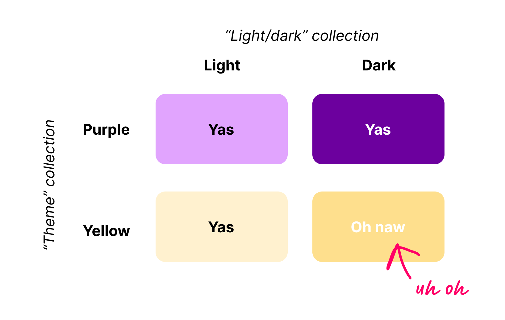
  • Have default light & dark mode
  • Have themes and each theme would have a light & dark mode

There is one way I can think of to solve this:

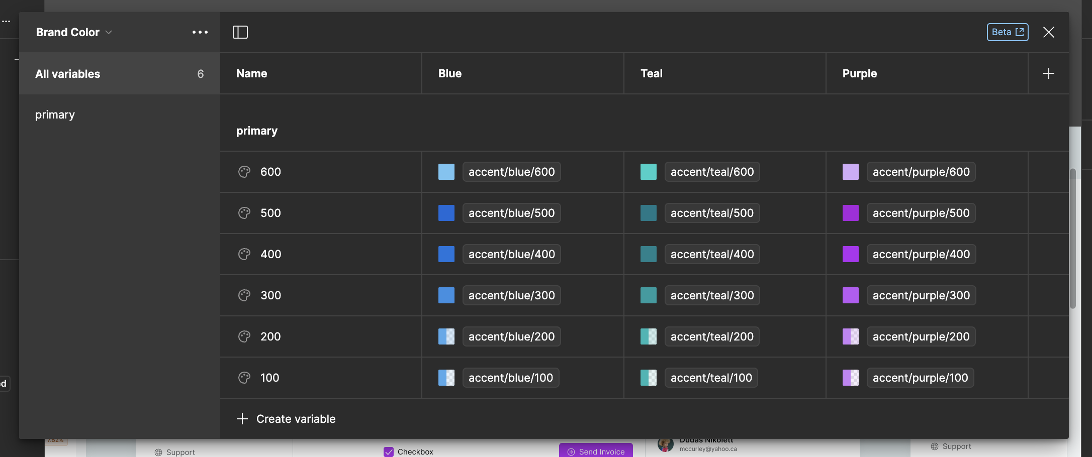
  • Have two collections - one with all of the colours and the other with all of the themes (for example light, dark, purple light, purple dark)

Is there a way to have one theme only (purple) which would work perfectly with either light or dark mode selected?

I appreciate any help!

Great question!

You could set them up as you describe:

  • Collection 1: Light/Dark
    • Mode: Light
    • Mode: Dark
  • Collection 2: Themes
    • Mode: Purple
    • Mode: Red
    • Mode: Green

While your approach is technically feasible and will work, I want to outline some of the design concerns. This approach implies that all of your themes use the exact same values for their light and dark mode variable values.

This might make sense for something like a default text color or overall background color. But what happens when the theme doesn’t completely jive with the mode? If you have a very light-colored theme you might need to invert the text color or adjust secondary colors to ensure enough contrast for accessibility. Maybe your theme has cool neutral colors but the default dark mode uses warm neutral colors, what then?

This is a common situation for many teams and there is an upcoming improvement, announced at Config, that will make this easier to accomplish.

In the meantime, if you want to prepare for that flexibility in the future, the best thing to do would be to have a single collection and ‘flatten’ the modes for each theme/light/dark combo. For example:

  • Main Collection:
    • Mode: Purple-Light
    • Mode: Purple-Dark
    • Mode: Red-Light
    • Mode: Red-Dark
    • Etc…

Yes this is more manual work. If the values between your light and dark modes don’t change much, you will still need to set them for every ‘flattened’ mode. For most teams these values don’t change often, so this should be a one-time operation. When the collections improvement lands, you’ll be able to extract/collapse these flattened modes into separate collections where you can set light/dark theme-specific values to your hearts content.

In summary:
If your light/dark mode variables are truly separate from your themes variables… then your strategy would work. Again, I haven’t seen many scenarios where this is the case but you would know better if this works for you.

If you think your themes need different values for shared variables based on their light or dark mode, like backgrounds or accent colors, then you’re better off going with the ‘flattened’ approach outlined above. This is more work to maintain right now but will help with future migration.

4 Likes

@adispezio Thank you so much for your really helpful response!

Other way around would be to define few accent palettes for the light and dark modes and then you alias to one of the existing bright colours.

This is your main theme collection with light and dark modes

Light            Dark
Accent/Red       Accent/Red
Accent/Blue      Accent/Blue
Accent/Purple    Accent/Purple

And then you add your brand collection for different brands that would alias colours from the theme collection

Brand Blue
Primary {Accent/Blue}

Brand Purple
Primary {Accent/Purple}

Brand Red
Primary {Accent/Red}

This will give dark and light modes with balanced colours plus an ability to set brand mode however you like

1 Like

Here is a quick demo of how it works

My brand colours

And my theme

3 Likes

Does this method still work? I tried doing the same but it looks like that since now Variables is not Beta anymore, Figma doesn’t allow it and my assumption is because if you allow sub-modes like that, you would be able to surpass the limit of 4 modes for Professional plan…

It still works for sure, limited to 4 modes on the Pro plan. For my design needs I made something different, to overcome that limitation