
Left panel page title needs to be moved next to Figma icon for better spacing


Lee_Hayward

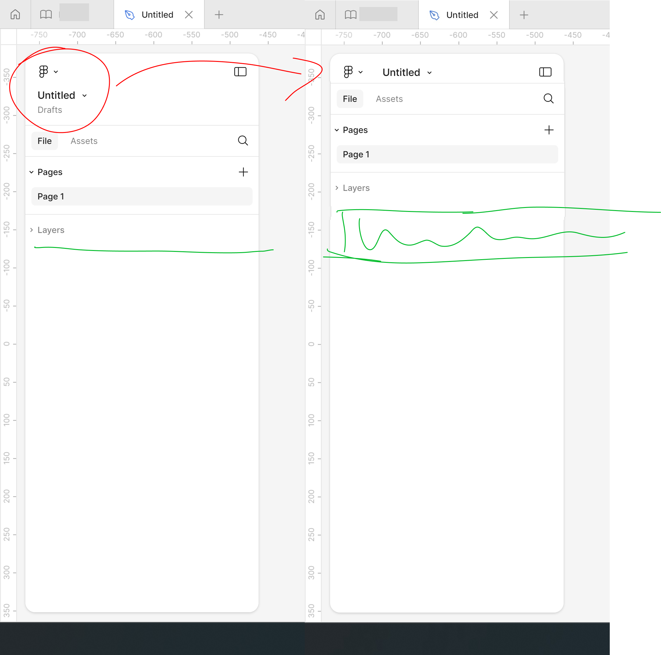
The left panel is always fighting for space with pages and layers, and now with the new UI, there’s even less… What’s the point of a vertical column, where space is at a premium, wasting so much for the Figma icon and file name when they could be side by side like below.

2 replies

ksn
Figmate
  • Community Support
  • 1624 replies
  • August 8, 2024

Ooh thanks for the feedback on the design of the panel – I’ll pass this along to the teams working on UI.

In your opinion, is the need to know what project the file is in not relevant to your day to day work? From your screenshot, it looks like you left that part out when moving from a vertical layout → horizontal one.


Lee_Hayward
  • Author
  • New Member
  • 14 replies
  • August 8, 2024

Hm, I don’t really need it, but others might. It could be shown in the window tab instead, or simply just put it before the page name - so in my example it would be like Drafts/Untitled.

I just find myself in UI 13 needing to scroll the left panel way more because of lack of space, which is time consuming.


Reply


Cookie policy

We use cookies to enhance and personalize your experience. If you accept you agree to our full cookie policy. Learn more about our cookies.

 
Cookie settings