
Currently the only function of fixed positioning on an element is to make it persistent in the same spot at all times. While this is useful the majority of the time, there are instances where it would be helpful to have an element become fixed when it scrolls into view or reaches the top of the screen.
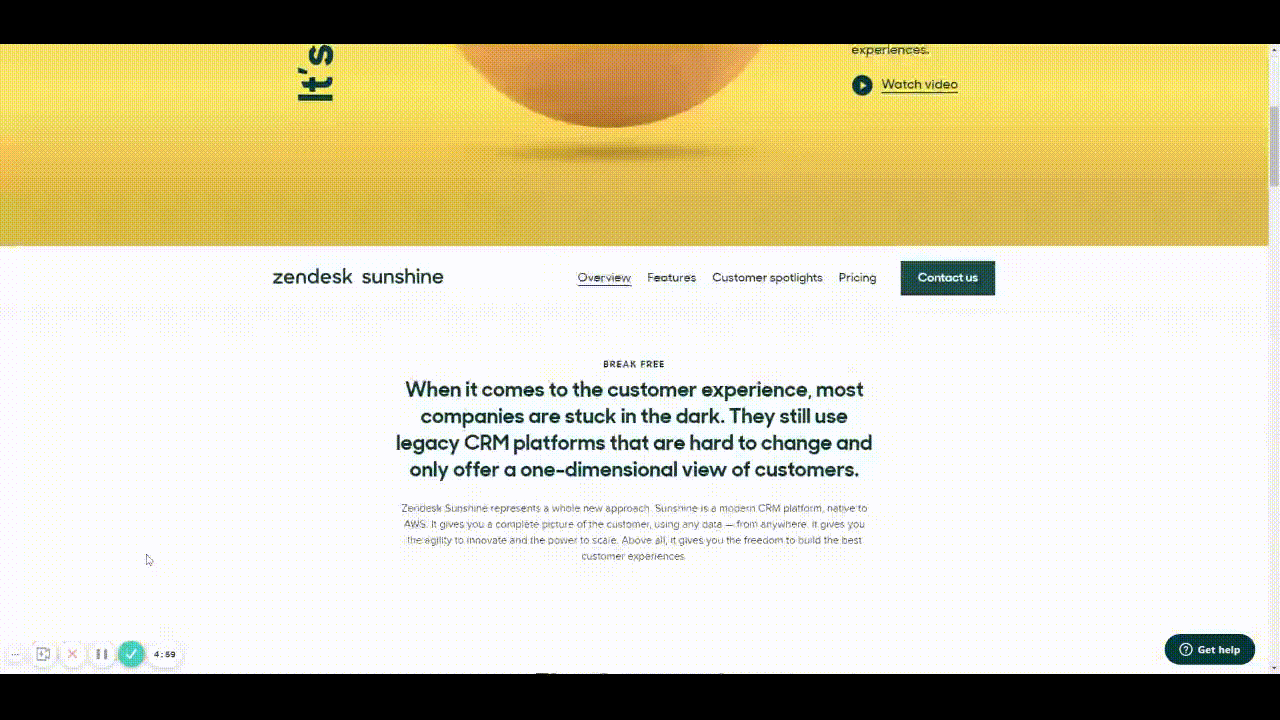
For example, there could be a web page that has a secondary navigation below the hero that will become fixed when it reaches the top of the screen and be persistent for the rest of the scroll depth. Then when a user scrolls back up, the element releases from the fixed position when it reaches its original position. You can see this in effect on this page: Develop custom experiences with the Zendesk Platform | Zendesk Sunshine. It could also be used in more advanced manners such as multi-level parallax scrolling.
This would be very helpful for both engineering and stakeholders to understand functionality, especially when the designer isn’t there to describe it to them. It would also prove useful for user testing to understand if a chosen function works for users prior to spending time in engineering.
Does anyone have any other solution to this that I’m missing?
Thank you in advance and looking forward to hearing back!