Issues with prototype presentation (Actual size vs. Fit to screen)

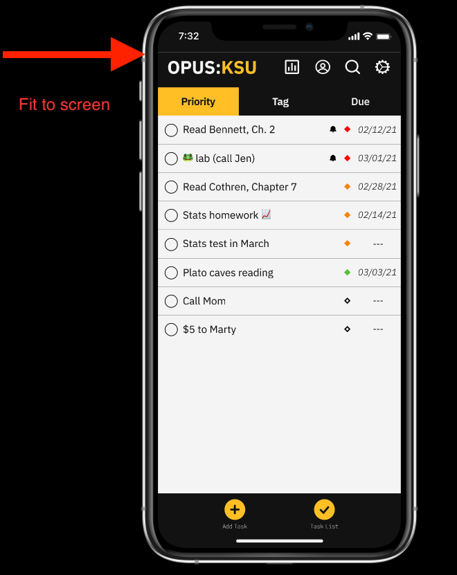
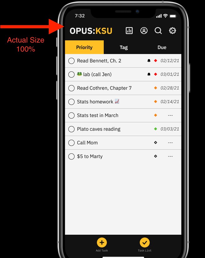
Hi, I’m having an issue when viewing a prototype in presentation mode. My frame size is 375 x 812 and the device is set to iPhone 11 Pro (but the issue is the same for all 375 x 812 devices).

When the prototype presentation is set to “Fit to screen” you can see gaps between certain elements on the screen. When the presentation is set to “Actual size,” those gaps go away. It seems to me that the elements are not re-sizing property when “Fit to screen” is selected.

You can see screen shots of the issue:


Am I doing something wrong? Is this something I can fix? Or do I need to tell everyone to only view the prototype on “Actual size?”

I have also created a single screen prototype test to show this issue: https://www.figma.com/file/b4t7a4QNhOYZJcZsEU8wnt/Test?node-id=0%3A1

Hey! Your Figma link isn’t working. Please update it so I can have a look.

Huh, sorry about that. Try this: https://www.figma.com/file/b4t7a4QNhOYZJcZsEU8wnt/Test?node-id=0%3A1

It’s not pixel perfect when you fill screen, because it is at an odd zoom level. Some edges will not align perfectly, and the background will bleed through. In this case, you can make the background behind those elements the same color as the elements to get rid of the lines.

Well, it does seem to fit properly when I have it set to 100% but not fit to screen. The process of shrinking it a bit allows for elements to being misaligned. But I see your point and it’s a bit frustrating. I have had this issue before when designing at 375 x 812 but not on some other iPhone screen sizes. Lesson learned on my part.

Thank you for taking the time to offer some solutions. Much appreciated.