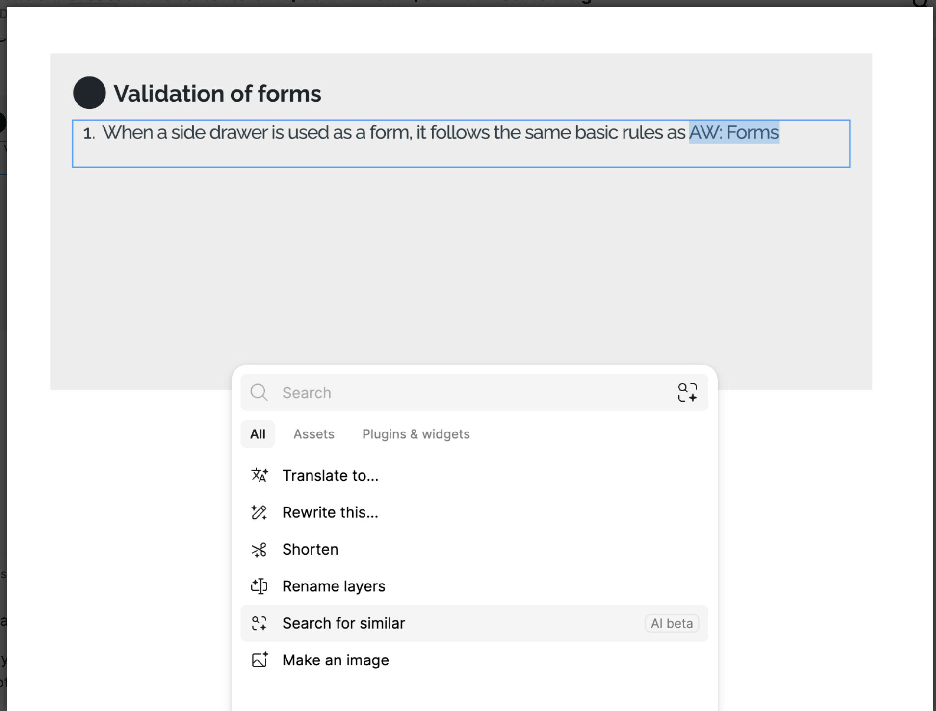
So I’m in the trial for UI3. So far it is going well. I am able to find everything that I need to do my work and I have been both designing and maintaining the design system for two weeks. I like that the main CTA have moved to the bottom of the screen from the top left.
One thing that is bothering me is I can no longer use my shortcuts to quickly create a link.
On a mac CMD+ K opens the link box then CMD+ V pastes in the link I copied from elsewhere. (On Windows this would be CTRL+ K then CTRL + V)
I use this functionality ALOT in handoffs. Maybe others do too? Also these shortcuts are used across many many applications such as Office 365, Google docs, sheets etc and even here in this text editor.
I was instructed that a NEW shortcut SHIFT+CMD+U. now opens the link box.
Unfortunately CMD K is used across all applications I have come across such as Notion, Google everything, MS 365 everything, slack, teams, etc and so on. So from a user experience perspective I believe it should be returned to the “universal” shortcut.
Though I realize there is no real universal shortcut- seems this one is pretty standard across so many apps - I am curious if anyone can give examples of other apps that also do not use CMD+K [CTRL+K on Windows] ? Thank you so much. Once again love the new UI. Keep up the great work.
I agree, this is such a weird change. This shortcut has existed for years (decades?) - not just in other apps but in Figma. What’s next, remapping cmd+a for autolayout?
You already had a shortcut for this, and it was fine.
I think I agree that this shouldn’t have changed but I do understand the reasoning behind moving to Cmd + K, which aligns with other “launcher” patterns all over the web. I think the previous shortcut for that quick action menu was not well-known and they probably hope that switching to Cmd + K will help more people find it.
This cmd K change is killing me. My team adds a Table of Contents on the first page of our design files for really complex epics. The headings (pages) and sub headings (flows in sections) are all links to the correct pages and sections. Sigh
Same, I use it all the time. This is someone at Figma thinking “Well I don’t ever use this shortcut so I guess I’ll assign it to something else, what’s the harm?” Meanwhile folks been using cmd+k for links since the 90s.
Please upvote and tell your design friends to upvote! I keep posting this on twitter to Figma and on linked in when I see a related post about the latest U13 updates. But I feel I’m being ghosted.
Hi! Does anyone know the new shortcut for placing images/video? It used to be cmd + K but it’s now changed. I tried CMD + SHIFT + U - but this doesn’t work for me
Taking over a universal shortcut is the most frustrating choice I’ve ever seen coming from Figma. This is unusable for designers who add links into compositions all the time. Please switch the menu shortcut to Cmd + [literally any unused letter or symbol], stat.
And it looks like Figma is doubling down on this. Here is a blurb from the release notes announcements sent on 10-24-2024. smh.
TODAY I LEARNED… "If I can’t find something in UI3, I just hit CMD+K and type it in. It’s become a habit and I waste less time memorizing and building muscle memory for shortcuts.”