How to use exactly auto layout?

Hi guys, i was looking for a Figma tutorial. During the creation of a landing page, the man is creating a series of autolayout frame and than, he put inside others one. This workflow is a bit messy, so i was wondering, why just arrange in the proper position the elements and than create auto layout for each field ? Moreover i’m trying to figure out if autolayout is necessary and is required to work in an industry workflow, sometimes it seems pointless…

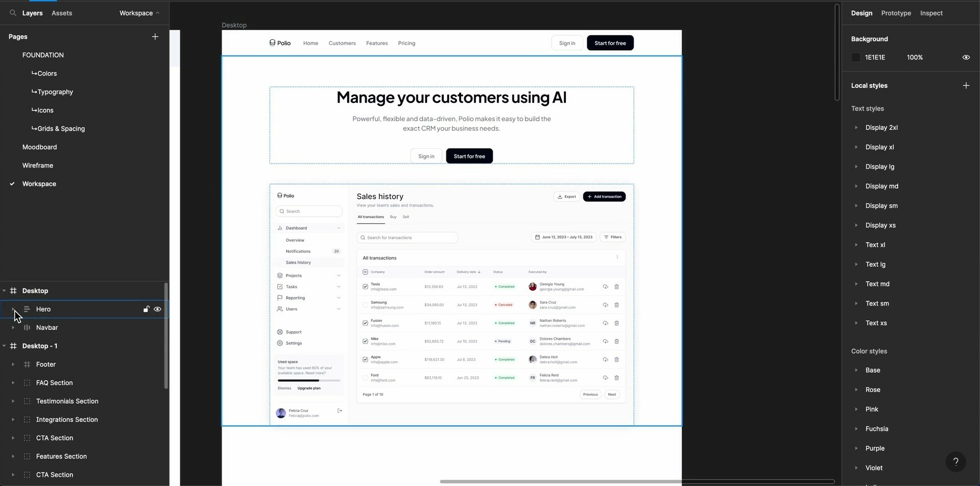
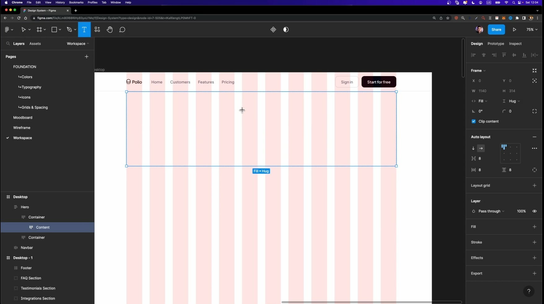
I’will attach a screenshot

Thanks for the attention !

Hard to say how the workflow can be improved without seeing it. But I think your idea makes sense.

Auto layout allows you to create responsive layouts that would adapt to any screen size and content size. That’s why it’s useful.

1 Like

Hi Gleb thanks a lot for your help.

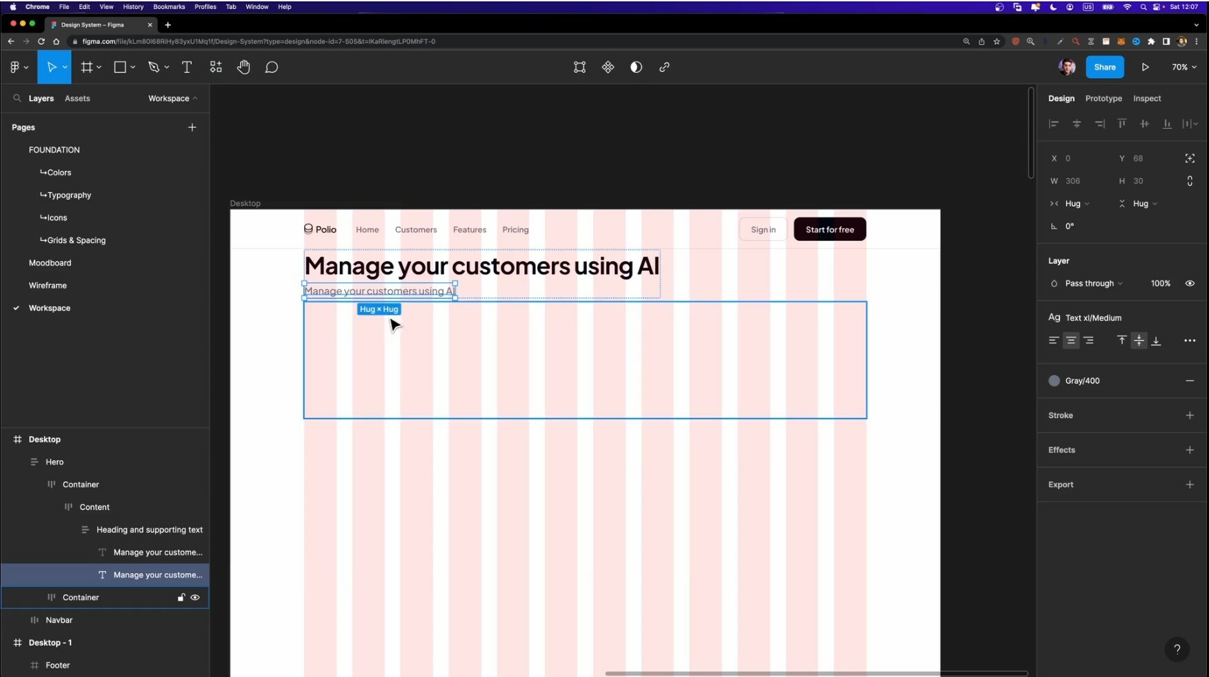
Lets get right on it, i’m going to attach other two screenshots, hopin it could help.
As you can see, he first created the containers and than created the texts and CTA, but does it work also if you create the text and other elements arranging in to the space and than create auto layout.

Moreover, i know auto layout is handy for responsive design, likewise for ipad or iphone version you must tweak content and not only shrink it, so is like doing another time the work, in this case you should not use auto layout, am i wrong ?

Thanks a lot !


Auto layout enables certain type of relationships between elements inside. It’s more efficient way of doing stuff.

You are in full control over spacing, it is number based and you don’t have to double check margins and paddings, no need to measure, eyeball etc.

It’s much easier to extend and change your designs. Adding new element won’t require manual adjustments for the rest of the existing elements, they will snap where they should be like a magic. Have ever been in a situation when stakeholder asks you to add something or remove some from the screen? And you be like “gosh, I have to re-align half of my design to accommodate the change? With auto layout it’s much smoother now.

Also it makes experimenting easier. Ability override auto layout aspects lets you experiment and iterate real fast. You can give some items more negative space, less negative space in a few simple steps. And it does not require to do anything with the rest of your design. Got more content? Everything will react accordingly no manual intervention is required.

You can still design things like it’s 2018, Figma allows that. But is time consuming, harder to maintain and evolve.

1 Like

Also I can see that Figma pushes auto layout real hard. They even made constraints somewhat secondary and auto layout feels more like a first class citizen. Designs that a put together with auto layout are way better when it comes to code generation. Regular frames and groups not so much.

1 Like

Hi Pavel, thanks for your support !

Would you mind, advice some tutorial whic, in your opinion, are very useful to master this skill ?

Thanks a lot !

I have learned just by doing it. It might be frustrating at first but once you get comfortable it just flows. If you want to get some basic understanding got to YouTube and search for “Figma auto layout tutorial” there are plenty of materials to work with. Official videos are great, there are some other guys explaining them in depth. If you want to see some practical examples, go grab my community file and mess around with design samples I have there → https://www.figma.com/community/file/1299635528357979672/source-colors-playground

There you will find a fully responsive landing page and some other stuff.

Happy designing!

1 Like

Thanks, have a nice day !

1 Like