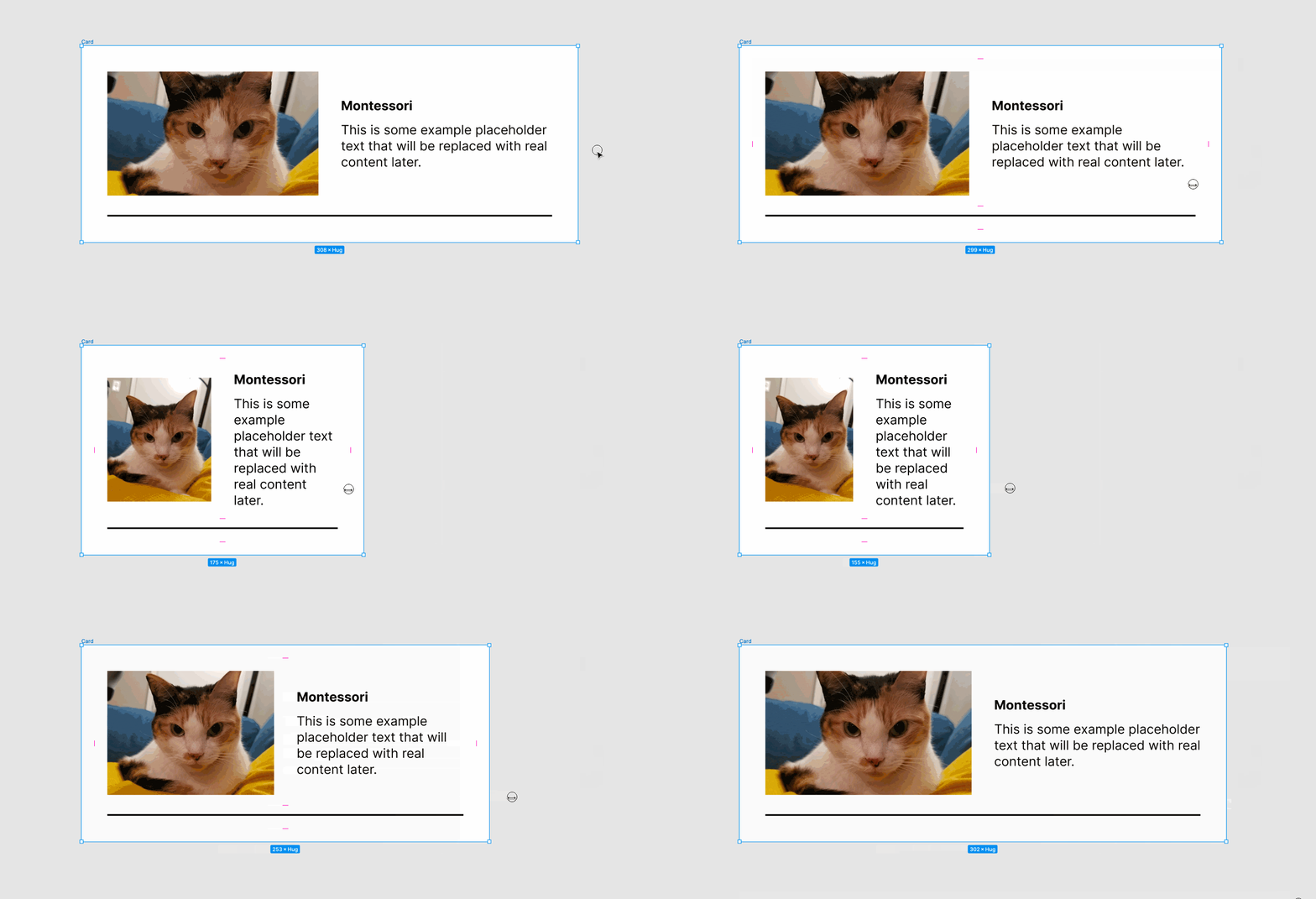
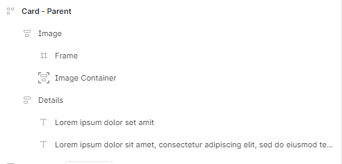
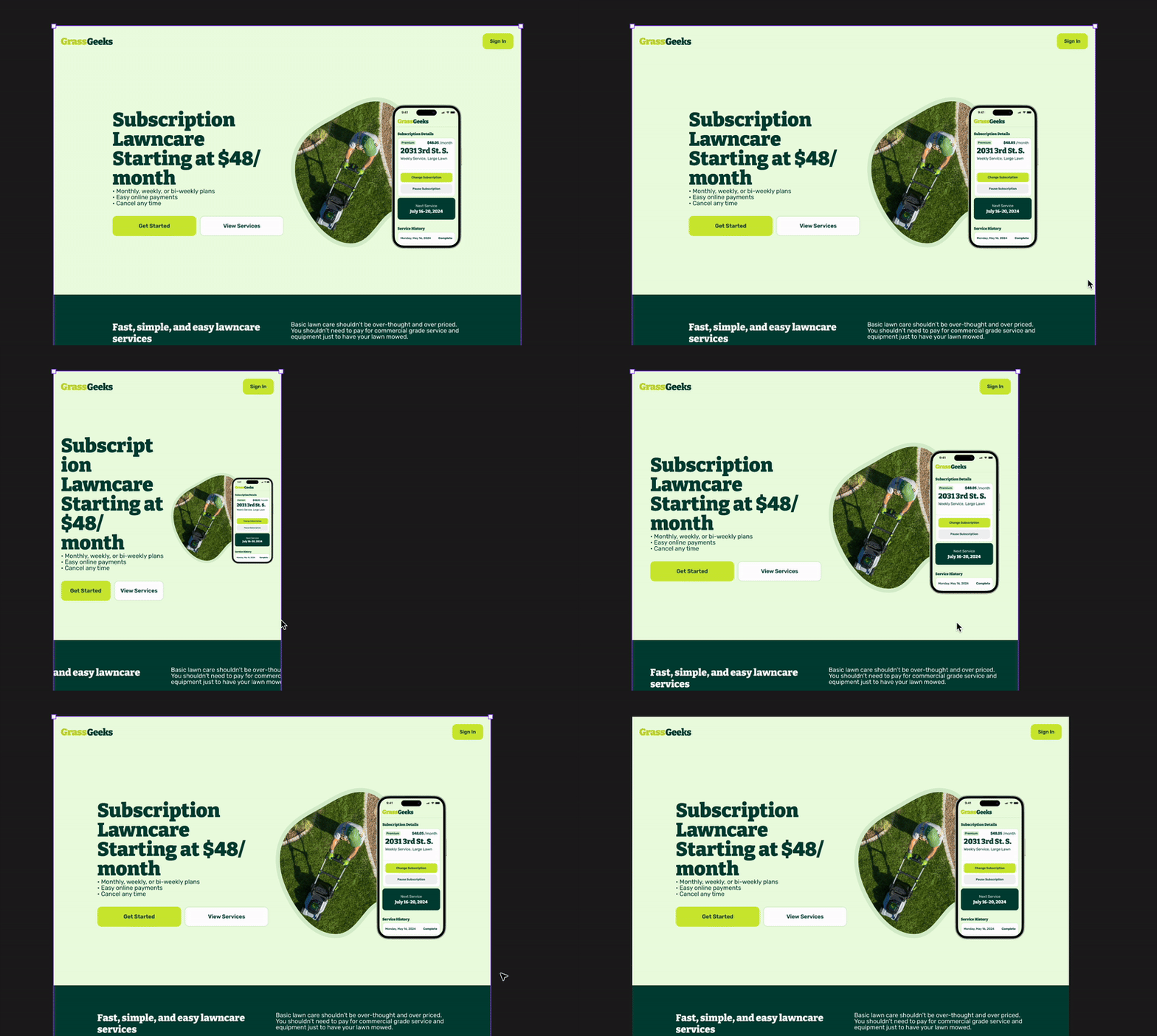
One of the last remaining pain points that I encounter in most of my projects when trying to set up components to be responsive across devices, is needing to be able to define a fixed aspect ratio for responsive images.
For example say I’m creating an instagram or youtube feed where the images/videos are 1x1 or 16x9, It would be great if we could lock the image layers aspect ratio to that. Unfortunately in the current state there is no way to have those images retain their aspect ratio’s on a responsive screen by using the fill property or left and right constraints, it would be amazing if responsive components respected a locked aspect ratio (or something similar) on shape/image layers so image/video heavy designs could be more accurately responsive.
Hi @ksn unfortunately no that thread isn’t referring to the same issue.
In the solution video [re-posted below] see how the image DOES NOT maintain it’s original aspect ratio, this is fine in a lot of cases, but what Im suggesting is that it would be really powerful to allow us to lock an image’s aspect ratio in responsive components (So in this example the image would remain what looks like 16:9 as it responds).
Hopefully that makes sense, as I think this would be a very common pain point. As right now creating responsive screens for an app like youtube or instagram with images and videos that have a fixed aspect ratio as I originally mentioned currently isn’t possible.
You didn’t understand the topic here. The request is how to make a image responsive (and now comes the most important part!) by also retaining it’s aspect ratio?
The post you referenced does not take into account the image ratio.