In the middle of the component there is an auto-layout group with an icon and a text.
The text and the label are “Hug”
Problem is when I resize the component the text don’t react to the padding since it is hug.
If I set the text as “fill”, the group will be aligned to the left of the component since the text will fill all the empty space.
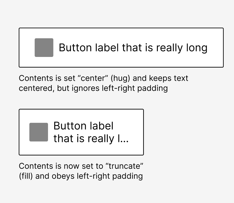
Not sure if this helps, but a way around this for me is to create a button (or element) with 2 variants “center” and “truncate”. Then I can quickly toggle the layout from an button instance as needed.
Center: Set to “hug”, which keeps them centered, but ignores left-right padding
Truncate: Set to “fill” (with truncate turned on for text) and obey left-right padding
Hello Nate, thank for your quick response !
So you confirm that theres is no solution that work for both case on ?
Indeed in that case, a truncate variant is the only solution (I wanted to avoid that because it is for a design system that won’t be used by myself)