Solved

How to build a button component with variable internal padding based on icon or not?

  • February 2, 2022
  • 3 replies
  • 3332 views

Uhl
  • New Participant
  • 16 replies

I have a button component that can be used with or without an icon. The problem is that the left padding changes based on whether the icon is shown or not. I’d like 16px left padding with icon, but 24px left padding without icon.

Button Padding No Icon

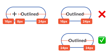
Any ideas on how to build this component so that it’ll work by just showing/hiding the icon?

My current workaround is to set the icon width to 0px, but you have to detach the instance to do this. I was wondering if there was a more elegant solution that doesn’t require detaching, preferably something not too hacky like using transparent spacers.

Best answer by Klesus

I’m assuming you’re already using autolayout, but are you not using variants?
If you get variants set up you could just make the padding 24px for the non-icon variant.

View original
This topic has been closed for comments

3 replies

Klesus
  • 237 replies
  • Answer
  • February 3, 2022

I’m assuming you’re already using autolayout, but are you not using variants?
If you get variants set up you could just make the padding 24px for the non-icon variant.


Uhl
  • Author
  • New Participant
  • 16 replies
  • February 3, 2022

Ah yes, that could work.

We’re already using variants for button states and size, so I guess we could add icon/no icon to the mix. Though it’d double the number of variants and it’s already a bit crazy. 😳

I was just hoping there was another trick, but we may have to go that route. Thanks for the idea!


  • 0 replies
  • March 5, 2022

This topic was automatically closed 30 days after the last reply. New replies are no longer allowed.


Cookie policy

We use cookies to enhance and personalize your experience. If you accept you agree to our full cookie policy. Learn more about our cookies.

 
Cookie settings