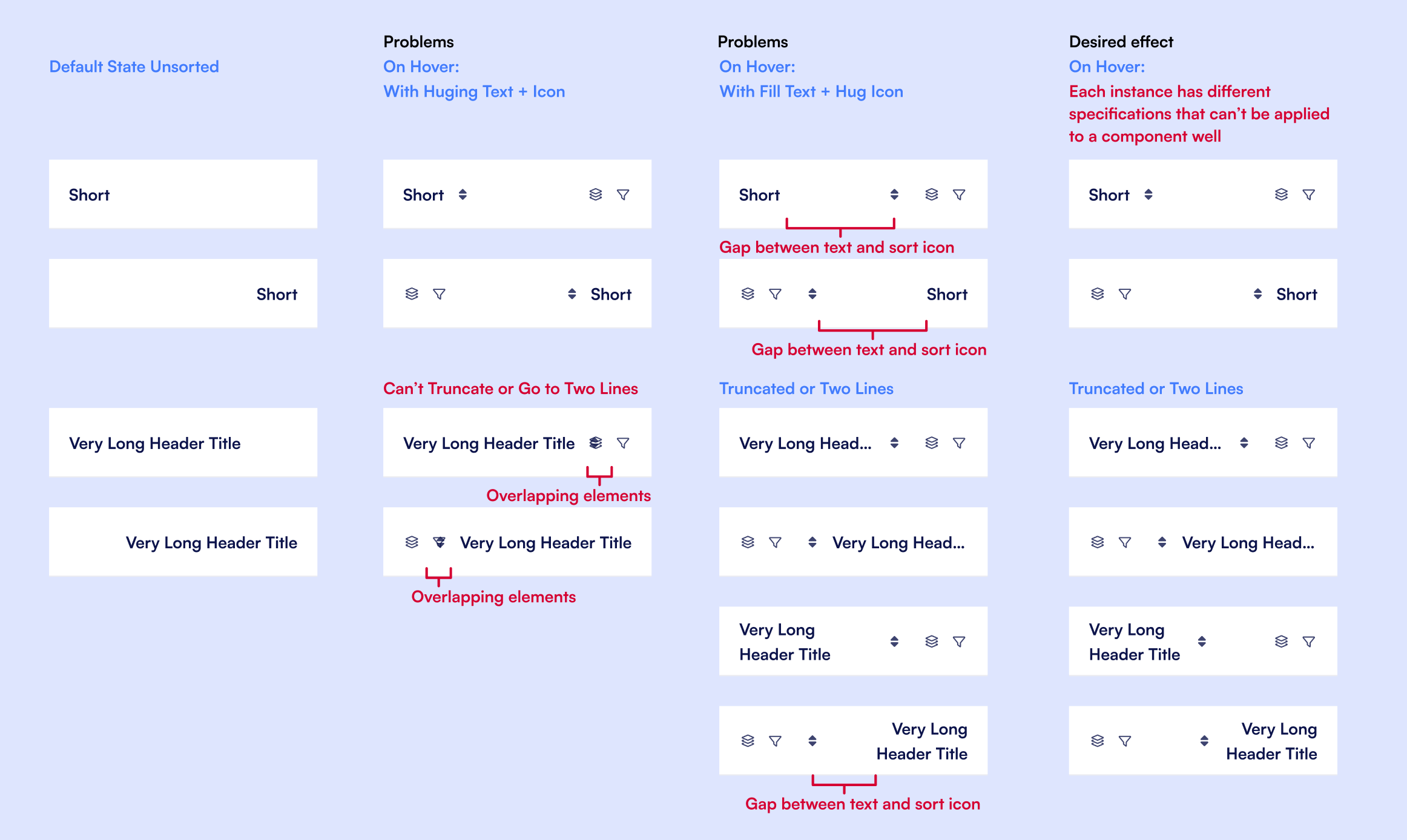
How can I center align an icon + text with "fill container"?

Hi, new Figma user here,

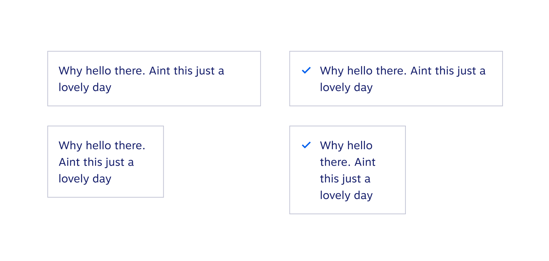
I have the challenge of creating table cells for my company’s design system. Our tables are primarily for marketing purposes and frequently make use of iconography. Components work great when left aligned.

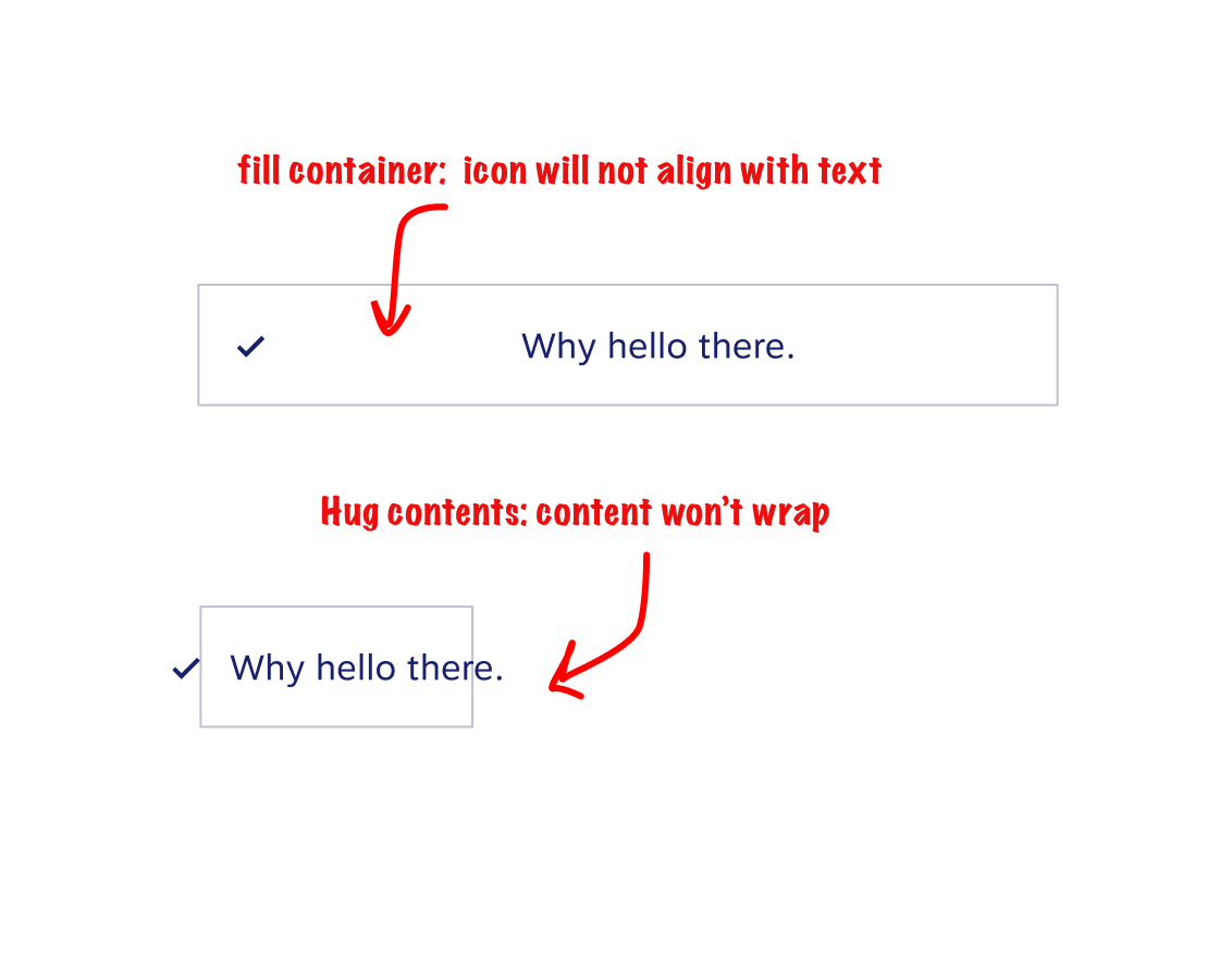
However, when centered, fill container leaves space between the icon and the text and hug contents won’t wrap:

Any tips?

Can you take a screenshot that includes the layer panel and design panel so that we can see what’s going on behind the scenes? You could also make a new file, drop the content in there, set sharing to public, and give us the link. It will be easier to deduce your problem that way.

Thanks for the tip @Wolfgang_H!

I played around with this for a bit and I think that what I want to do isn’t possible in this version of autolayout. But Figma link is here if you want to take a look:

You just need to switch the text to “fill container” instead of hug contents. :slightly_smiling_face:

Copy of file where I switched it:

Thanks for looking into it @Wolfgang_H!
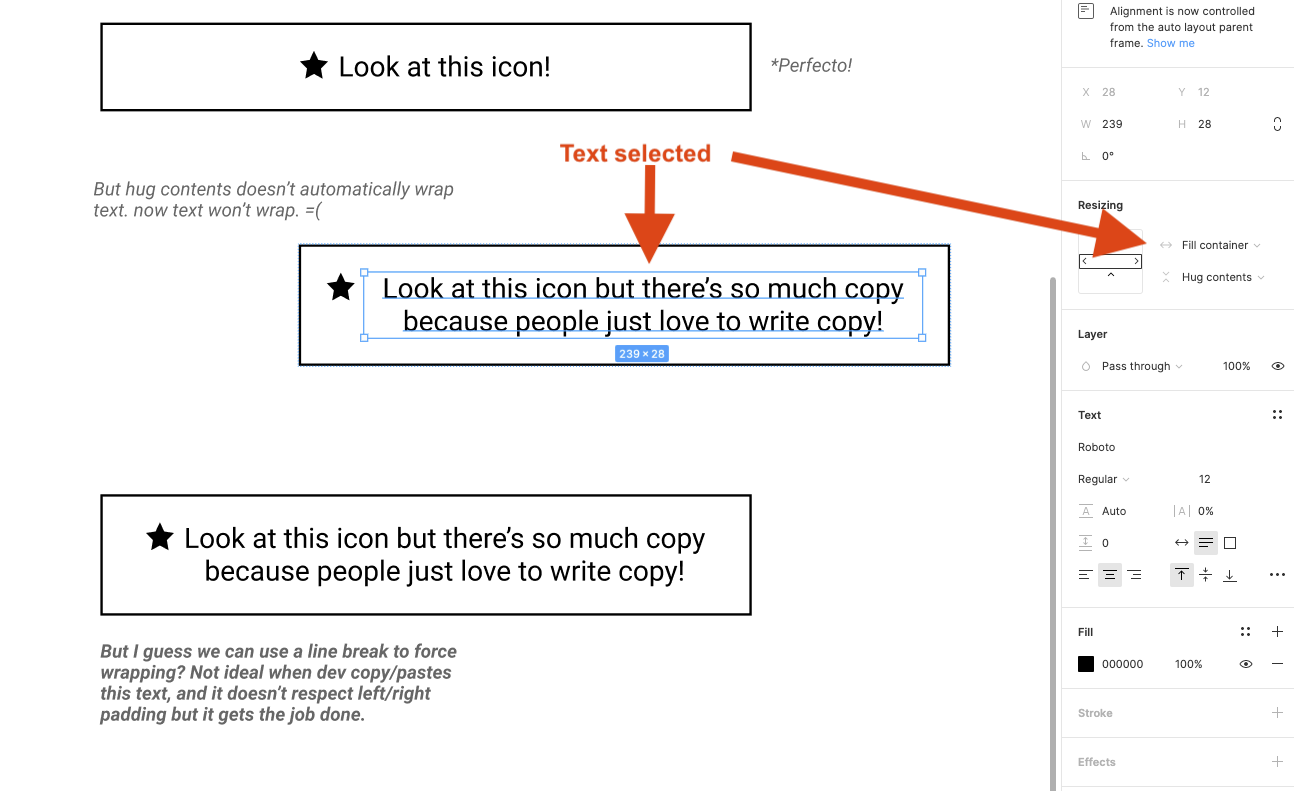
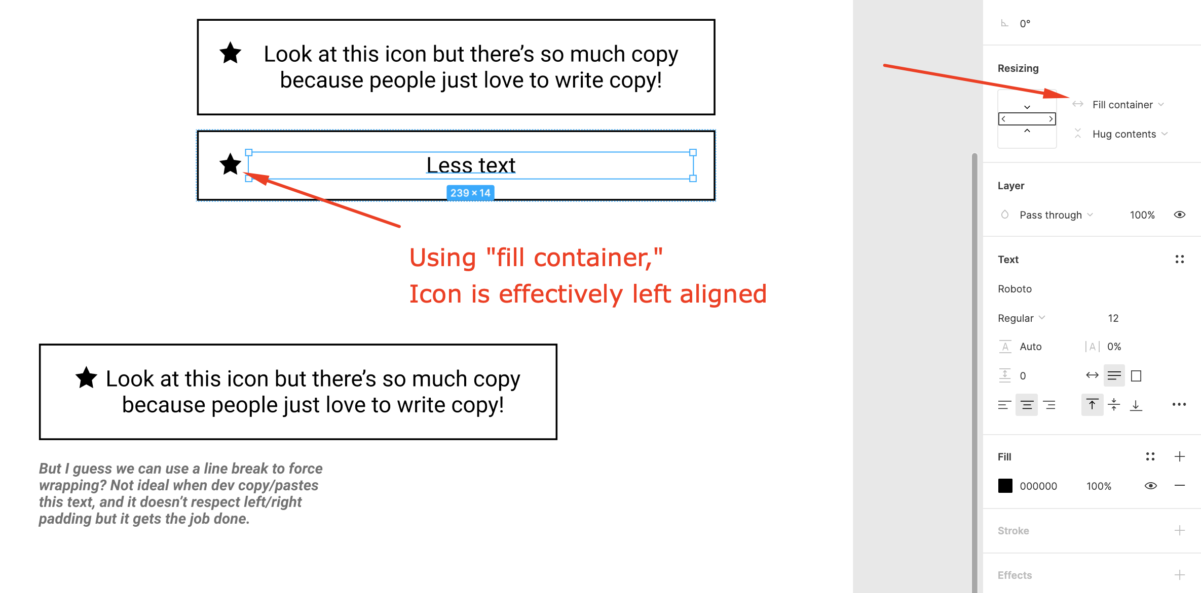
However, that doesn’t accomplish what I’m trying to do. As a component in our system, it needs to hold different amounts of text. “Hug content” keeps the icon next to the text but doesn’t allow wrapping. “Fill container” allows wrapping but left aligns the icon instead of centering it with the text.

For the design system I’m working on, the text needs to wrap AND the icon needs to be center aligned with the text.

Again, I’m doubtful a there’s a solution for this without manually updating the component per instance. It’s not make or break for our needs, just not ideal.

I know this concern is old news for the people involved but there was no conclusion left from anyone about whether or not this is possible. I’m having the same problem and have been trying to work on it and wanted to revive this thread to see if there are any new solutions!

Basically, I am similarly working on a table component for my work and in the header cells I want to have the sort icon hug the text but need the text to be able to wrap and truncate if the column is shorter with long text or additional elements take up space on hover. I’ve been trying to figure out if the new min/max feature can help but it hasn’t in this case, it also is too limiting with varying title lengths and header widths.

@Sarah_Lund1 You could add a max width to the title section and switch between different variant states: Default, Truncated, or Stacked.

Get example file

1 Like

I’ll try this out and see if it works for our situation, thank you!

1 Like

Any luck @Sarah_Lund1 ?

It works for the most part but is still tricky since the default state of the header has no icons, sort or right icon actions, while they appear on hover.

1 Like

I updated the file and added some rough hover examples, but yes it does get tricky.

Hover Examples
View Update File

I’d sugest you should design the default state of cell as if the sort icons are there always, just transparent or the same colour as BG to keep yourself from all the troubles of managing the hover states

OR you could play with modes — force all the elements in design mode to switch to hover state with string variable, then test all resizes and combinations and switch variable to default again

Thank you, so much. I was trying to find a answer on Internet for this exact problem, all i can find is telling me to do extend container with fill container when objects cannot fill in.