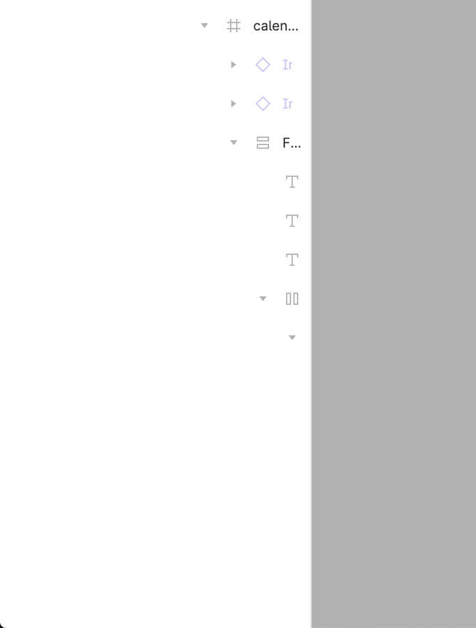
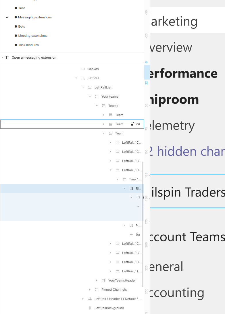
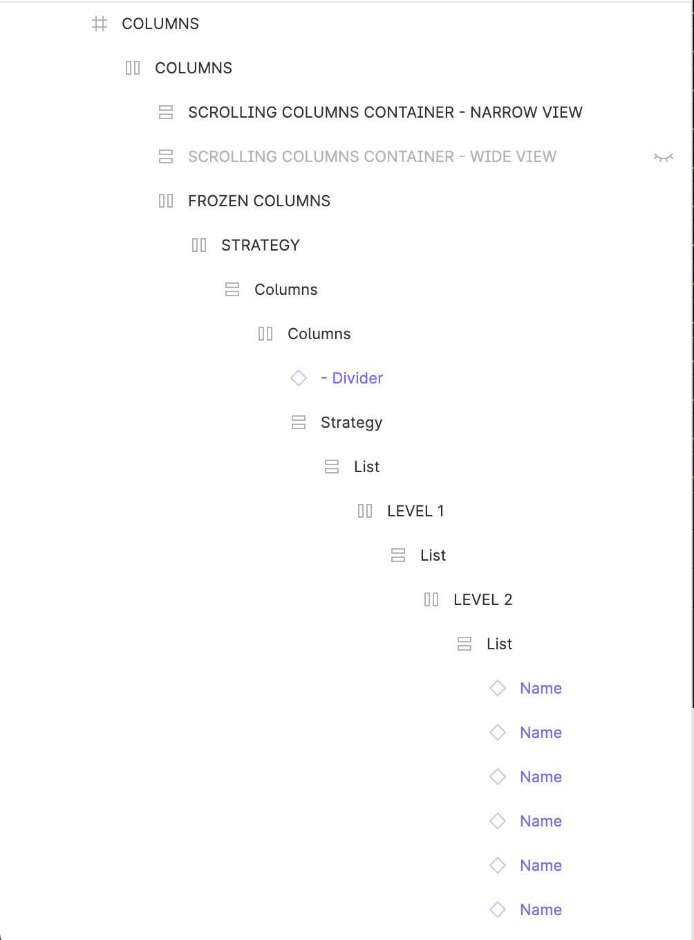
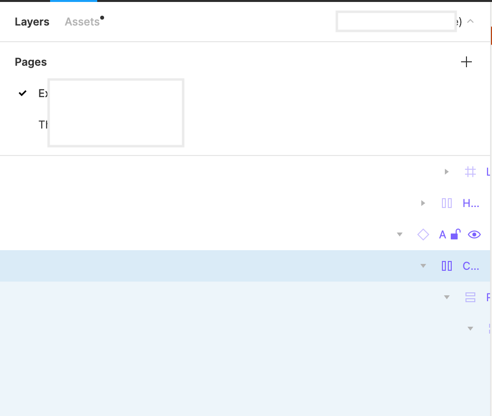
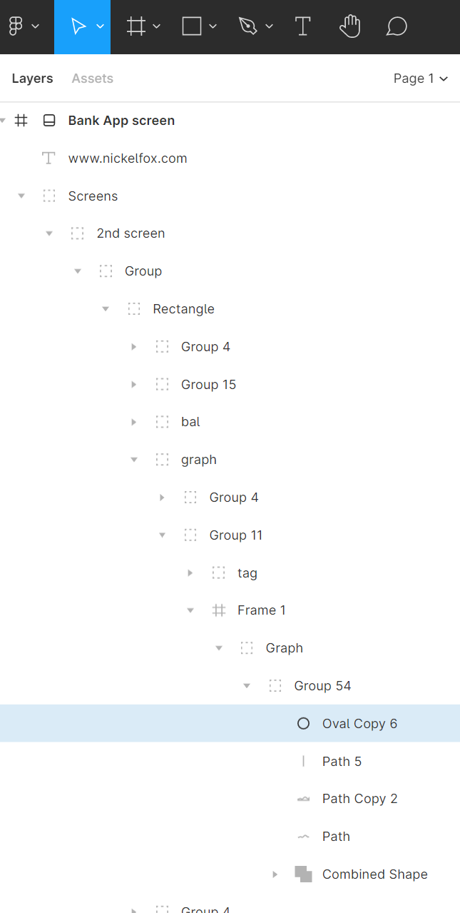
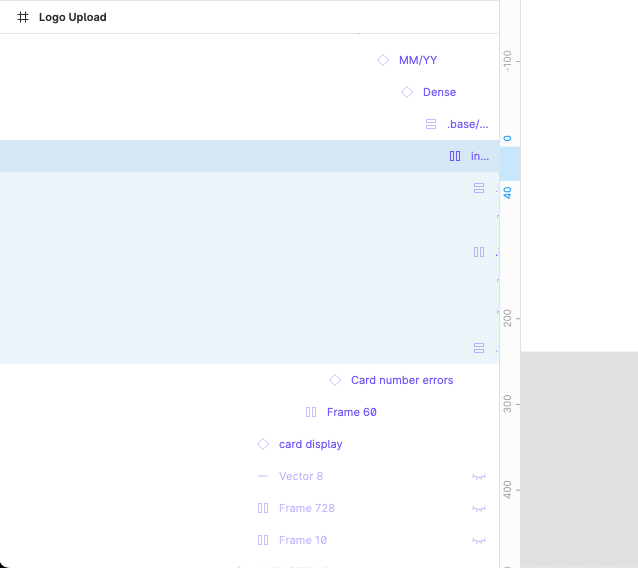
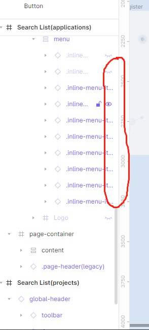
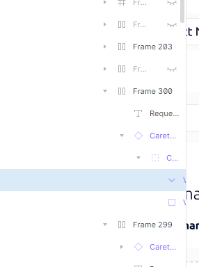
it seems to me that layers panel become even more restricting, earlier I could extend layer panel as much as I want, now it is cropped, I cannot reach some of the layers… That is terrible User Experience. With auto layout, deep nesting is a must: imagine icon inside form field, that is part of the card of the section of the page with side bar. You have the situation like bellow, where you cannot reach a layer… One scroll bar for horizontal scroll is all we need. To me personally this is something that should be top priority to be fixed
It would be great to have a horizontal scroll or a way to lock or align right the layer selected since it gets lost, on really complex screen or in nested components the group of layers could get too high, and the further layers inside get lost and doesn’t appear completely on the Layer panel, it would be great to have a way to scroll or view the layer and options ( Lock and hide ) of these layers that get outside of the panel view.
thanks!
Ditto. Up Vote.
This is incredibly important. Especially with auto layouts, you can easily reach a point where it’s virtually impossible to navigate layers. How can a simple horizontal scroll be missing from a tool like Figma? At the very minimum, decrease the indentation for nested layers so we can have a little bit more room…
Same issue here!
+1000000 on this one here.
All these new features that dropped a couple of weeks back are great. But not being able to scroll horizontally in the left panel is a real ball ache.
Some on Figma - this really cant be that hard can it?
So this is actually a bug!
There is a max size for the side layers panel as well, so in the screenshot below I CANNOT see my layers no matter what.
There’s currently no workaround for this (as far as I’m aware?). I’m also managing large design systems and need to see many nested layers deep.
Tooltips on the layers with long titles (the ones with ellipsis), would make my Figma-life som much easier. Outlook has done it in their pc application.
+1
It’s just as easy to do. Why not do it?..
This is a major BUG. Making prototype connections to a complex layout is just about impossible.
Ditto. This is literally preventing me from getting work done.
Ditto, really need a horizontal scroll bar here on overflow (or let us expand the panel wider). This is killing my productivity.
Please oh please, add a horizontal scroll bar in the layers panel
This is driving me nuts!
Thank you
As soon as your file grows and contains a lot of layers and nesting, it can become extremely cumbersome to select the right one.
Figma should offer layer search like Sketch.
The layer panel should also scroll horizontally. Right now once you reach a level of nesting layer names are cutoff the panel.
I’ve just posted the same issue (not knowing this has been highlighted since early 2021).
Come on Figma. This is a basic interaction request surely. Yeah, I get it’s not going to be something with bells and whistles on, but this should be an easy implementation and will probably improve usability no end.
Don’t take it into 2023 . Get it done in 2022 at least.
Personally, I’d like to see both a horizontal scroll bar AND tooltips when hovering over any row in the layer’s panel (whether it’s hidden or not).
With both in place it is possible to choose between scrolling sideways - which lets me see the full name of a deeply nested layer at the expense of scrolling the name of layers closer to the hierarchy root out of view on the left - OR just hovering over the row to see the full name - whether it’s a nested layer hidden to the right or an ancestor layer hidden to the left.
Agreed - I’'m totally blocked from doing my job at the moment. I’m literally switching to web app to see if I can hack indent widths with front-end css just to get unblocked…
We literally can’t see what we are doing!
Just a scrollbar or an expand interaction. That’s all we ask. It’s not much. Just the ability to scroll left and right. I mean…we just want to SEE.
New to Figma, but in the same boat regarding this issue. To build out a UI “correctly” with frames nested within frames with auto-layout, it is imperative to be able to: a) Allow us to drag the layers panel even wider than currently allowed. I have a 5k monitor and I have plenty of room to still see the canvas. b) Add a horizontal scroll. c) possibly lessen the indent of hierarchical lists (I know that one would be visually challenging). d) “other” that I have not thought of… but I (we) need something! (please)