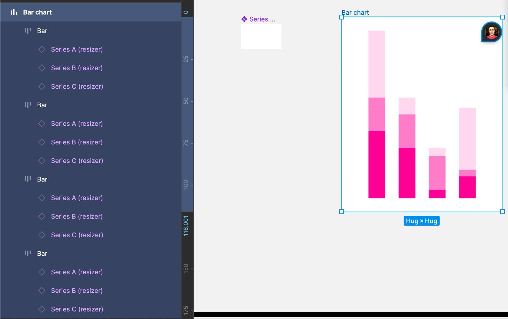
While designing a component, I would like to mark which child elements shall be editable in all instances. The same way we can apply “absolute position” attribute to a nested element, I want to apply “width and height can be changed” rule for a component’s child. Or simply have a forth option called “flexible” next to the fixed/hug/fill ones.
USE CASE:
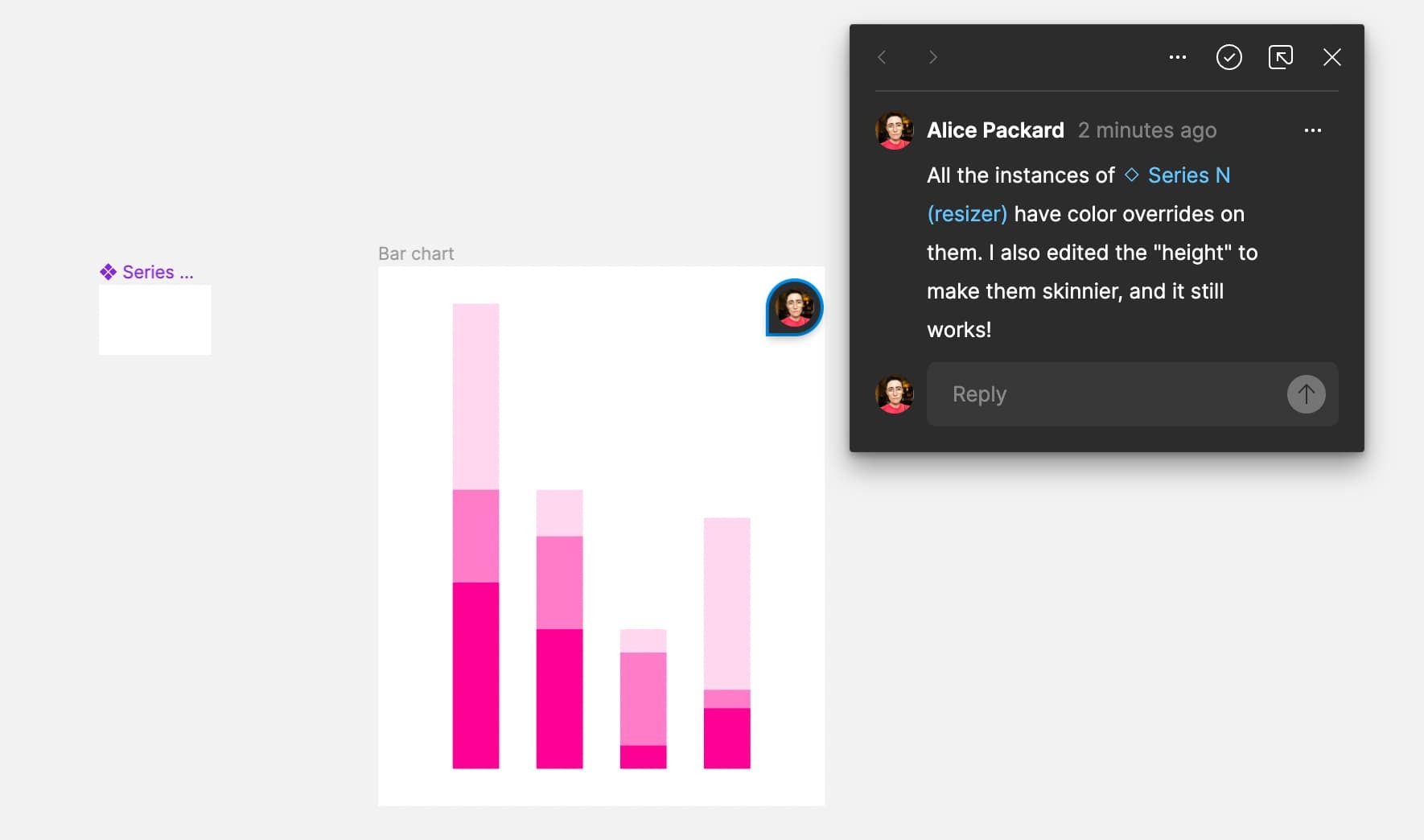
Imagine that you want to design a simple bar chart. And now imagine that you need dozens of them to show different data. And that you want apply a hover effect on every single bar. So you make a component of that bar. But PMs insist on representing real data on those charts so you need to manipulate the heights of those bars… BUT you can’t unless you detach the component… Then you end up with hundreds of detached instances and there’s a need to apply different styling to all of them. Well, good luck
I work on interfaces for data visualisation tools, so I deal with charts and graphs everyday and this drives me crazy ;/
Hey @Katarzyna_Kurnicka1, really like this idea you’ve shared. I think a lot of folks would benefit from having this kind of flexibility.
In the mean time, I wanted to share a reply I posted in a similar thread where I offer a workaround to do exactly what you’re describing! In this case it’s for a nested calendar-picker input that needs its width to be adjusted. The same method can also be used to adjust height. You can even apply multiple zero-frames to objects to “push” and “pull” on it from many directions! Here’s an example of this for a component I was making for presentation decks.
That almost worked out! Thank you for sharing. Although I realised that no matter how I arrange the layers inside the Resizer frame or how much I change the space-between parameter, the minimum height seems to be set to 44px and I can’t force it to change.
EDIT: Making the component shorter solved the issue. Wish there will be an easier way to go with such cases!
Ah, apologies, I should have mentioned this in my first reply. Seeing that you’re making bar charts, you could actually use the resizer for what you’re currently using the “bar” rectangle layer for! This might make things work more smoothly. I tried to mimic your set-up in this Figma file (feel free to download and play around with).