I’ve been tinkering with the layer panel for a while now. I have a few observations and suggestions.
Observations
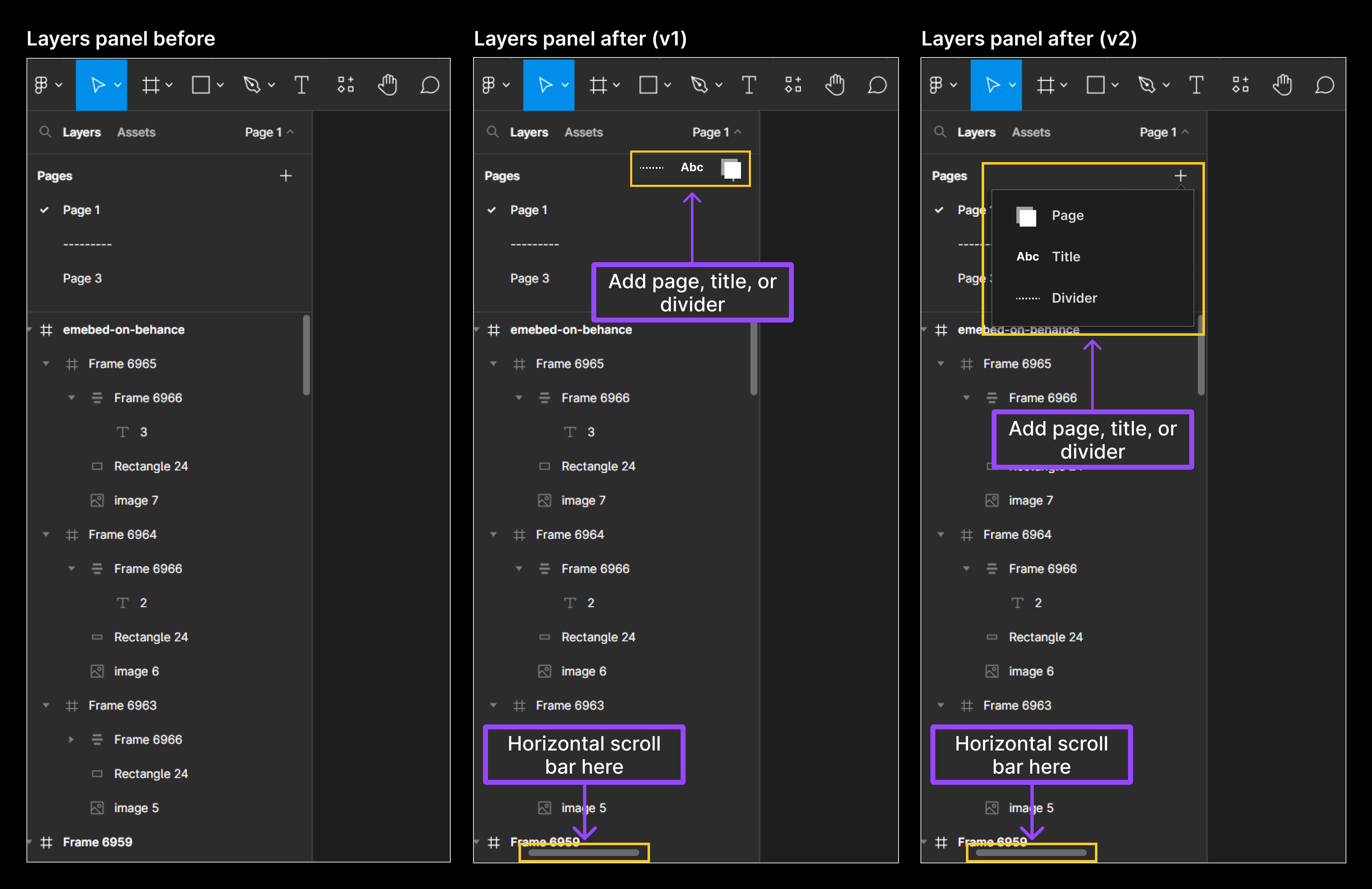
- Organizing files. Users have often used blank pages as an hack to create a structure for organizing their files in the layers panel e.g. title and dividers.
- Horizontal scroll bar. Item names sometimes expand beyond the width of the layers panel. Although, the width can be expanded but that - expanding and reducing every now and then - can be quite stressful for users with smaller screen sizes.
Suggestions
- Organizing files. Include features to add title and dividers in addition to pages.
- Horizontal scroll bar. Include an horizontal scroll at the bottom of the layers panel.
Let me know what you think in the comment section.


