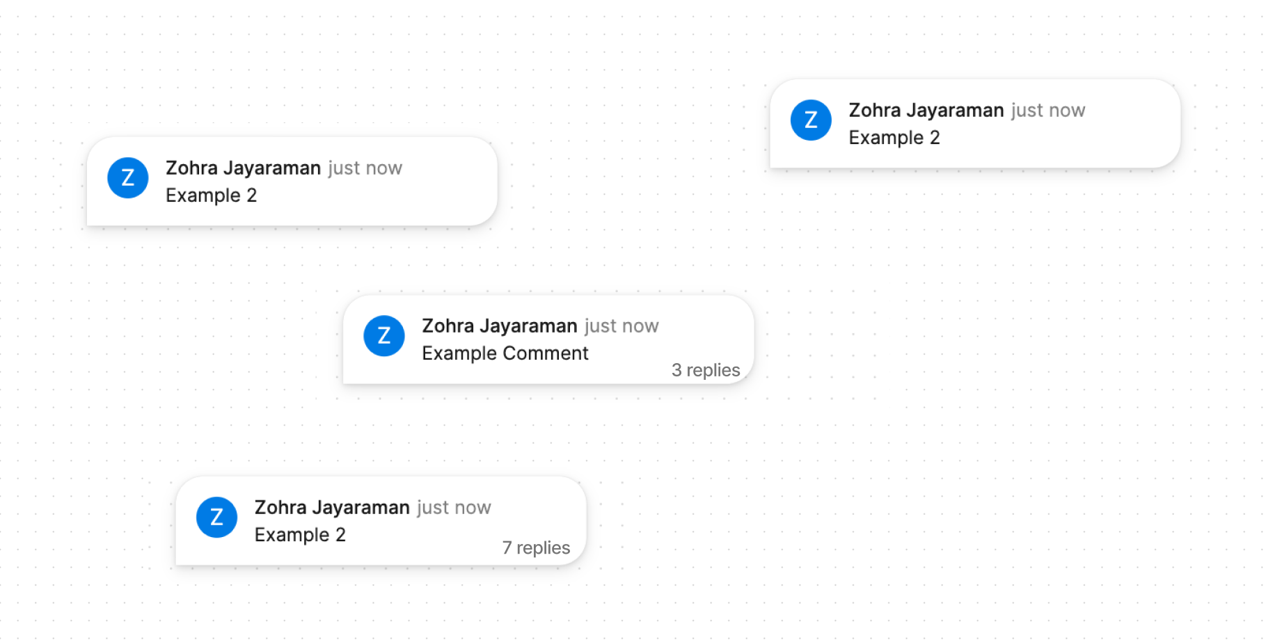
The current view of comments is hard to use because you have to hover over each one to see them in full with the context of where they are placed. I find myself repeatedly opening each one while brainstorming or viewing feedback.
My idea is that when the user hits C on their keyboard (or another shortcut), they can see a slightly expanded view which includes the first comment in a thread and the # of comments in the thread (Screenshot 2).