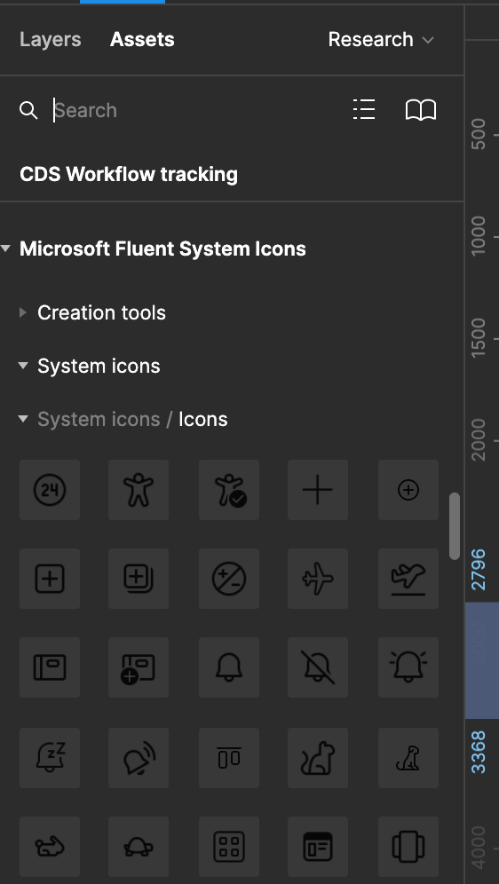
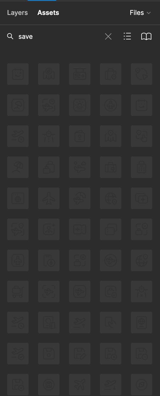
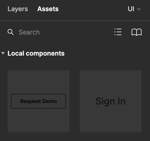
After changing the theme to dark I have issue with component preview in Assets panel. The component background turned dark and dark components are not visible. Do you have the same issue?

After changing the theme to dark I have issue with component preview in Assets panel. The component background turned dark and dark components are not visible. Do you have the same issue?
Enter your E-mail address. We'll send you an e-mail with instructions to reset your password.