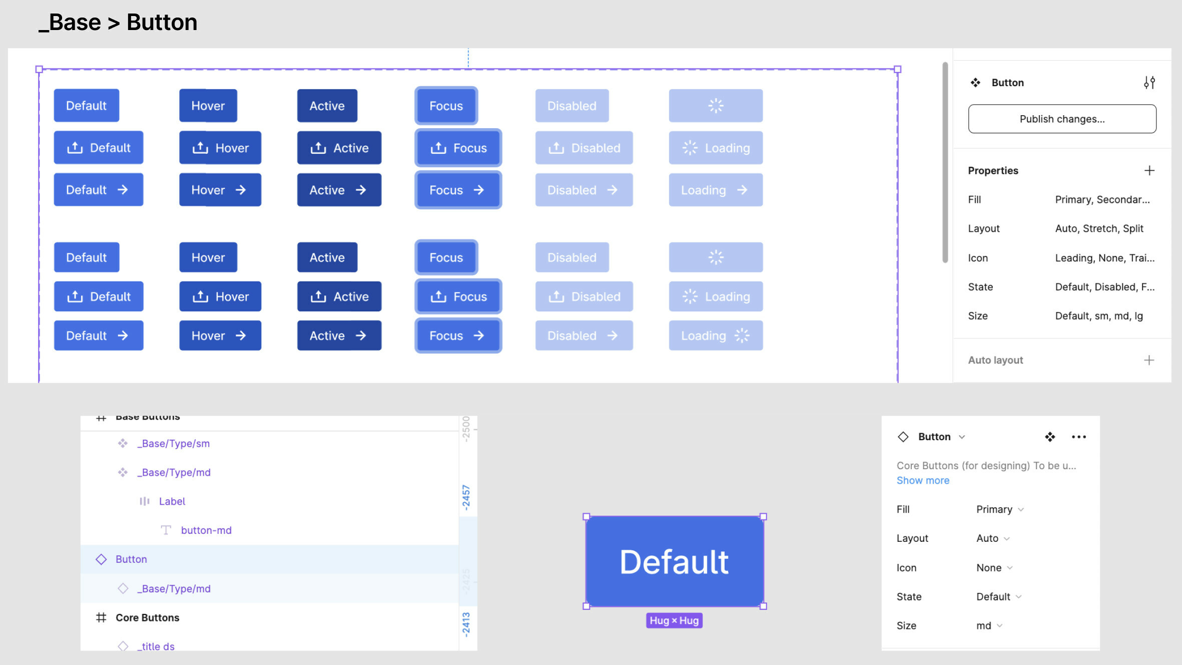
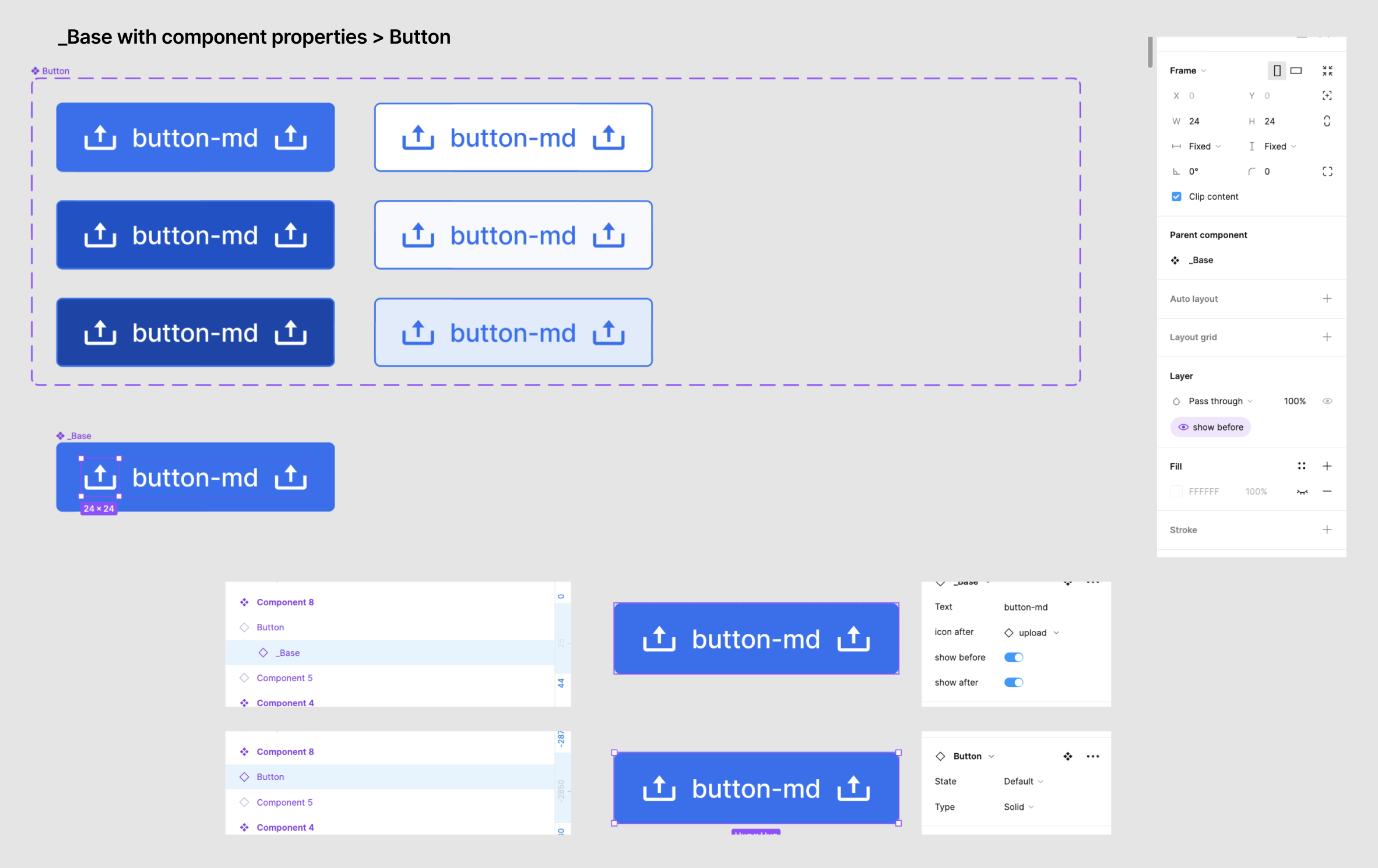
My team has been using _base components as master components to pull from and make all our button variations, so _base-buttons are nested within all core-button components.


With the new component properties feature, we added the component properties to the _base-button component. However we noticed that the properties selection changes from the variant component level, to both variant component as well as base component.


So previously, we could change states and other properties such as trailing/leading icons from the same panel. But now we can only change states from the top layer, and have to click into the layer below to change these component properties.


We’re wondering how other teams with a similar build and workflow have integrated the component properties feature into their components now. One way we considered was making component properties in all the variants, but it’s super tedious.


Would love to hear from other teams!! Hope I’m making sense haha


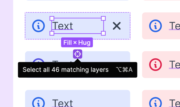
Not very tedious, requires just one more click compared to the base component:


image


@Natalie_Mae I’m a big fan of using base components, I understand your point of view perfectly.

The point is that this is a mindset shift and maybe we shouldn’t be using base components in favor of new component properties. But it is too early to tell.


Just yesterday, there was an official talk about the component properties (not yet uploaded to the channel). Regarding the base component, they suggested not to rework the old components but to try not to use the base components for the new components. They talked about a new feature that may be released in the future: bubble properties. It could be a way to collect component properties of instances to expose them to another main component.


Personally, I’d wait a bit before redoing already consolidated components.


indeed, seems wise to wait a bit to update existing working design systems as the new version is too fresh and is generating a lot of feedback, so I’m personally waiting for the next update to rework anything.


For me, a base component is now redundant, I am steering away from it completely. The number of variations to support dropped radically, bulk update in Figma is a breathe!


could you develop please @Pavel_Kiselev ? indeed it’s possible to get rid of a lot of variants with boolean, text and comp swap properties, but some of these things don’t work properly on nested components (there seems to be issues that need polishing) so ok for that, but how is bulk update a breathe ? once a component has been modified using variables etc, making it work without breaking all the places where this component is usent isnt always a breathe at all …


@Alexandre_Istrasoft Would be better to come up with an example, but it’s not a good time. Let me try to describe how I see then. I would use a simple button as an example, it should be fairly easy to expand to anything else.


So to have a proper button component you would need a simple structure, like a shape itself, optional icon and a label. Plus few visual states like rest, hover, active, focus and disabled. With a base component I would make a structure to define a shape, icon and label. Then I would use this base in my variants to toggle a label and an icon. This way I would have to make at least 15 variants for a single button style (button with a label, button with an icon and a label, button with an icon and no label times five visual states). The base would simplify maintainability of the component, things like shape and spacing could be defined once in the base and then reused across all variants.


Now when comp props comes into the play, I can reduce the number of variants to five, these would reflect five visual states, everything else is on comp props. If I would need to change something in the structure I can simply bulk update all these, to me it’s a breathe because I would select component layer, press Enter to select all the variants and now I have full control over the shape and spacing properties, no need to iterate over each of them individually


I hope it all makes sense, later on I may return with something more visual to illustrate the idea


Oh wow, nice tip mate! It makes it even easier that ever!


@Alexandre_Istrasoft this one contributes to my point too! 😉


okay I see, indeed. there is a very good explainer video from Figma that illustrates just this :


Yea, this is exactly how it supposed to be done, piece of cake 😉


Thank for sharing everyone!! Will probably wait a while more to see how the feature develops, but will take note on what’s shared so far:)


I think we’re worried we may have similar naming layers for different components within the same page, so there may be some confusion. But still sounds plausible with some extra work!


This button shouldn’t select layers within different variant sets.


Thanks for all the great information here, very valuable!

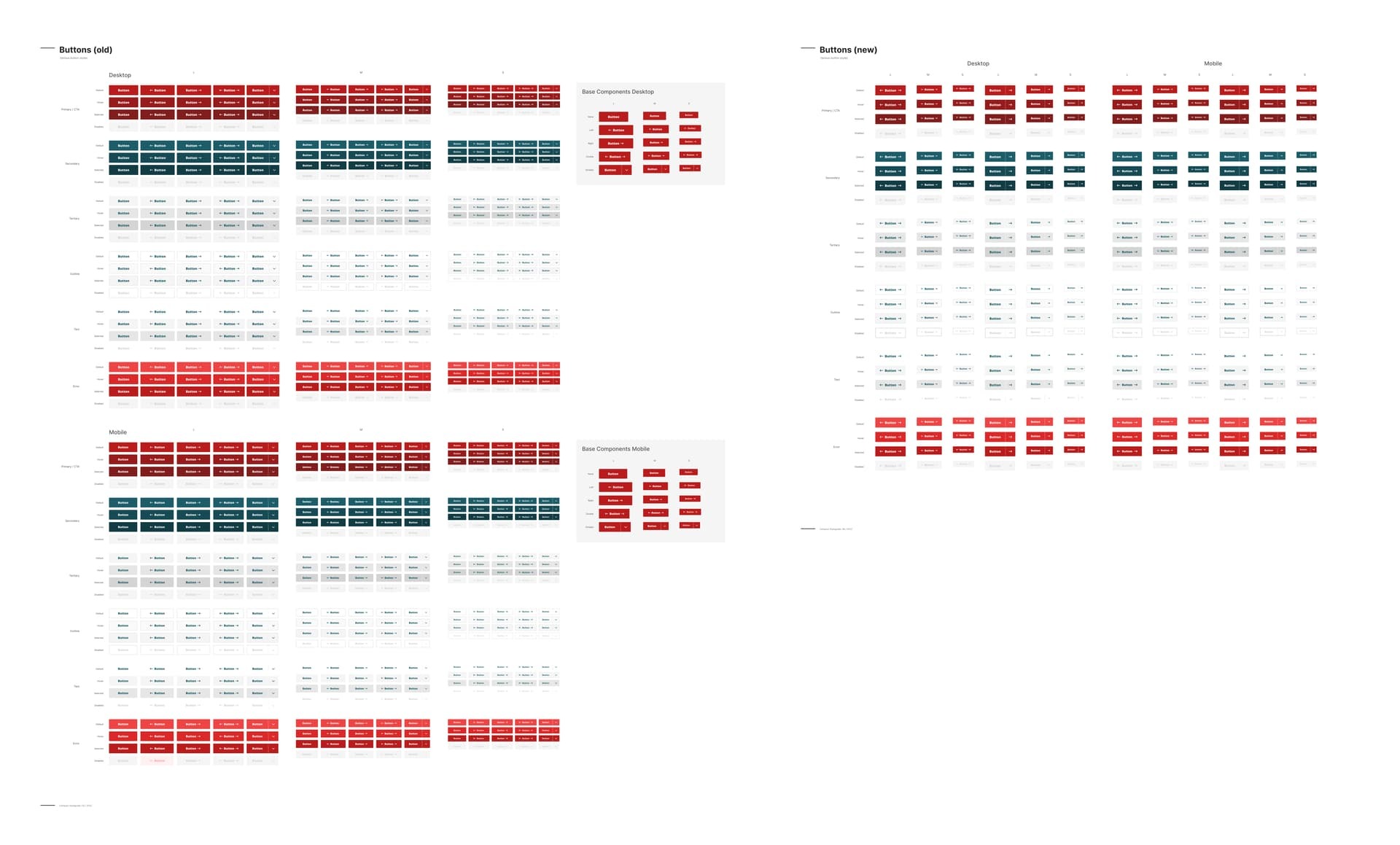
I’ve refactored our buttons with the new component properties feature to 40% from 720 (2x360) to 288 Variants and removing the base component strategy (which I honestly don’t miss anymore now that we have the select all feature)


@Gabriele_Malaspina This is probably that you were referring to: https://twitter.com/pwnies/status/1529526365187215360


Seems like there is an update coming that lets users surface props from nested components. Question is when, did they say anything when to expect it?


Regarding the base component, they suggested not to rework the old components but to try not to use the base components for the new components.


I wonder what they meant with this. With bubbling you wouldn’t need to get rid of base components to get the benefits of props.


For example I was considering reworking an input component lately. There are three components - input, dropdown and textarea - that use the same form field base component.


Keeping a base component seems more valuable here for now since otherwise I’d have to maintain input + dropdown + texarea comps separately. With bubbling props I could manage all of those three and get rid of a lot of the variants at the same time. So it seems waiting and then reorganizing components with base components + bubbling would theoretically improve efficiency even more that what’s possible now. But getting rid of base components now would break my components on future updates instead.


As it stands props are great and improve efficiency a lot but I’d also consider the feature incomplete since it throws overrides and inheritance out of the window. Really wonder when the update is coming, my fingers are itchy.


twitter.com

That said: It would be possible to introduce props in the components where necessary already and then create variants up in the hierarchy (or continue using your existing variants) to surface the props manually. Thats way you can enable the bubbling and delete your variants later (I hope Figma will match variant names with property names during a future library update as to not break everything)


But now I’m getting into heavy speculation territory about the behavior of this future update.


I reworked our button component to eliminate the base component and use component properties. It’s dramatically reduced the amount of variants our system required and I’m generally happy with it save for one issue: there’s no way to tweak spacing or padding based on which property is turned on.


Ex: I like to shrink the padding a little bit based on whether or not an icon is present. With the old button I was able to handle that because each button-with-icon was its own variant. Using properties, I’m unfortunately tied to whatever the padding is for the button overall.


@KaiMagnus Yes, it was that. Personally now I will not do any big rework on what is already consolidated and working, maybe just on some simple components such as buttons.


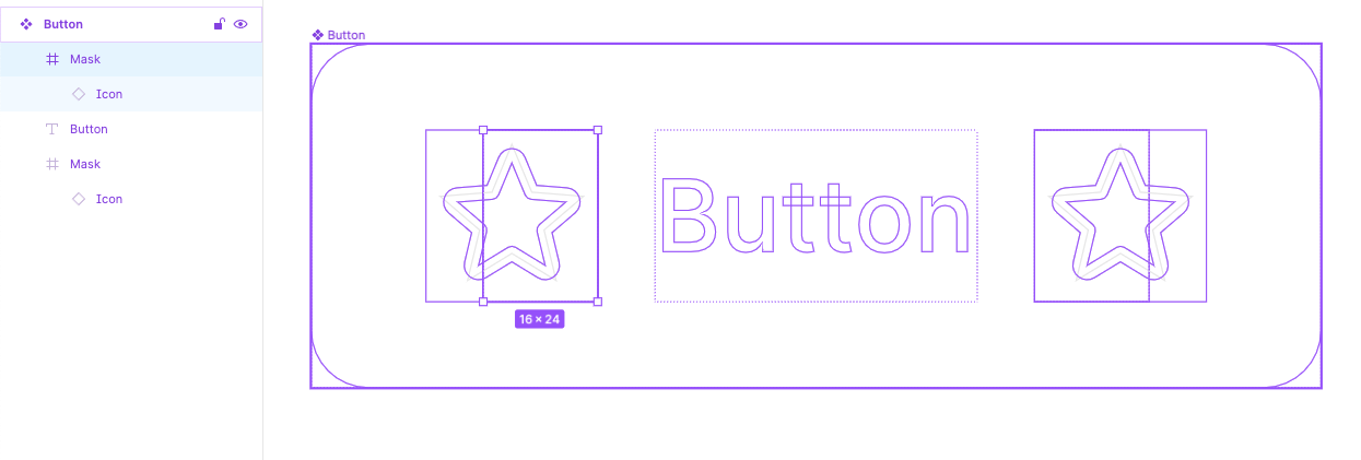
@RizePoint_Product I totally understand, it’s a common issue. Maybe this solution can be helpful: you can put your icon in a smaller frame, so for instance if your icon is 24x24px you can create a frame 16x24px around it.


This way it will take up less space than its actual width and it doesn’t need to change the auto layout padding. Take a look at this: https://www.figma.com/file/N26h4clXI7tO3oN5uO4V4e/


I never thought of that, but it works perfectly. Thank you!


When I convert a button from a base model to component properties (removing the base layer), and publish the library, it resets all of the buttons in the consuming file that accepts the update. Is anyone else having the problem? Or know how to avoid it?


Figma said to make small updates. I tried that, but as soon as I remove the base frame (to reduce how many nested frames there are), it resets all the buttons.


Breaking down nested component isn’t a small change, this is rather structural one. In my team I would publish new version instead and mark an old one with hdeprecated] label so people would know to upgrade manually. Usually when you swap instance manually it works just fine


This topic was automatically closed after 30 days. New replies are no longer allowed.