Hi all,
I’m 2 weeks in learning Figma so bear with me,
I just finished designing a home page with prototypes and all. It was approved and I got the go to make the thing responsive for tablet and mobile.
I tried to educate myself as much as I could on auto layout, constraints and all, but it seems like when I create a component that has instances and I put them into a auto layout, it doesn’t work as it should.
It seems like if I want to use the same prototyped animation for desktop, tablet and mobile I need to recreate that prototype for each version? It seems like too much work.
My example is:
I Created a slideshow for the showcase section of the website.
My slideshow is made of 5 images inside a auto layout, inside a frame that are turned into a component.
The frame acts as a clipping mask to show only one picture at a time.
I then created variants of this component showing different pictures each time. The prototype is set on a delay, and auto animates to switch picture automatically.
This works like a charm so far, but when I try to change the constrain of the child to scale, the parent height switches to fixed and I can’t resize properly.
I hope this makes sense to someone, if someone needs pictures of the stuff let me know and I will provide.
Thank you,
You may grab this as an example. Try different frames and see how they resize.
Hi @Pavel_Kiselev ,
Thank you but this is not what I’m talking about. Nothing in the file you sent is prototyped.
I’m looking for prototyped components that are responsive, the example you sent me are responsive components with breakpoints.
Unfortunately this is not possible in Figma.
Figma does not use real responsive design the way the web does. At most Figma can set min/max widths for specific elements or components, but there are no media-queries, breakpoints, percentage based widths, conditional visibility, or anything like that which you would need to design proper responsive layouts. Additionally prototypes are not resizable outside of resizing the entire window (the prototype scales with it) and thus are not capable of responsive design either.
Basically for responsive design you have to design entirely separate frames at different screen sizes and each one needs its own prototype setup.
One more reason I am beginning to design more and more in Framer or straight in HTML/CSS instead of Figma.
2 Likes
Thank you very much @mattaningram this awnsers my question
1 Like
Not sure if I catch that. In my example you can resize design however you like and run in prototype mode. What’s prototyped components? Is it a new invention?
@Pavel_Kiselev my question has been answered above, no bother.
Look at this to understand what I mean https://www.youtube.com/watch?v=aGvWDDPsjUM
In sum I wanted to know if a component that is prototyped can be responsive, and the answser is no.
Not sure what you are referencing, but true responsive design is still not possible in Figma.
You can fake mockups for different screen sizes and you can make variable groups named after screen sizes, but none of it is actually RESPONSIVE to the screen size. It is entirely manual and will require explaining to devs and will work differently than how it will in code.
but none of it is actually RESPONSIVE to the screen size
Please try:
I will agree that layout logic is different from css, and that things like breakpoints won’t work.
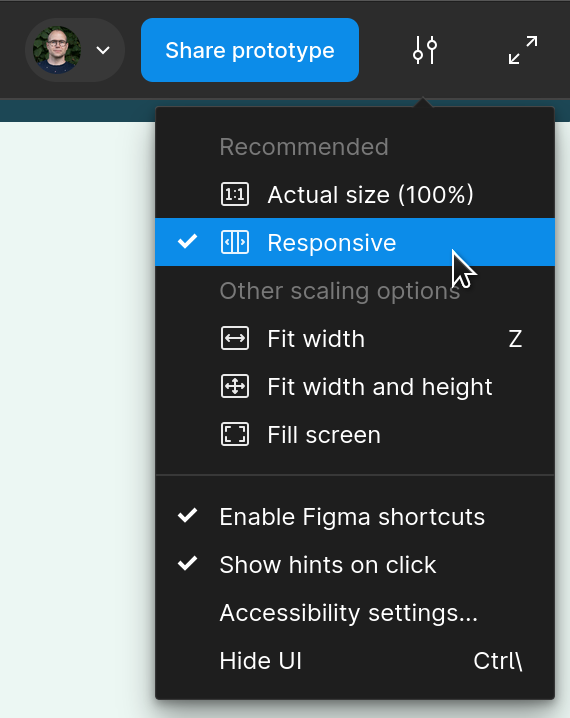
Since responsive prototypes are a thing now, has anyone had any luck with them? They seem so resize horizontally just fine but there’s still extra width to be scrolled to the right. Seems like it’s fixable but I haven’t tried it yet.
1 Like