
My biggest enemy with figma for web design has always been translating a finite number of screen mockups to a real page that can get infinitely big and small.
To ensure the same content looks just as great in a 4K ultrawide monitor as it does on an iPhone SE from 6 years ago, I try to cover my bases by designing the same screen like 12 different times. 3 screen sizes for 4 breakpoints: desktop, tablet, mobile landscape, mobile portrait.
But this is so tedious. I was hoping the new variables feature would ease my pain but it doesn’t support typography, and I can only have 4 modes, so I can’t even use it to set variables based on screen size.
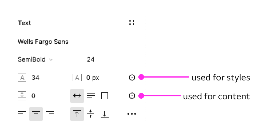
One of the main reasons responsive design in figma is such a headache is because I personally make heavy use of REM/EM for fonts, and VW/VH/% for basically everything else. Things rarely have a defined pixel size.
Are there any plans to support these in the future?