
Auto Layout: Percentage or column widths for better responsive design

  • August 27, 2021
  • 2 replies
  • 3997 views

Lisa_Weishaupl

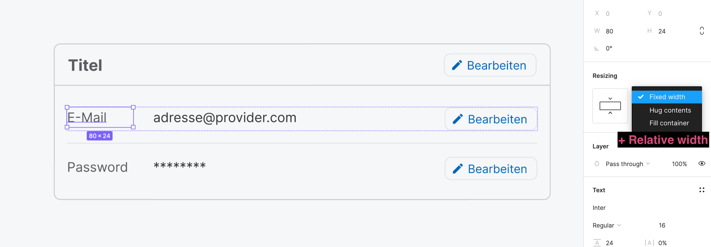
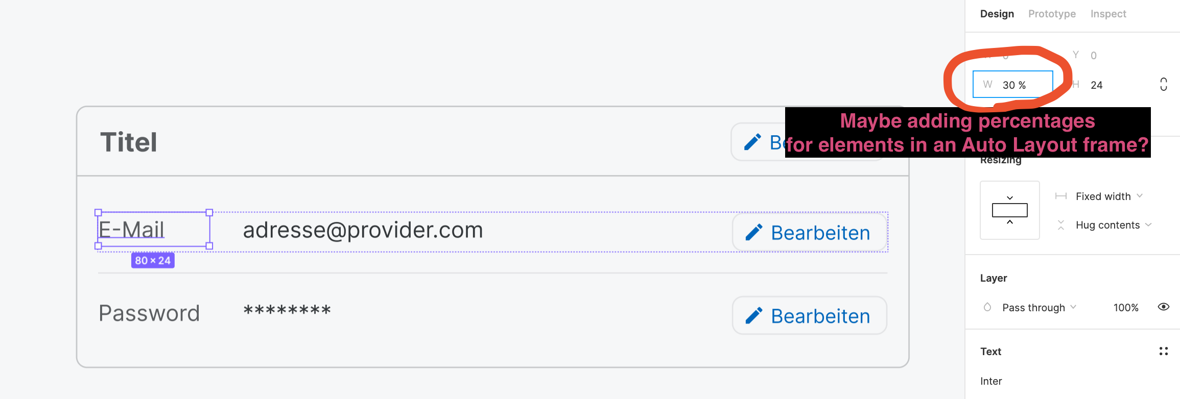
When using auto layout, I can chose different ways to define the width/height of the elements: “fixed”, “hug” content and “fill container”. In many cases none of these matches how the design should be implemented. I want elements to have a relative width of e.g. 2 of 12 columns or 30 %. By offering to add a relative value or working with columns I could move one step closer to the actual implemented result of a responsive design

Is anyone else in need for this? Are there workarounds for the problem I didn’t think of yet?

This topic has been closed for comments

  • September 26, 2021

This topic was automatically closed 30 days after the last reply. New replies are no longer allowed.


dvaliao
Figmate
  • Community Support
  • March 19, 2024

14 posts were merged into an existing topic: Fr/Percent units for more control over auto layout content

51 votes have been moved. 21 votes could not be moved because their users already voted in the other topic.


Cookie policy

We use cookies to enhance and personalize your experience. If you accept you agree to our full cookie policy. Learn more about our cookies.

 
Cookie settings