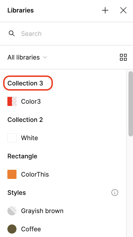
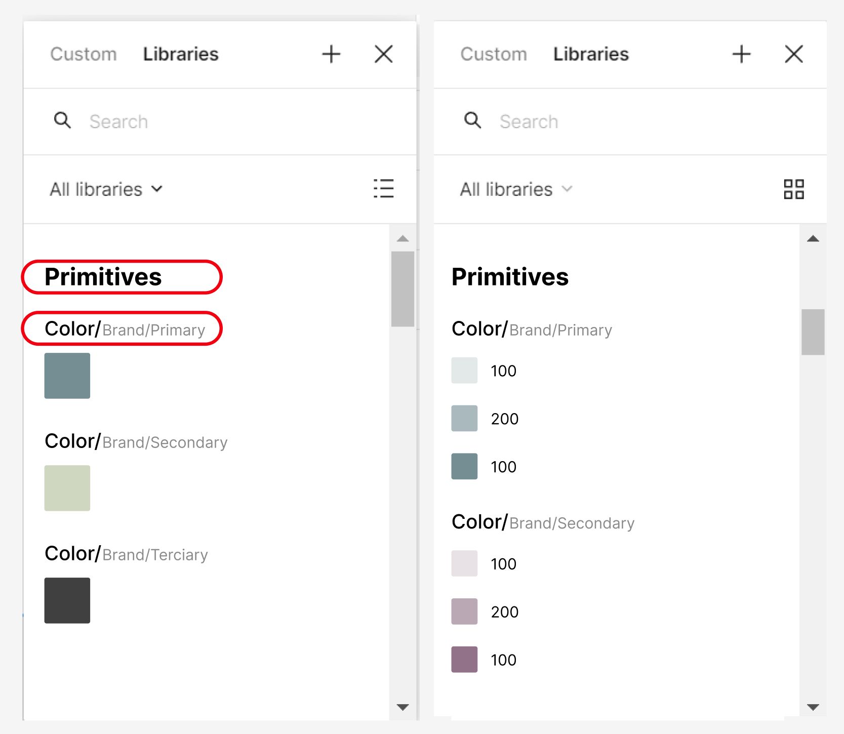
When we enter the variable library to select a color and we have it in list mode, it is very difficult to differentiate the folders from the tokens (even though the latter have their color chip). Therefore, I propose that you give these lines of text extra weight or a little more size. Or both.


Small adjustments that make our work easier. ☺️

Hi @Javier_Jimenez, Thanks for sharing your idea! We greatly value your feedback.


Just to clarify, is this proposal regarding the visibility of the section outlined in red in the image below? If I have misunderstood, please feel free to correct me.


I believe that your ideas will be helpful to other community members, so we’d love to see the responses of other community members!

Also, please don’t forget to vote your idea.


Thanks,


Hello Junko 3.

Rather, I mean this, a larger size and weight of typography to emphasize the collections, and a slightly larger size for the first containing folder.


The first containing folder is a consideration made based on how I have seen other colleagues and myself organize these folders.


Thank you very much for assisting me.

Greetings and thank you.


Hey. @Javier_Jimenez, Thank you for explaining everything in detail! Now, I understood it perfectly.

We are so excited to see how the community reacts to this. I’m sure other community members will support your idea!


Reply