
Support for responsive frame widths

  • July 25, 2024
  • 2 replies
  • 60 views

nickgould

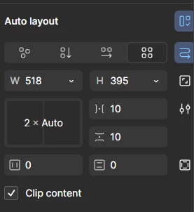
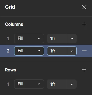
To design for responsive web, we need the ability to use layout grids and percentages for widths of frames.

For example: width=50%, or width=6 columns of the defined layout

2 replies

Celine_
Figmate
  • Community Support
  • August 8, 2024

Hi there! Thanks for your feedback, this is in our radar. We will pass it along to our team for consideration!

Tips: please also upvote your idea! ⬆️


Armin_Rouhanian

@nickgould Isn’t this feature already implemented?


Grid in auto layout (4th option)
​​Customizing the percentage of each column or row in a grid​​​
A showcase of how to edit grids in auto layout

This one should help you managing your items, If I’ve understood correctly. Also adding min-max width can also help you making a mostly (if not fully) responsive layout.

I know you’ve opened this thread a year ago. But the thread was still open; So…, I thought it might be good to have a closure ;D.

Sincerely, Armin.​​ 
​​