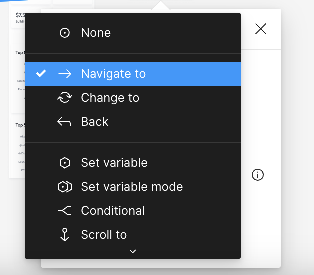
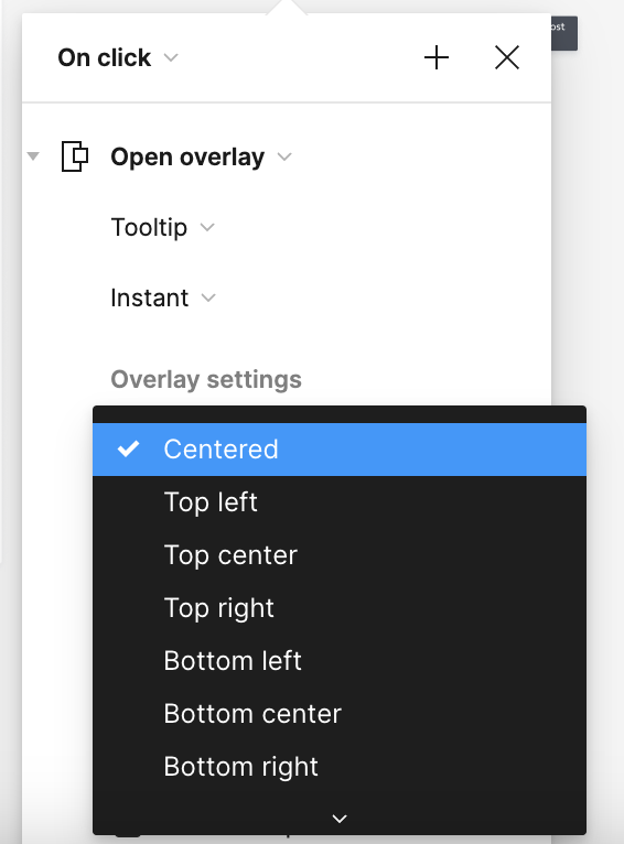
Recently the Prototype dialog was altered so that the select menus show a truncated list with a down arrow (when the dialog is positioned near the bottom of the screen). When you hover over the down arrow, more options appear.


On the surface, this seems intuitive enough, but the problem is that when I do this, my eye scans for the option I’m looking for, and when I don’t see it, I start to doubt if I opened the right select menu, then I have to consider it again and finally remember to hover over the down arrow.


Even though I use these menus a gazillion times a day, I am always having to go through this multi-step cognitive process when I don’t see the menu item I am expecting to see.


Would prefer how it was before when the entire select menu was visible right from the get-go!


In the screenshot example above, I’m looking for the menu item for “Open Overlay”, but I don’t see it off the bat. It takes half a second for me to think to hover over the down arrow.


Same thing applies to this menu–I want “Manual”, but I don’t see it off the bat. For a new user, they may not even know it’s there…


Hi @Kaori_Emery1, Thank you for contacting me and for sharing those screenshots. I truly appreciate it and completely understand where you’re coming from.


​​I feel this concept will also bring advantages to other members of the community and we are eager to witness see the community’s reaction to this.


In addition, please don’t forget to vote for your idea.

Moreover, if there are other members of our community who share an interest in this feature, we urge you to also cast your vote.


Your feedback is crucial in shaping our decisions, thanks for your contribution!


Reply