Hi, new to Figma, but not new to UX design. I’m very competent with Sketch, JustinMind, Illustrator/Photoshop, and Axure and now my company is trying out Figma.


The question I have is about Presentation Mode.


I see all these great tutorials and functionality around responsiveness when INSIDE the Figma editor. Constrain the button to the parent frame for a variety of responsive behaviors… that’s cool.


But when I launch Presentation Mode I’m only given choices like “Shrink to fit frame” and “Fill to fit” etc.


I need to be able to make some UI that responds like HTML/CSS in Preview Mode.


Like, a responsive data grid where some cells shrink as the window gets less wide and some do not and eventually resulting in a horizontal scrollbar when the grid can get no smaller.


You know, web page style.


I guess I’m confused about why the “drag and watch the objects respond” behavior seems to be limited to only the editor view.


Am I missing something??? I can’t find any info about this. All the search results are about responsiveness in the Editor and none are about the Presentation Mode, at least none that I have found so far.

Unfortunately, in Presentation Mode you cannot change breakpoints to look at the responsiveness of the design.


More info/detail


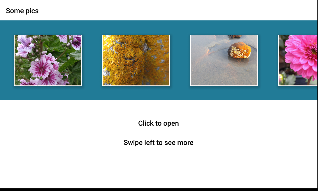
I made a quick demo of a scrolling thumbnail viewer. It was easy to make and it looks great and works as intended. EXCEPT for one thing…


I can swipe left and see more images and I can tap to open an overlay. But… in an actual webpage there would be a horizontal scrollbar, either on the whole page or on the blue div/container… to indicate that there is content off-screen to the right.


And if I resized the browser widow to be horizontally smaller, the viewport would, or could if I set the sizing and responsive behavior correctly, respond by getting smaller up to a point where it would stop… again, potentially triggering a horizontal scrollbar.


I’m not seeing anyway to make anything like that happen in Presentation Mode?


In Presentation Mode you can see how your design looks on a certain device (static width), interact with design elements for which you have configured any actions on the “Prototype” tab (click, hover, horizontal and/or vertical scrolling, etc.) and test animations. Changing the size of the Presentation Mode window will not do anything, because the width of your design will be static, and in this mode there are no tools that could allow you to switch between breakpoints in your design, like in Chrome DevTools.


When you have horizontal and/or vertical scrolling in your design, Figma doesn’t display scrollbars in Presentation Mode, but you can still interact.


You can read the article from the help center: https://help.figma.com/hc/en-us/articles/360040318013-Preview-designs-and-prototypes-in-Presentation-View


Thanks for responding 😃


This would be such a useful feature for Developers (Viewer Role). It would be easy for them to figure our which parts of the design is responsive and which aren’t.


All of the responsive behaviors we build into our prototypes should absolutely be available in Presentation Mode.


What’s the point of building in all sorts of complex and subtle responsive behaviors if I can’t even show them to Stakeholders & Developers in Presentation View?


Actual Size and Fit-to-Frame are basically the only options?


It’s kind of hard to understand this one… both views are in a browser after all. So why can’t we see our flexing layouts in Presentation? At least let us toggle them on or off?


Please vote this up if you agree.


This topic was automatically closed 90 days after the last reply. New replies are no longer allowed.


Hey there, I’ve just changed the category from “Ask the community” to “Share an Idea” so others in the community can vote and share their feedback. Feel free to upvote this feature request.


I strongly agree with @Darth_UX. It seems odd that the functionality is already there, it just needs to be moved into the presentation mode (where it really matters to us). We are an agency and it would be fantastic if we could share 1 link so that the client could experience the responsive design that is built in Figma.


Additionally, this unlocks a whole new feature where you can use Figma to create quick landing pages or website comps.


As a developer, I can’t tell what my visual design team wants, because I can’t see what’s happening at different screen sizes. If this was for print it wouldn’t be an issue, but how is this supposed to be viable for web?


Wow. I’m new to Figma from other tools and was excited to dig into Figma’s Auto Layout because of how it allows for responsive behavior in layouts. Finding out that this dynamic behavior only exists within the editor and can only be used to produce static previews/presentations is extremely disappointing.


Reply