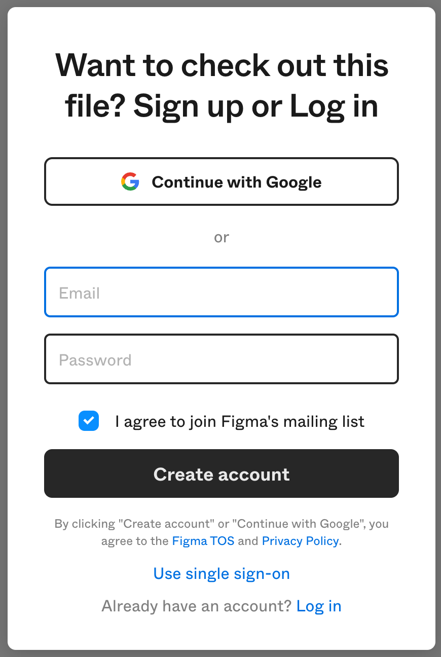
This sort of thing really does zero good to the company brand.
Dark Patterns like this, to get people on the mailing list, is not genuine and could be much better.
Keep sign-in/sign-up flow clean, because right now it’s muddled. My initial feeling after clicking “Continue with Google” was that I had also accidentally committed myself to “ I agree to join Figma’s mailing list”. And my gut was saying “NO! I don’t want that!”
Only after later inspection, I realized that checkbox was grouped with entering an email/password and “Create account” flow.
So, not great, and this experience applies to every single user that follows a shared link from email. Definitely needs improvement. It could be a clear choice for the user on next screen, after going down the “Create account” path. Make it intentional. Your users will thank you.

