1. Describe the problem your experiencing and how your idea helps solve this

    In my humble opinion, the cursor in Figma has an ugly rendering.


  2. Add as much context as possible (screenshots, Figma files, mockups, etc.)

    Actually it looks really ugly.


  3. Ask questions to bring the community into the conversation

    How about to change it to something cleaner?

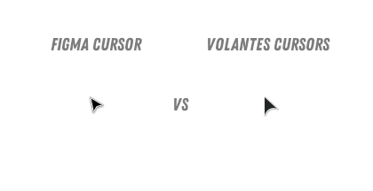
    I suggest this one, looks much better: Volantes Cursors

    Just compare them: Figma_cursor_vs_volantes_cursor


And there is another nice cursor: Bibata
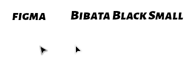
Figma_cursor_vs_bibata_cursor

I think the rendering depends on your browser and system OS. And surely the pixel density of your display (non retina / 1x vs. retina / 2x+).

The white stroke of the cursor renders differently (more cleaner, less pixelated) in the version I see using Figma in Firefox on macOS with an @1x Display. Same goes for native app. It even resembles your Bibata example pretty accurately.


I agree that the rendering you’re experiencing is slightly worse than the one I’m seeing.

The Volantes cursor looks ugly to me because of the optical irregular rounded back part.

So you see it’s really just about subjective taste here.

You can’t expect them to change the curser just because you don’t like it.

But I agree that the white stroke should be rendered cleaner and slightly thicker.


It’s just a matter of antialiasing depending of the angle.

No need to use volantes or bibata… they can manage it 🙂


Reply