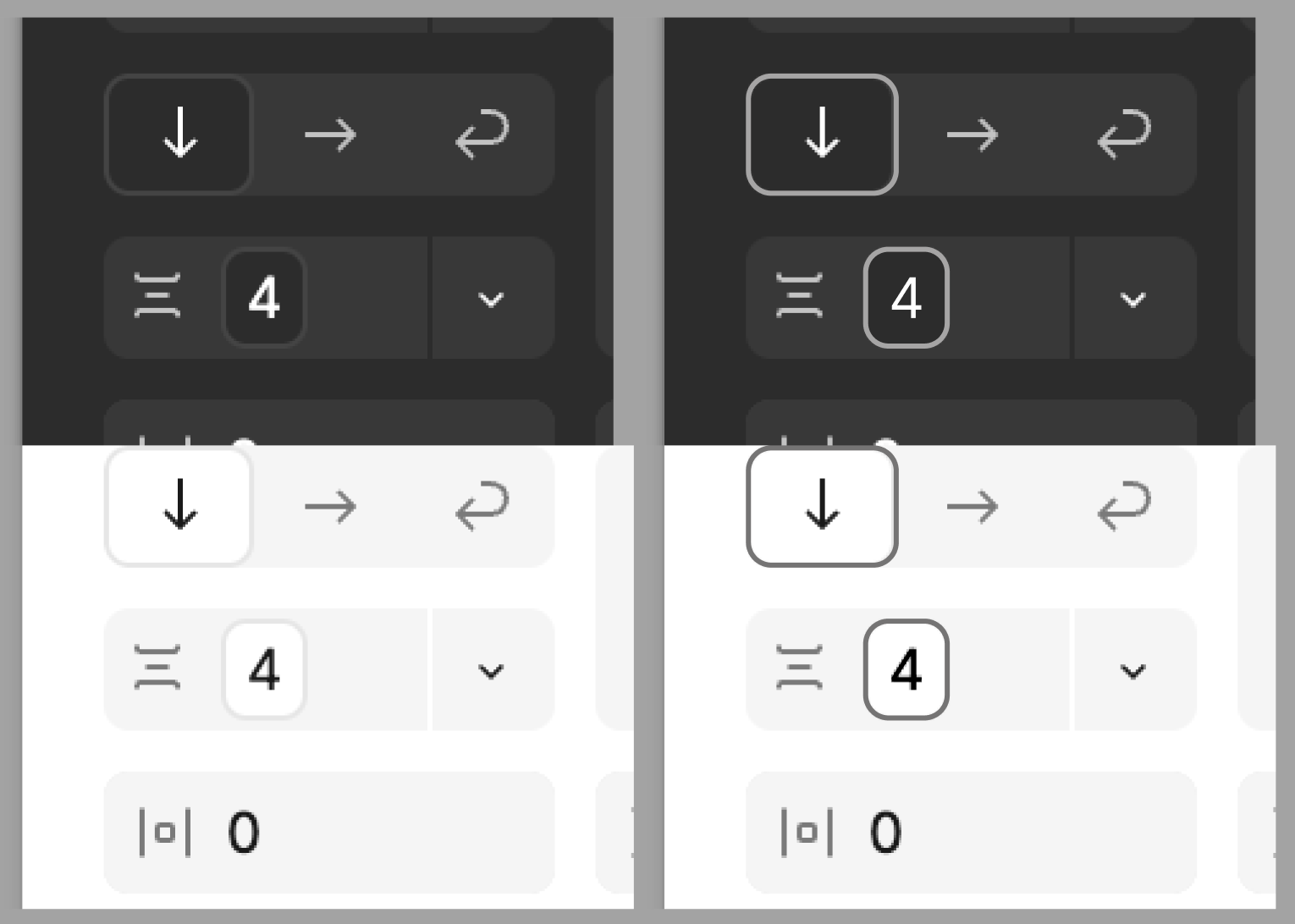
I would love to have a higher contrast theme for Figma’s UI. It has long been a minor annoyance to me that a tool I use to create accessible designs doesn’t itself meet minimum accessibility requirements. However I’m now at a point where it’s actively impeding my own workflows.
I’m currently going over hand-off-ready designs to make sure they use variables in all their autolayouts. The distinction between pixel inputs that have variables assigned to them and those that don’t is unfortunately abysmal, making the work very strenuous when it doesn’t need to be. The little raised/sunken area and border around the value isn’t anywhere near WCAG contrast recommendations in either theme.
There are plenty of other instances throughout the UI where I feel aesthetics have been prioritised over accessibility and that would benefit from an accessibility audit, but a higher contrast theme would be an excellent start.


