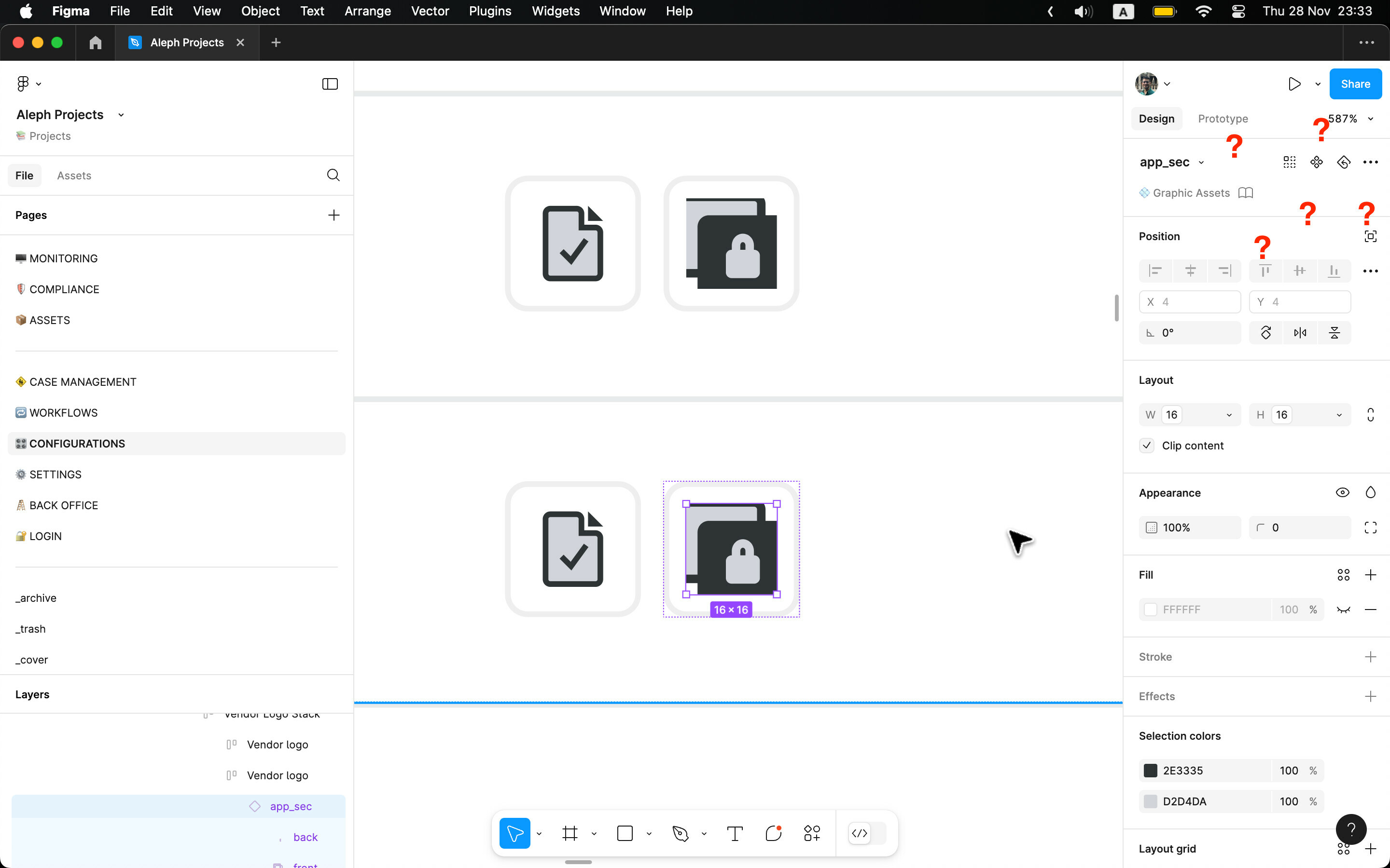
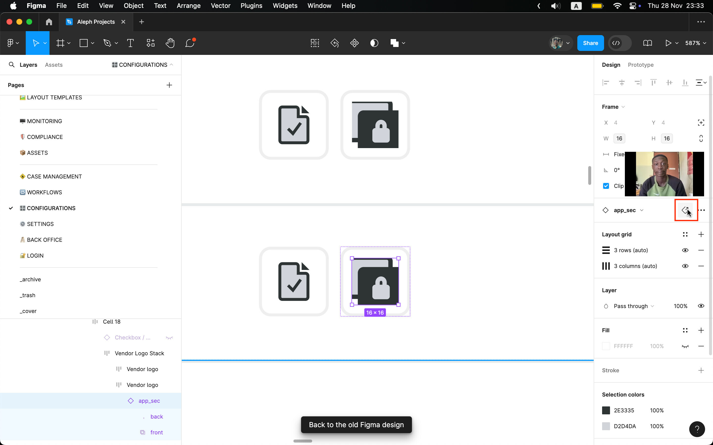
This is why i am still not opting to the UI3. it is missing so much functionality of the current UI. for instance. i want to “go to component” of a nested component.
Either the new UI don’t have it or the Figma team managed to hide it very well.
In the current (old) UI it is so easy and clear to find.
Please before releasing any further features at least work on parity between versions.
And if possible, bigger, more legible icons. the current situation in UI3 is just a joke all small icons no one can read and with very limited “clickable” area.
I hope you will take these issues seriously. this is not Instagram or tiktok. Figma is an every-day tool for most of us.


