
Hi,
When creating a webpage, adding images with Aspect Ratio Lock enabled, applying them to ‘fill’ the container they are in, then previewing the prototype in Responsive View (Z) cuts off the bottom half of the prototype.
Steps to reproduce:
- Create a new webpage design in Figma. Example: 1920 wide
- Add images with Aspect Ratio Lock enabled.
- Set the images to Fill the container they are placed in.
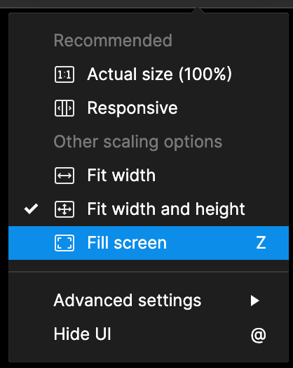
- Preview the prototype and swap to Responsive View (Z shortcut)
Expected Result:
The full prototype should display correctly in responsive view.
Actual Result:
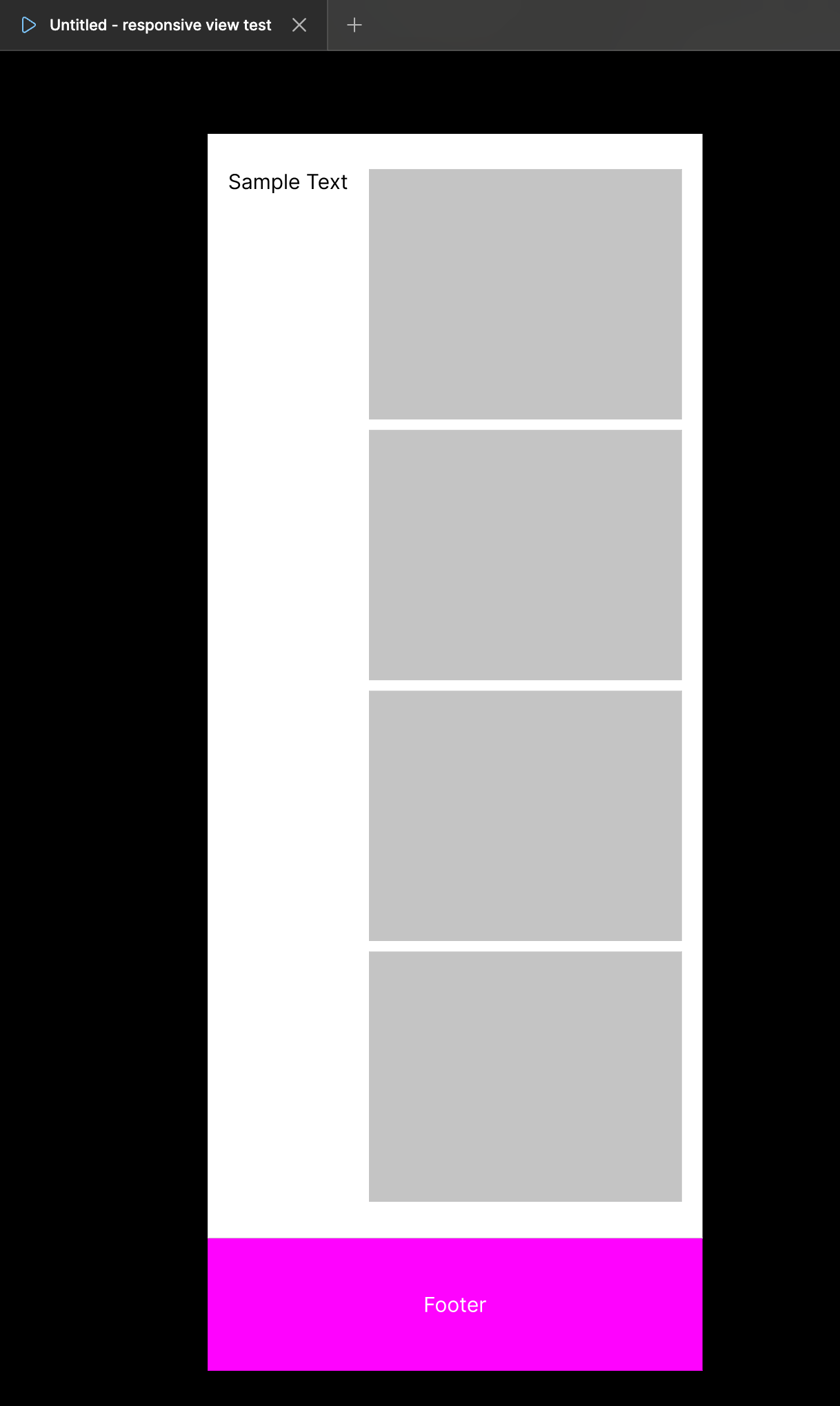
The bottom half of the prototype is cut off in responsive view.
Notes:
- I am on a Mac Studio Display (2560px wide) + the main frame is 1920px wide.
- This issue appears to happen consistently when the frame is smaller than the resolution it’s being scaled to in Responsive View. (1920px frame scaling up to 2560px)
- Moving the browser width inwards allows more of the full website to show.
- I use responsive images daily, and my current work around is to include a giant empty frame at the bottom of my design, but this is not ideal for showing stakeholders on different devices.
Working Example: