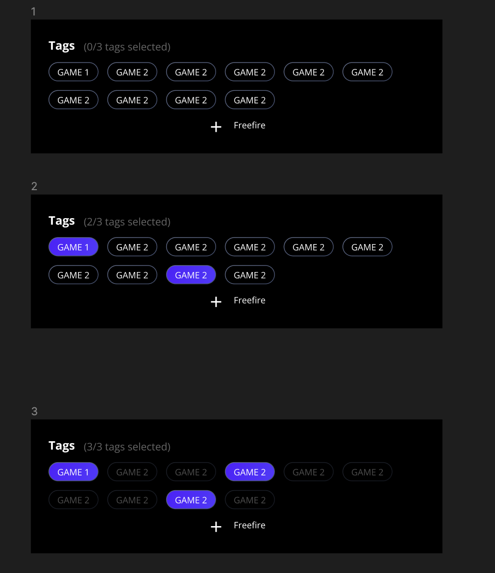
Hi @Kashish_Naidu1
This is doable
You need at least two variables :
tags selected number
: it will count the number of tag selected
disable tags
: it will toggle every tag in a disabled state whenever your tags selected number
reach the maximum tags allowed (3 in your case)
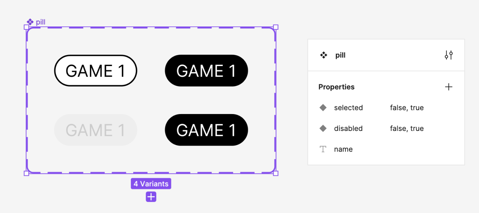
Tag component need to have a boolean property in order to toggle itself between available and disable state.
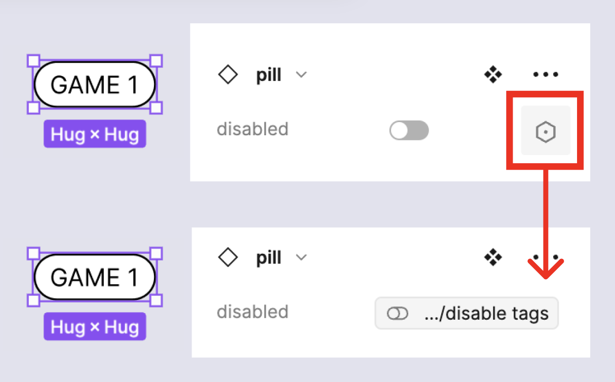
You need to bind the variable
disable tags
to the boolean property of your Tag component instances (as shown above) and then you’ll be able to change all of their status at the same time.
To do so, add to the component interaction
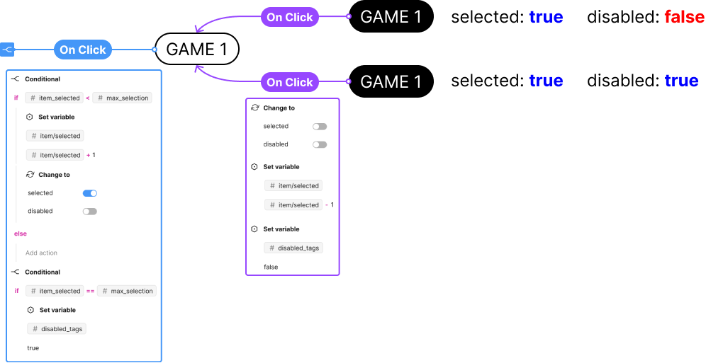
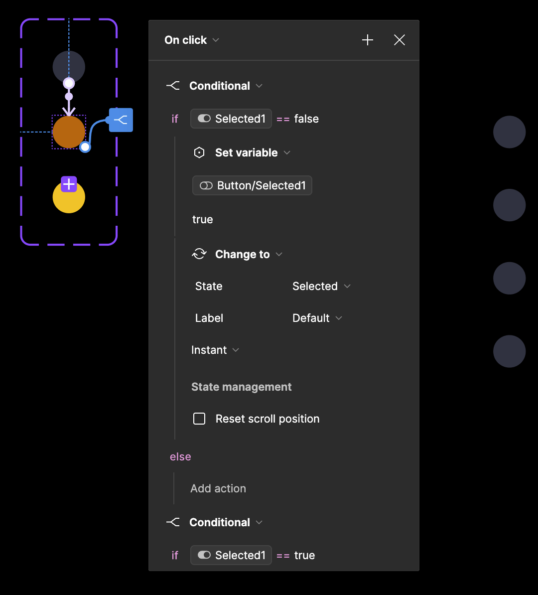
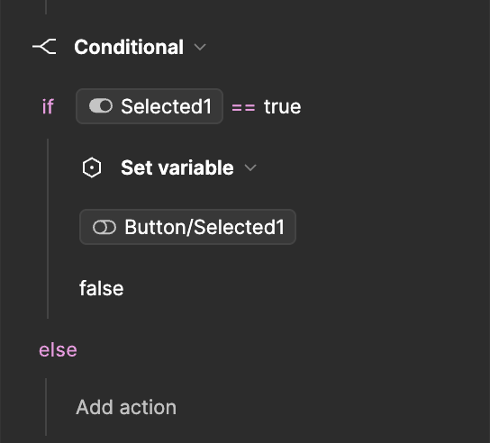
On click a condition to check if the total number of selected tag as reach its maximum. Then set your variable
disable tags
to true if it reach the max and false otherwise.
Hope it helps
Could you record video in Presentation mode? It seems to me that your solution does not match the author’s question. Note that the example uses 3 states (disabled, not selected, selected).
I’ll do you one better, here is the link of the prototype Figma prototype : tag list item disabling
Note that the example uses 3 states (disabled, not selected, selected).
I cut the selected state of my component part out on my screenshot, to focus on the main thing, because it looks like they got this part figured out.
Oh, great catch. Thanks for sharing. I originally thought about creating as many variable modes as there are instances. And you made it much easier by using 4 variants.
Hi, I was following this post as I’m trying to build something similar, so thanks for sharing this! I didn’t quite get it though, could you share a screenshot of your interactions and the variables, that would be great!
For context, this is what I’m trying to build:
A card component that has a small variant and a full-screen one.
So if I have a scrollable feed of distinct cards of the small variant and click on of them I want that one to change to full screen and all of the others to disappear (or to also change to full screen but align in a vertical feed in the same order as they were)
Hi @Matti
On this screen you will find all the properties of my component + the variable attached to the instance I used for the prototype and then all the variables
This one will show you the On Click interaction between the different variables of the components Pill
Regarding what you are building, it’s almost the same, when you click on
- a small card: you need to trigger a “On click” interaction, and set a boolean variable to true (or false, depending of your card’s property definition).
- a full screen card: you also need to trigger a “On click” interaction, and set back the boolean variable to its default value.
then on all your card instance you have to bind the aforementioned boolean variable to the property of the card that defined its disabled state.
Hi @Haroll
Thank you for sharing your workflow! Is it possible to build a radio button menu using a similar approach? I am trying to build it inspired by your workflow, with the difference that the button has the additional hover state along with the default and the selected.
Hi @Marius_Calude,
I’m assuming that you want a list of radio button and when on is checked, all the others become unchecked?
In that case, yes it’s quiet the same things : the boolean variable must be applied to the property of your component triggering its state change (in this case the check status)
As for the hover state it shouldn’t be a problem, it just some extra-step to account for the hover state :
- add a “while hovering” trigger on the component’s default state
- add the “on click” trigger on the hover state
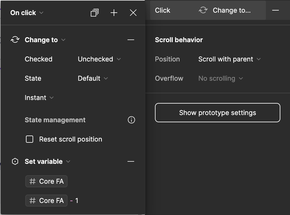
Thank you @Haroll for your quick reply. Here’s what I have set up on the hover state on click trigger:
My issue is that once I select a button it remains selected so I get similar functionality as in your example. I don’t know what I am missing to have only one button selected at a time.
Wow, i just checked back in this thread after a while. Can’t wait to try these solutions, thanks!
It’s so annoying that I can’t make it work and mine is so much simpler. I just want the counter on the title decrease 1 number unit if a checkbox on the list below is unchecked and to go up 1 if it’s checked. It worked once and I have changed the UI now it’s not anymore and it’s driving me insaaaane. The variables are there, are connected to the title, the action is set to when the click is made, even when there’s a hoover state… BY the way, when it hovers it works 😭
There’s a hovering state in between that breaks things… what I did was:
I have a design system where the interaction happens - default → while hovering → click → check. I set the action to happen on the click and it doesn’t work, if I put the action on the hovering it does work, so apparently the action can’t go one state further by itself