

Raku
New Member
March 21, 2024
Question

Text box horizontal trim

  • March 21, 2024
  • 3 replies
  • 927 views

Hi there,

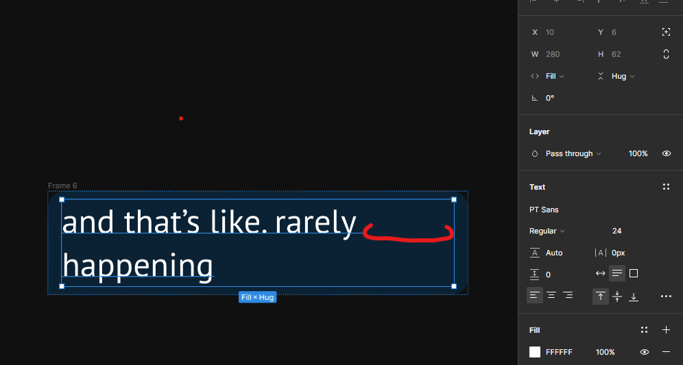
I’m struggling with text boxes which are not trimmed horizontally. I’m trying to create single speech bubble with limited width. When the last word in the line doesn’t fit the bubble goes to maximum width and then jumps to another line. I wish to trim it to the actual text width.
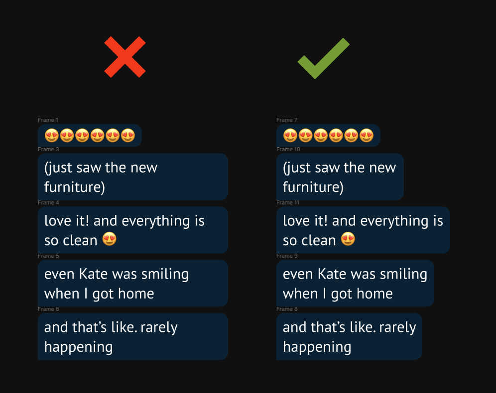
Do you know a solution which is not manually set every single bubble?

3 replies

ksn
Figmate
Community Support
March 22, 2024

@Raku I’m trying to understand a bit more – first, can you give more info on how you’ve put together your ideal design (like the one you showed in your screenshot). Are you using components/instances for this design?

Raku
RakuAuthor
New Member
March 25, 2024

Every bubble is a simple text with auto hight added to auto layout.
image

Here are text preferences:

Auto layout has maximum width set to 300px.
Preferences:

It works good except that one thing I mentioned.

HJW
New Participant
September 16, 2026

Right now, it's impossible to left-align stacked text layers with different font sizes inside Auto Layout.

Because Figma aligns to the text bounding box instead of the actual glyph bounds, font sidebearings create an awkward visual gap. For instance, if you place a 120px heading starting with "L" above a paragraph of 16px body copy, the stem of the headline won't line up with the flush left margin of the body text.

  • You can't manually nudge text layers inside Auto Layout.
  • Negative padding isn't a fix because it shifts the whole container, not the individual text layers.
  • Community plugins like “Text Visual Alignment” only works with freeform layout.
     

How to recreate the issue

  1. Create a large headline starting with a straight-stem letter like L, E, P etc.
  2. Place a paragraph with body copy underneath it.
  3. Put both in a vertical Auto Layout frame with left alignment.
  4. Notice how the stem of the “L” sits visibly further to the right than the body text below, because the massive sidebearing gap on the 120px font pushes the letter away from the left edge of the frame.


Solution:

Add horizontal trim to type settings (right next to vertical trim) that crops the sidebearings to the outer edge of the glyph bounds. This would let headline stems snap directly to the left margin of body text, giving us true visual left/right alignment inside Auto Layout.