Yes 💯!
Came here to say this.
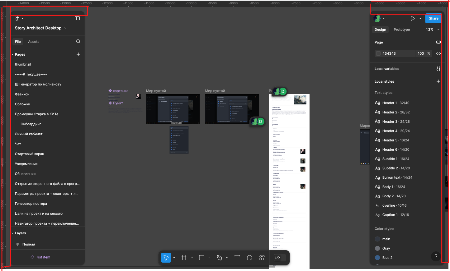
Yes! These gaps just eating space that i need so much to see my workspace! I feel so uncomfortable…
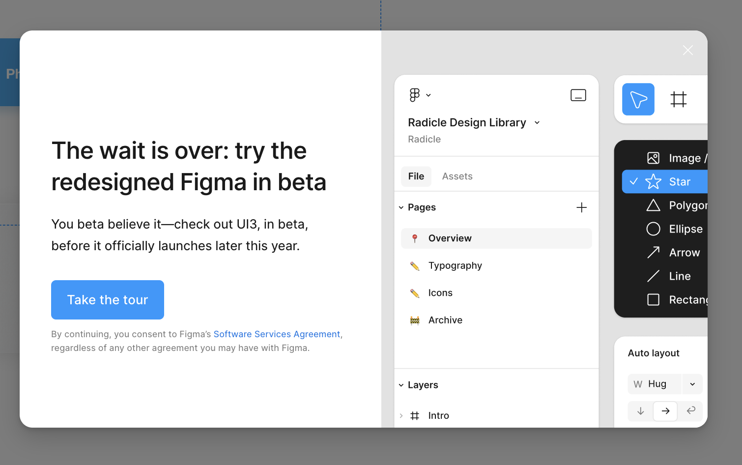
Without even know any of this, or seeing the new UI3, I decided to click the CLOSE button on this pop up. I can’t stand what Figma have been doing lately with terrible, new product releases.
Slides was an abomination. Half of the new Figma features they’ve dropped in the last 12 months are only specific to people who create complex phone apps or software programs for a living — not everyone else that uses Figma.
No idea what’s going on in their office but the decisions they make are clearly not in favour of the people that actually use Figma for a living — outside of Figma employees.
Ain’t no way I’m trying UI3, and when it drops I’ll be sticking with the current UI.
Side note, what Polina has shown here with the floating tiles is truly one of the most horrible things I’ve seen from any design software. Adobe included. And that’s saying something.
Sheesh, in what way was Slides an “abomination.” Is it just because you don’t personally have any use for it and think Figma should be spending their time elsewhere? I find it to be a nice product and honestly really good, especially for a beta. I don’t understand why this reply is so negative and full of hyperbole.
And I say that even while completely agreeing with you that Figma needs to do a better job of serving ALL designers and reducing their use of dark patterns that make them even more money. The reality is that large orgs and enterprises are where they make most of their money, so at the very least this focus is not at all surprising or hard to understand. Their CEO said in his recent keynote that focusing more on freelancers and smaller design shops would be a point of emphasis for Figma, but personally I will only believe that when I see it based on how things have gone so far.