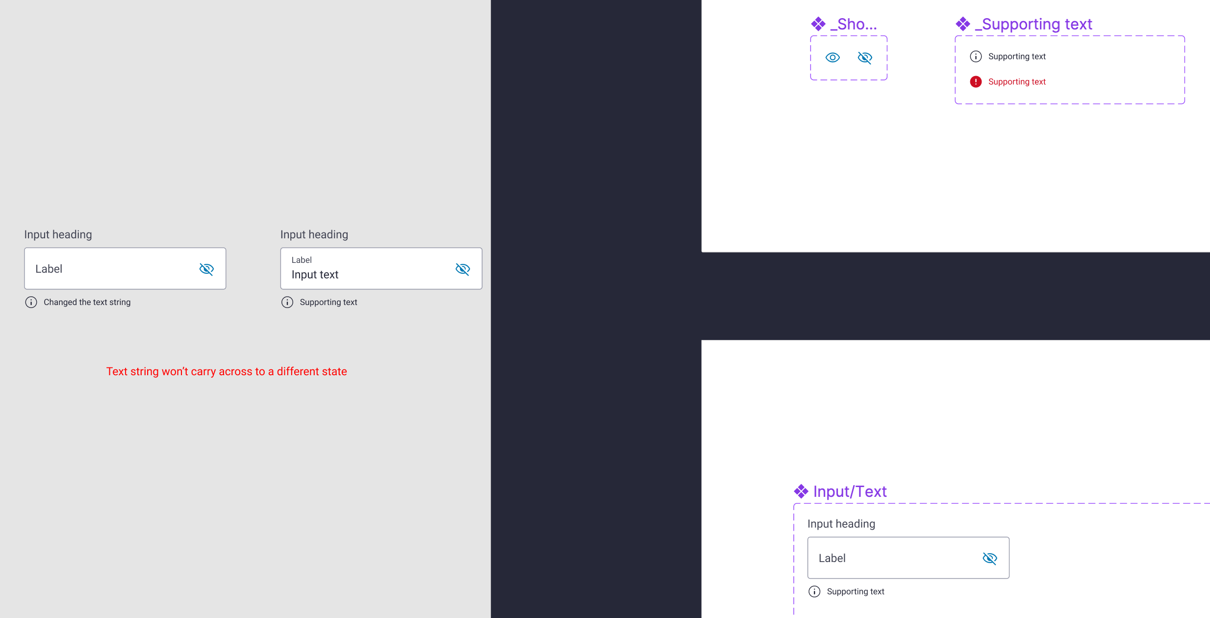
I’m creating a text input component with several states (ie enabled, focused, disabled etc)
I have centralised parts of this input component. For example; the ‘Supporting text’ lockup (icon and text) has been created as a component and NESTED into a text input component.
I have added a text property (string) to the supporting text. I would expect that no matter which state I select for the input component (ie enabled, focused, disabled etc) that IF I change the supporting text string to something other than the default, it would carry across when I select the different input states.
It does not carry across. The only way I have found to get around this is to not centralise the supporting text component; thus losing the ability to make changes to styling in one place and have it apply consistently across different variants
Image below to give a visual to what I’m talking about.
All help appreciated. TIA


