I cannot figure out what I am doing wrong here. I would swear this USED to work just fine.


It seems now, when nesting auto-layout frames, they do not seem to actually wrap like they are supposed to. They work fine at the first tier, but anything nested fails to follow the assigned “wrap” layout setting.


I am open to feedback on how you are handling responsive wrapping and if you have the same trouble with nested components.


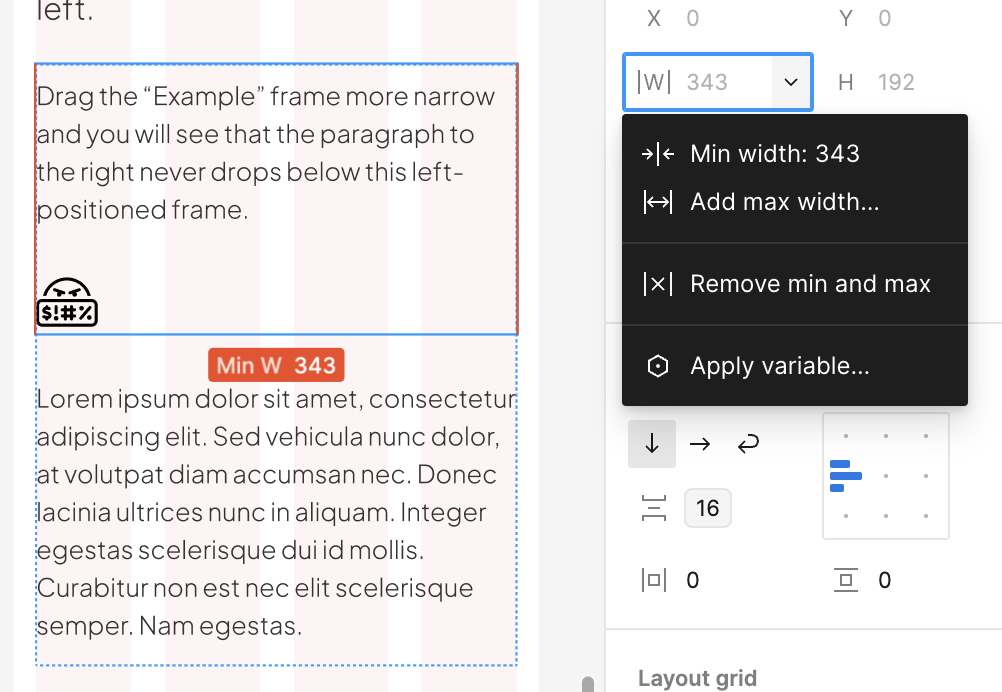
The footer is what I am mostly concerned about. But as you can see, the two column section does not wrap the frames either. 🤬


Is it a nesting bug? Or am I doing it wrong?


Seriously…this used to work…

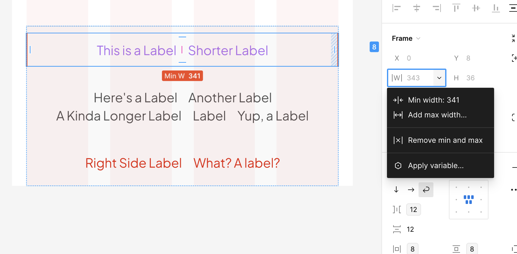
You need set minimum widths to the containers so they know when to wrap. There are no minimum widths on your containers atm so they just keep filling the infinitely shrinking containers. It would look like this: (mobile example @ 375px settting min widths to 343(16px gutter).


Same with the footer but you will have to define the min widths inside the component. You might want to set the vertical spacing and look at alignment on mobile though. (I detached it just to do it quickly).


Thanks Toby! I didn’t even think to do it. 🤦🏼‍♂️ Had I been coding it, I prolly would have done it by nature. Totally slipped my mind!


Worked like a charm and things are working well.


I decided to drop the center section of the footer since it doesn’t break very pretty unless everything is the same length. So just left and right now and it is really good.


Thanks again. I appreciate the second set of eyes for sure.


Good tips for all!


Reply