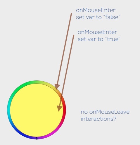
So, I’m using some variables in my component. Here is the intended interaction:
In the table header, when you hover over the label, I want to show the sort and menu icons. (This is working via the mouse enter interaction setting the "X Column / Hover Active variable to true - it is false by default.)
When you stop hovering, the sort and the menu icon should go away. (This is not working with the mouse leave interaction. The hover state simply stays applied. I also tried setting the “Hover Active” variable (which is linked to visibility of the icons) to true while hovering, but that didn’t show the icons on hover at all.)
I am simply struggling with getting the icons to hide when the mouse leaves the area.
Why am I doing it like this instead of using a component to change the states. Well, I was. Except for the fact that variables do not work with nested states at the moment, so I had to break apart my components and get creative.
When you click on the menu icon, it sets a variable, “Active Column” - which is a string. It essentially just records the name of the column you clicked on.
If I click on PO #'s menu, Active Column’s value becomes “PO #”
This is used later when you click on “Filter” - this switches the overlay to the Column Filtering Overlay. There is a text field that is linked / populated by “Active Column.” It is intended to work exactly like Material UI’s column filtering on their X Data Grid.
So, when the filter column is opened, the text in the first field should be something like:
PO # contains _____________ ← which is a text input that allows them to search. So this is why I’m using variables for the hover state.
I created a demo with the gist. The first couple of columns work, I didn’t want to spend time recreating the entire file. (Can’t share source due to company policy.)
Here’s the Demo

