Question

Inability to create responsive side panel with a fixed header & footer in a web dashboard


Hey Community!
I always struggle with creating responsive designs using the correct combination of constraints, auto layout & prototype settings.

I am trying to create a side panel with the following expected behavior:

  • Logo section (Topmost): Must always be visible on screen & not scroll with the page
  • Middle section with menu items that scrolls when I scroll with my mouse pointer over the side panel, that is, in case the number of menu items exceeds the screen length.
  • Footer section (Bottom-most): Must always be visible on screen & not scroll with the page

The entire side panel should increase/decrease in length depending on viewer’s screen size.
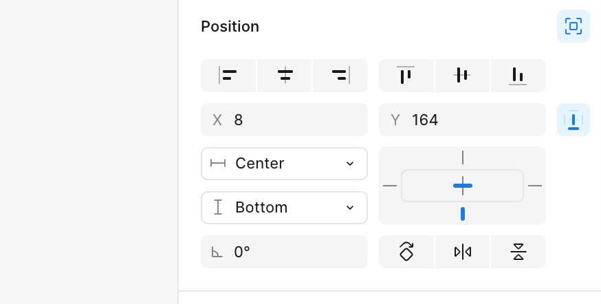
 

My Settings: 

  • Menu component has 3 frames in auto-layout for the 3 sections (Logo, menu items, footer), with the middle section (for menu items) set to 'Fill', 'Clip content'.
  • Logo & Footer sections have fixed heights. Logo section is set to 'Sticky: No scrolling'
  • Menu component canvas stacking is set to ‘First on top’
  • The menu component is set to 'Left' & 'Top + Bottom' constraints on the desktop page for responsiveness.

Problem Statement:

I don't know what settings I should apply to ensure the footer is fixed to the bottom of the screen. 
I am attaching a screengrab of how the side panel currently looks - apparently, the footer shows up after a certain scrolls of the menu items section. It scrolls within the menu items frame up to the 20th item without showing the footer, then scrolls the side panel to show the remaining items along with the footer. I am clueless about the behavior & the solution to fix it. 

Thanks in advance for all the help!


Attachments:

  1. Image showing frames in the Menu component
  2. Video showing behavior of the side panel


5 replies

giliard
  • New Member
  • 67 replies
  • June 8, 2025

Seems like you're using the sticky position for the footer instead of the absolute position.

I suggest you try with these constraints for the footer (absolute, center, bottom).


  • Author
  • New Member
  • 2 replies
  • June 8, 2025

Hi ​@giliard thank you for the prompt response!

Yes, I was using ‘Sticky’ scroll option for the position of the footer frame.

But I changed it to absolute & my problem persists with the footer not showing unless I scroll down to a certain number of menu items.

Moreover, now I’m unable to scroll and see the entire list of menu items (there are 22, but I am able to scroll only up to the 20th)


Attachments:

  1. Image showing the new properties for the footer frame
  2. Screengrab of the new behavior on scrolling


giliard
  • New Member
  • 67 replies
  • June 8, 2025

Gotcha. 

There is a simple way to only scroll the menu items, for that you will need that the Menu area has a height with "fill", check the "clip content" and set to Vertical scrolling under the prototype.


The layers should be:

Header: height auto/hug

MenuItems: height fill, clip content and vertical scrolling

Footer: height auto/hug


Take a look at this demo video that i just created. If it is the result you are looking for, I can share the file with you use as a reference.


  • Author
  • New Member
  • 2 replies
  • June 8, 2025

Yes, this is exactly the result I am looking for, and I think I have applied these settings but it just doesn’t seem to work. 

It would be really helpful if you could share the file so I can look into each layer carefully to find out where I have gone wrong

Thank you once again for your prompt response!


giliard
  • New Member
  • 67 replies
  • June 8, 2025

Here is the file available on the Community: 

https://www.figma.com/community/file/1513543826099886245


Reply


Cookie policy

We use cookies to enhance and personalize your experience. If you accept you agree to our full cookie policy. Learn more about our cookies.

 
Cookie settings