Hello, this is the first time Iā€™m posting here. I just started working on my first prototype. Everything seems fine until I tested and realized that my prototype show differently depending on their phon size.


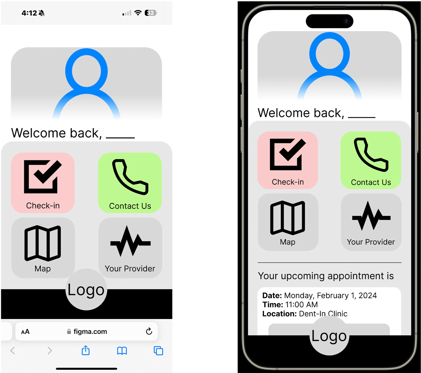
Here is the example.


In Figma display (the right picture), the size is what I wanted it to be. However, on my actual phone (left picture), there are too much empty space on top of it. Is there a way to fix this? Thank you!

Hi @Jedsada_Thavornfung, Thank you for reaching out, and congratulations on your first post here! I completely understand how you feel about this situation.


I wanted to suggest a possible solution that might help you out: Layout Grids. When it comes to responsive design, web grids can be really useful. They provide a consistent layout across different platforms, making your design more cohesive.


To learn more about using grids in Figma, I recommend checking out the following resources:


I hope the information above is helpful to you. If you have any additional points to share, please let us know.

We also welcome insights and suggestions from our community, so feel free to join the conversation!


Thanks,


Reply