I need set value for assets in my design system, ex:
My logo dark mode vs light mode, the brand asset are different for the color scheme.

The options available are:

  • Color
  • Number
  • String
  • Boolean

I try insert the URL from image value in string, but I dont have success to retrieve value and set for background.

Anyone have a idea to resolve this? 🤯

Anynone can help me?

Just played with something similar. Tried to change the logotype of our multibrand design. In our header component i put both logotypes and controls them with booleans properties. Then I set the boolean values from two booleans variables.

Maybe not the best solutions since it will create more layers in the component?


This wasn’t obvious from the UI but I discovered it in the Playground File.

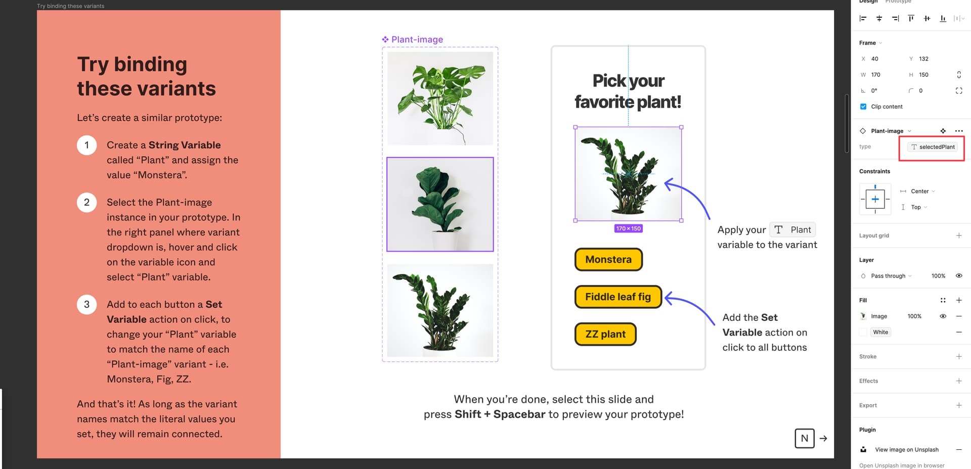
You can bind a string variable to a variant property, which means if you have a component with each image as a variant, you can use a variable to switch between them


Tks for help!


I go try this, tnks 😉


I can’t get this to work. Do you have to name the modes the same as the variants?

For example type=


@lucasvieluz I’m probably stating the obvious here, but if you have an svg logo, you can assign color variables to the svg and they will switch in dark mode.

Of course, if you have a png, I feel your pain.

We desperately need a variable for assets, that will switch a graphic asset with modes.


Yes… variant are identified by names, and you can think of them as strings.


I think this feature should be coming soon, no?


Running into this issue too i can build a complete complete that isnt bouncing around these things like styles, variables, tokens, & modes


I’m in need of this as well. I am working with several different partners and when demoing a design flow to them I want to make sure the demo includes their name and logo without having to manage a separate prototype for each of the partners as designs change. I am using modes to quickly switch between partner names which is great, but I can’t switch the logos using this same method which is a bummer.


This would be such a great feature. I was looking for it today and I can’t believe it’s not there.


I found myself needing this today as well.

Use case: Light vs Dark modes. I have a help page, where I have a screenshot of another page, that is being used as an example. It looks very out of place in dark mode to see the light mode version of the page.

Oops, I got all the way to the bottom and Henk’s comment made me think I was on a feature request. Sorry for the unhelpful update.


@morebutworse I got this to work. I tried what ​@Mattias_Berkesten1 suggested. This is what I did: 

  1. I took my two images (light and dark versions) and place them in a frame with dark mode image at the top.
  2. I then created a component 
  3. In my colour modes variable collection, I created a boolean variable called “dark-mode”
    1. In the light mode column, I set the boolean property to “false”
    2. In the dark mode column, I set the boolean property to “true”
  4. Back in the component, I selected the dark mode image (actual image layer, not the whole component) and applied the “dark-mode” variable I’d just created. In the Appearance section by clicking the “Apply variable/property icon.
  5. Now, by default in light mode or auto, the dark mode image is hidden. When I switch to dark mode, the layer property/variable changes from false to true and reveals the dark mode image.

I hope that helps