I really like Figma, and i been using UI3 for couple days
here is some idea about UI i like to share,
I think these parts are taken up a little bit too much:
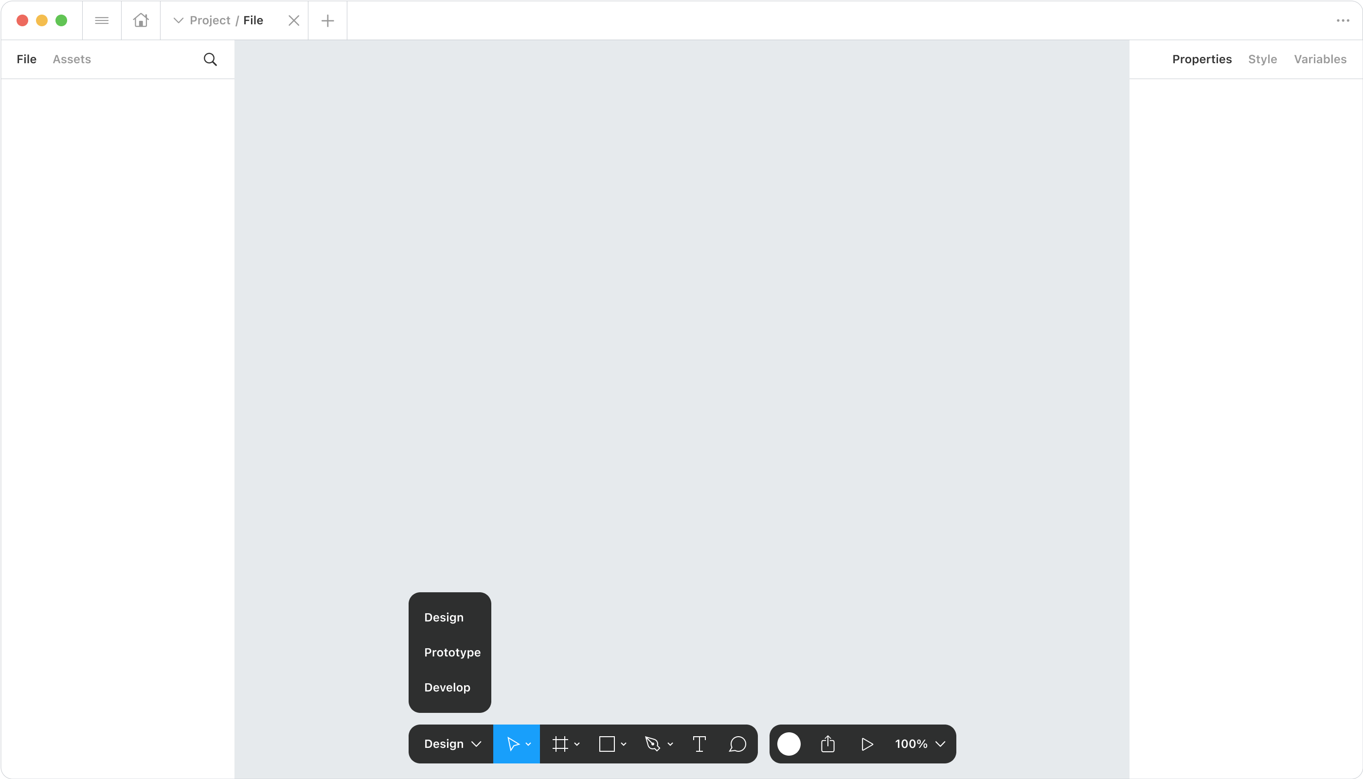
here is changes i made:
“Figma”(menu) button move to tab bar;
“user” “play” “share” button move to tool bar;
tool bar has 3 role, design, prototype, develop;
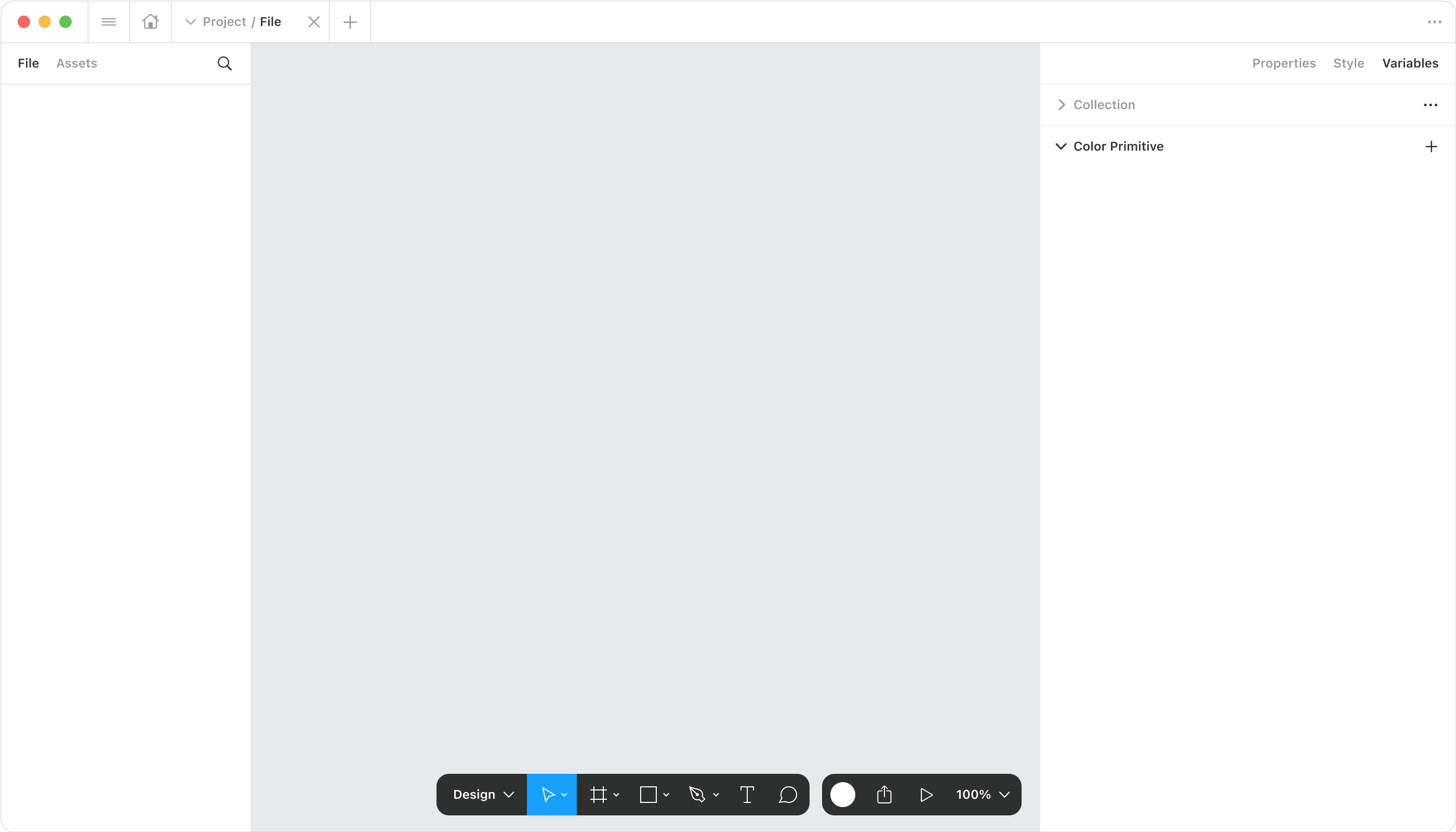
right panel has 3 tabs, properties, style, variable, they’re all properties;
when switch to variable, the panel will get a little bigger;
the structure of “collection list” and “variable list” is similar to “page” and “layer”.
Thanks!


