Hi,
As a temporary solution I created a component with variants for each device (e.g., Desktop will have XS, S, M, L, XL mapped to some px values).
Spacing component has 2 properties: size (e.g.; XS, S, M.) and device (e.g.; Desktop, Tablet).
This article was a great inspiration: https://uxdesign.cc/worry-less-about-spacing-in-figma-8b44f34db4f5
Of course, I hope Figma will integrate “spacing” as a style, but for now, treating spacing as a component is saving me a lot of time. 🙂
So good to see your post. We are also dealing with this and currently are trying to find a solution. What we’re exploring right now is:
- establish the spacing unit (8pt) and some (strict) possible multipliers (x2, x3, x4, …, x8)
- have a placeholder component (that you swap with when building the UI)
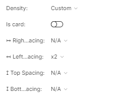
- build a block component, that is using an auto-layout with only the placeholder component, and has properties for spacing left, right, top, bottom, and instances for all the possible combinations. Indeed, it feels like a lot of work here 😃
- build multiple layout components (for rows with 1,2,3,4 elements, and cols with 1-8 elements). We go with multiple instead of variants to avoid the “cycle detected” thing. Each layout component has the block-component inside. For example, the layout-stacked-x3 component includes three placeholder components, stacked; the layout-cols-x3 component includes three placeholder components arranged inline, on three cols. No spacing added here. Spacing will be handled by the block component.
- make all the complex components (molecules, elements or patterns) in our design system use the placeholder component inside; when needed, you can swap it with the block component
- all the basic components (button, form elements, text component, icon) are left untouched, they DO NOT use the placeholder or block component
- all the molecule, element and pattern components are composed using the layout component. For example, a card component is using the layout-stacked-x3 (for header, content, actions). Header inside a card is using the layout-cols-x2 (for avatar and text), content is layout-cols-x1 (for content) etc. Because layout components do not have spacing, we will need to add spacing at each block component, using the variables that we define on the main component. So, in this case, for example, we will set x2 right spacing for the avatar block (x2 = 16pt)
I don’t think it is the best appoach, but, as I said above, we’re just exploring possible solutions. 😃
Definitely, a must feature!
Please add a way to create spacing styles.
We currently have our spacings as tokens via figma tokens, but using them in figma is just not optimal.
this is a really good idea!
Figma team please include spacing as a Style