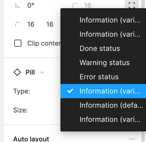
When choosing a variant of a component, the dropdowns could take up more space than they do. In many cases, the full variant values aren’t displayed. The attached screenshot shows a case when several options are not distinguishable, because their first halves are the same. I would suggest that you let the dropdown option lists adjust their width based on the option values instead of limited to the space the original input takes.
It would also be great if the list was sorted by name.


