My biggest enemy with figma for web design has always been translating a finite number of screen mockups to a real page that can get infinitely big and small.


To ensure the same content looks just as great in a 4K ultrawide monitor as it does on an iPhone SE from 6 years ago, I try to cover my bases by designing the same screen like 12 different times. 3 screen sizes for 4 breakpoints: desktop, tablet, mobile landscape, mobile portrait.


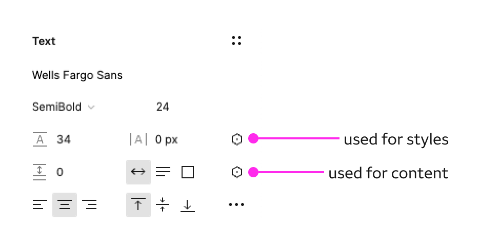
But this is so tedious. I was hoping the new variables feature would ease my pain but it doesn’t support typography, and I can only have 4 modes, so I can’t even use it to set variables based on screen size.


One of the main reasons responsive design in figma is such a headache is because I personally make heavy use of REM/EM for fonts, and VW/VH/% for basically everything else. Things rarely have a defined pixel size.


Are there any plans to support these in the future?

Unfortunately this is likely not going to happen.


Figma doesn’t use actual HTML/CSS to render so all those CSS features like media queries, % and responsive units, rems/ems/ etc would have to be rebuilt from scratch by their team.


I think for designers who know HTML/CSS we need to start looking at other tools like Framer or Plasmic that are a lot like Figma but built using actual HTML/CSS rendering. It will take too long for Figma to build those features and I don’t think it is the direction they want to take the tool in.


This could actually be implemented quite simply by adding a style variable.

Each mode for a style variable could be set to reference a specific style in the styles library. This could control font styles properties. This way XL breakpoint could have large fonts, XS could have smaller fonts, etc…


This topic was automatically closed 90 days after the last reply. New replies are no longer allowed.