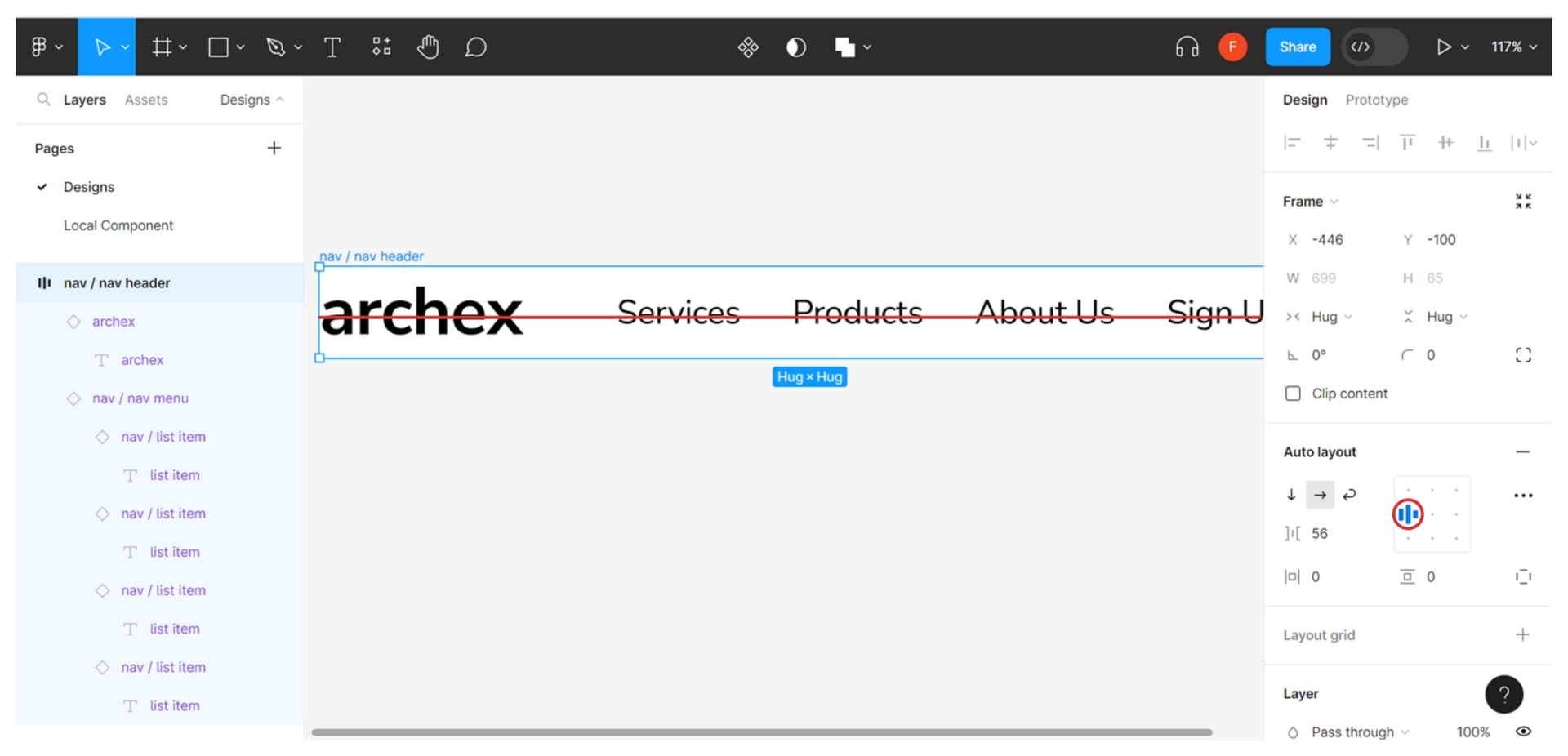
I created a logo (text-based) in Figma and tried to align it center with my menu item. However, when I did auto layout with the menu item, it produced the result like in the image below. How do I solve it?
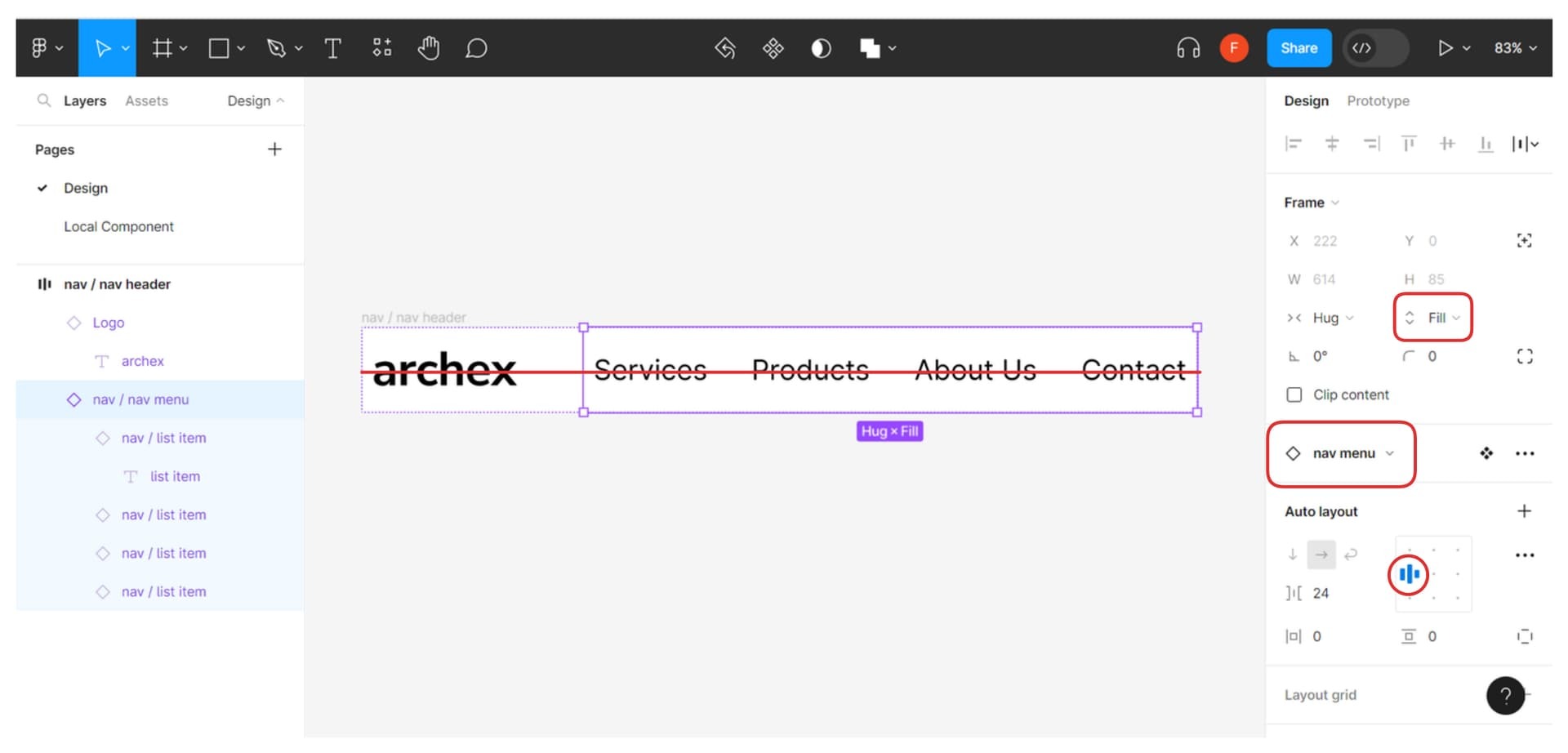
Looks like your logo is centered but the rest of the text items aren’t. Try setting vertical fill + align left on the nav menu component, altering the line height of the list item text, or setting a manual padding offset on the nav menu.
I’ve tried to set vertical fill, align left on the nav menu component, altering line height, set manual padding. It just doesn’t work. You can see I’ve tried it in the image below.
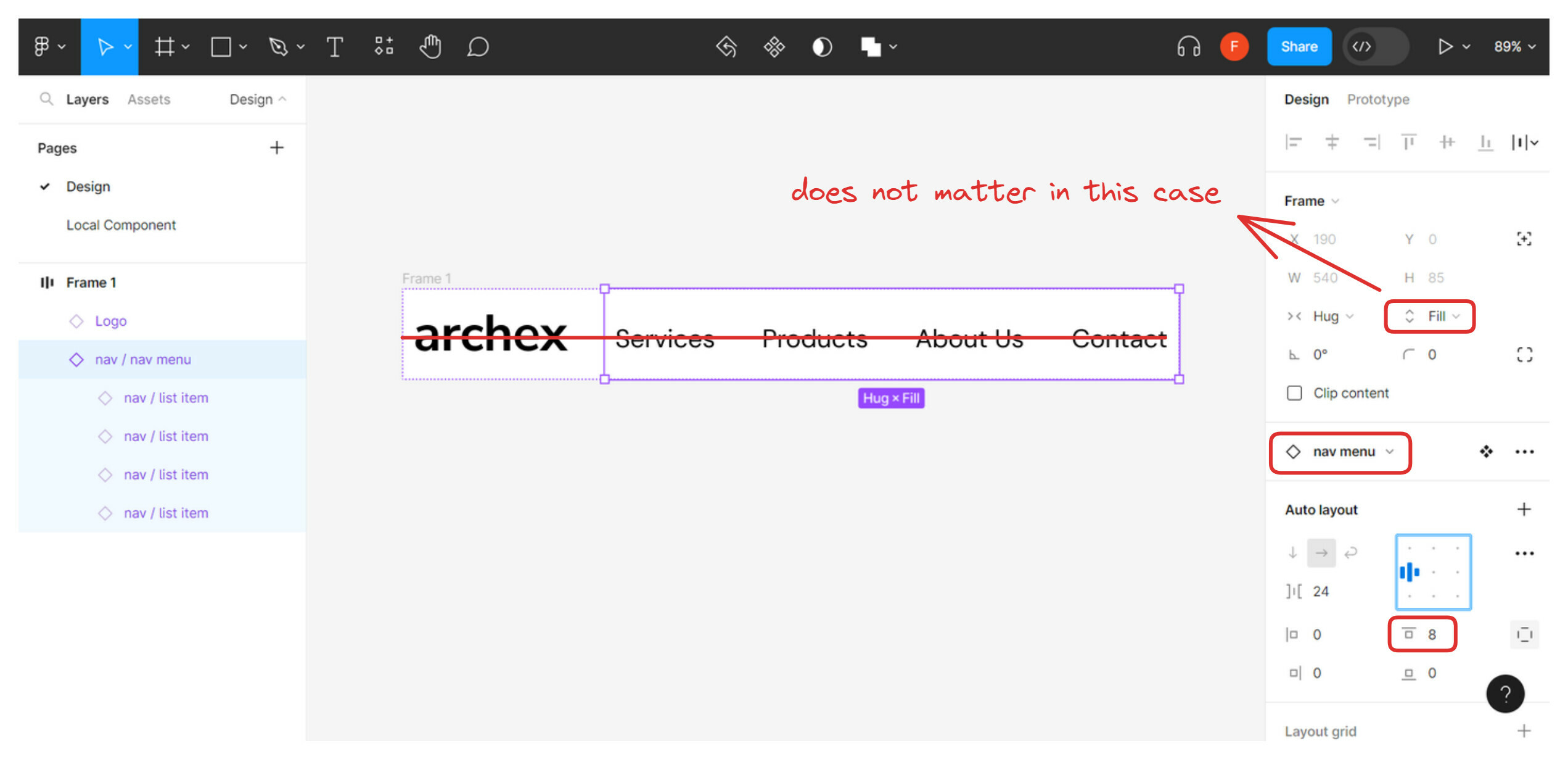
I am pretty sure it is a matter of typeface anatomy where the type bounds of the lowercase logo doesn’t line up with the type of the menu items. The items appear properly centered on the horizontal line as far as Figma is concerned, and any smaller adjustments will probably have to be manual (as exemplified in the screenshot with using top padding on the menu item container.
I have tried it again and yes, you are right! It is because of the typeface anatomy and unfortunately we have no choice other than to tweak the padding ourselves to make it to the center (i’ve used the exact same method, tweaking top padding)
However, the vertical fill does not affect anything in this case, because of the nav header height hugs the child component inside it.
Anyway, we have found the solution, thanks @Michael_Persson !
If there are better solutions, feel free to suggest.
This topic was automatically closed 3 days after the last reply. New replies are no longer allowed.
Enter your E-mail address. We'll send you an e-mail with instructions to reset your password.