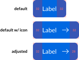
Layer properties are great at reducing the complexity of our components, but I’ve noticed an issue with using them that’s kinda driving me a bit nuts and I’m wondering if any of ya’ll might have a work-around.


When using layer properties for button icons, there doesn’t seem to be a way to bake-in an adjusted padding value for the icon side of the button. The result is a lop-sided appearance when the icon is visible:
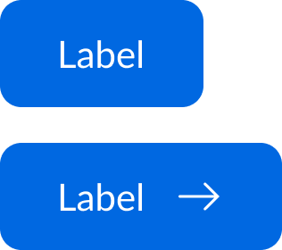

Default and Icon


Manually adjusting the padding after switching on the icon fixes this, of course. The bottom button example now feels optically balanced:
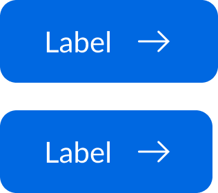

Icon and Icon Adjusted


With redlines:


Variants with Redlines


So, I seem to be left with three choices:


  1. Avert my eyes and try to forget about optical balance altogether (can’t do it)

  2. Write a guideline for designers that requires them to manually adjust the horizontal padding whenever applying an icon (ew)

  3. Go back to using tons of variants (double ew)


Is there something I’m missing? Has anyone else been struggling with this, or am I just an insufferable nit-picker? 😅


Thanks in advance,

Larry

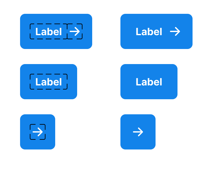
You might add your label in autolayout frame with left and right padding and reduce the padding of the button by the same amount.

in the attached image the left and right autolayout padding for the label is 8 and for the button is 16.

the set on the left I tried to highlight the skeleton of the frames within the button and on the right you can see the proper visuals.


I hope the idea is clear and would benefit you, if you need any further explanation please tag me in a comment.


Thanks, @Osama_Turki! This seems to do the trick, though I’m still racking my brain as to why it works 😅. Maybe it will make sense after more coffee.


Cheers!


@Larry_Reynolds1

Sorry I was not able to reply to you earlier.

The idea behind this technique is to set an additional padding to the label only without adding a padding to the icon. That is why it’s wrapped in an autolayout frame with a padding. And when the icon is showing the padding of the label (the extra padding of the button) of a one side translates to the space between the label and the icon. Thus, reducing the padding of the button from that side.


I hope you get the concept behind why it works.