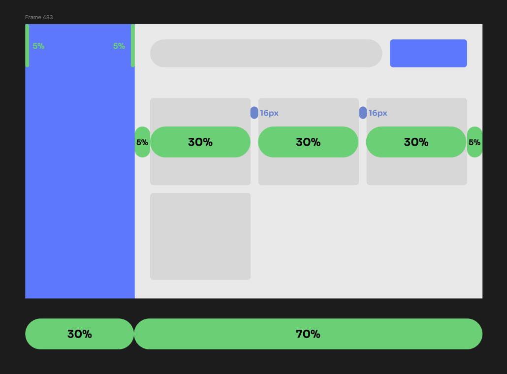
Hi all!
At my job, I create a lot of interfaces for completely different industries, these are both small and large projects, and very often I created a lot of variables for different screen sizes. Then every time we argue with the frontend because it is quite long and sometimes difficult to support all the variables. And I even agree with him, if it were possible to set sizes and margins not in pixels but in percentages, this would greatly simplify and, most importantly, speed up the work of both the designer and the front-end developer. You can create truly flexible interfaces.
100%, as in html, will be calculated from the container. We already have auto layout, we just need to add a toggle in the auto layout settings to switch to % (or just have the same option as for line height by default). And then all objects inside auto layout can be specified with % instead of px. And in dev mode, the developer will receive the result in % and will not have to sit and calculate (or I will do it instead 😅) and the result will be a truly responsive interface


