Hey guys,
I searched for topics and couldn’t find any that really solved my exact problem, so was hoping I could get some help from the community.
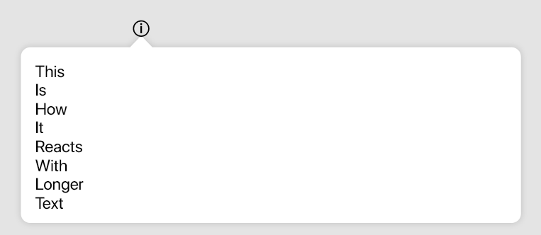
We have these info icons that help explain various aspects of our software when you hover/click on them. Here’s a screenshot of the icon & popup box
- in XD the hover effect is part of the component, it’s a natural state.The way we prototyped it in Xd was very simple. We had a master component with placeholder text, copy/paste an instance of it and edit the text. The rectange around it auto-adapts to the text, but the triangle/arrow doesn’t stretch and the top of the rectangle stays in the same place all the time, while their drop shadows don’t overlap. It’s all incredibly easy to set up & hand over to developers … in XD
I’ve been playing around with it in Figma for way too many hours now and am at my wits end.


