Question

Changing a fontawesome icon component property overrides the content


Jil

Hi, eversince the Figma update from 2 weeks ago I’ve been having an issue with the Fontawesome icon component.

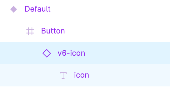
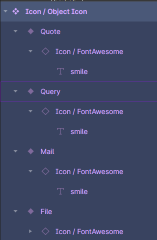
I have a button component with an instance of the Fontawesome icon component in it.

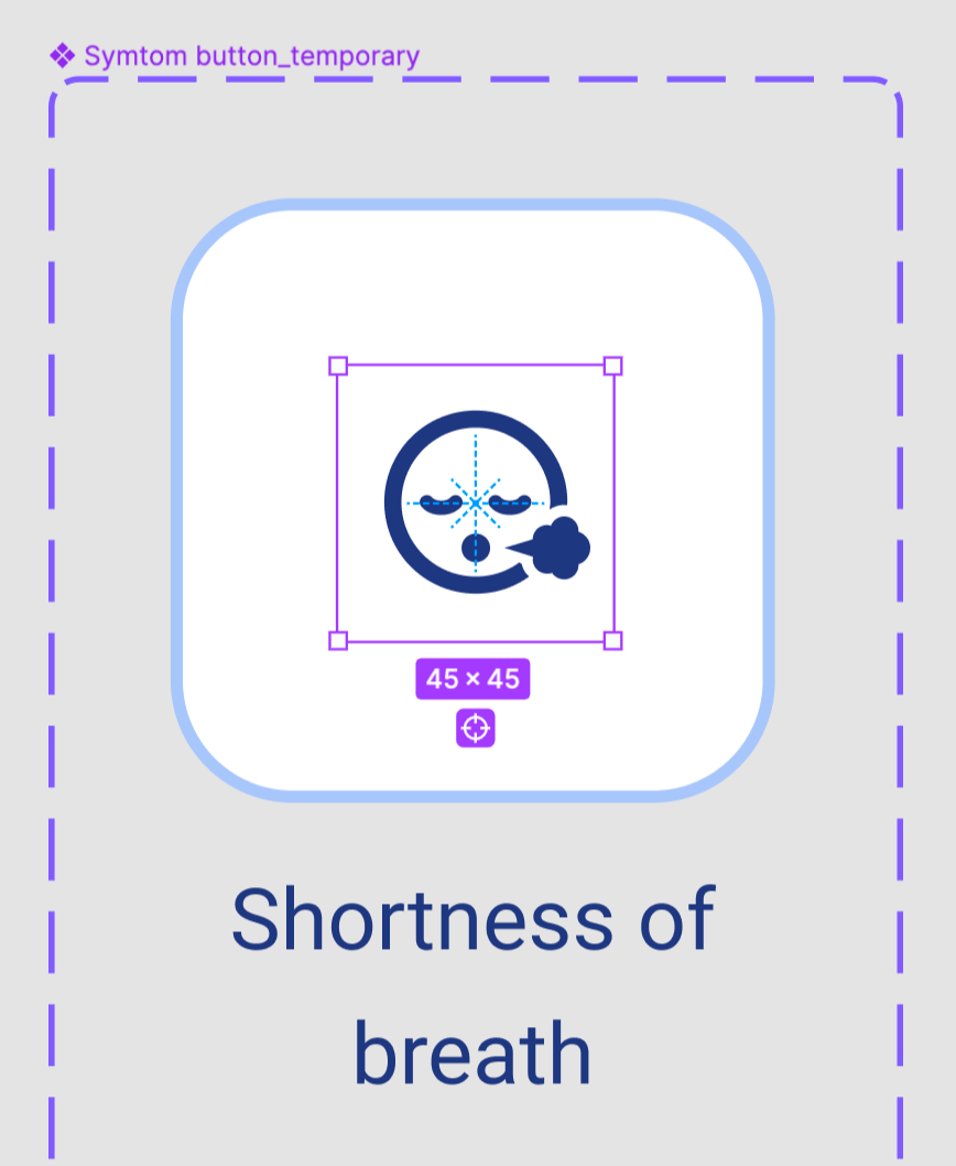
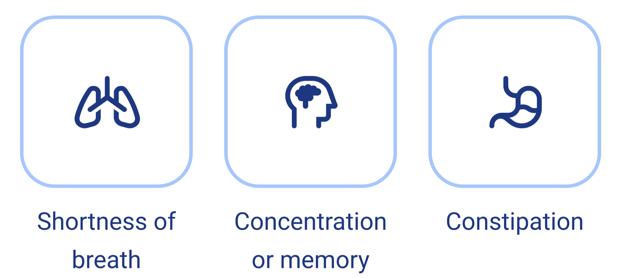
I have multiple instances of this button component with each a different icon, which means that I had to change the content of the text so it changes into the glyph of Fontawesome.

But when I update, for example, the scale of the Fontawesome icon component in my button component. The content of all my button instances are reset.

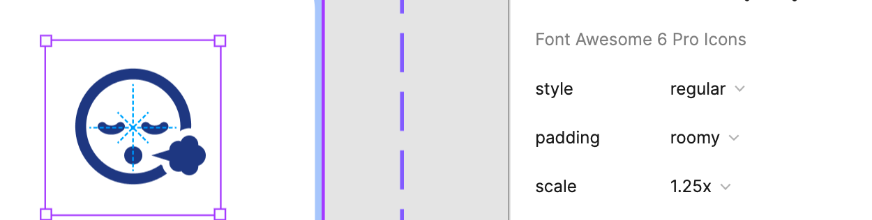
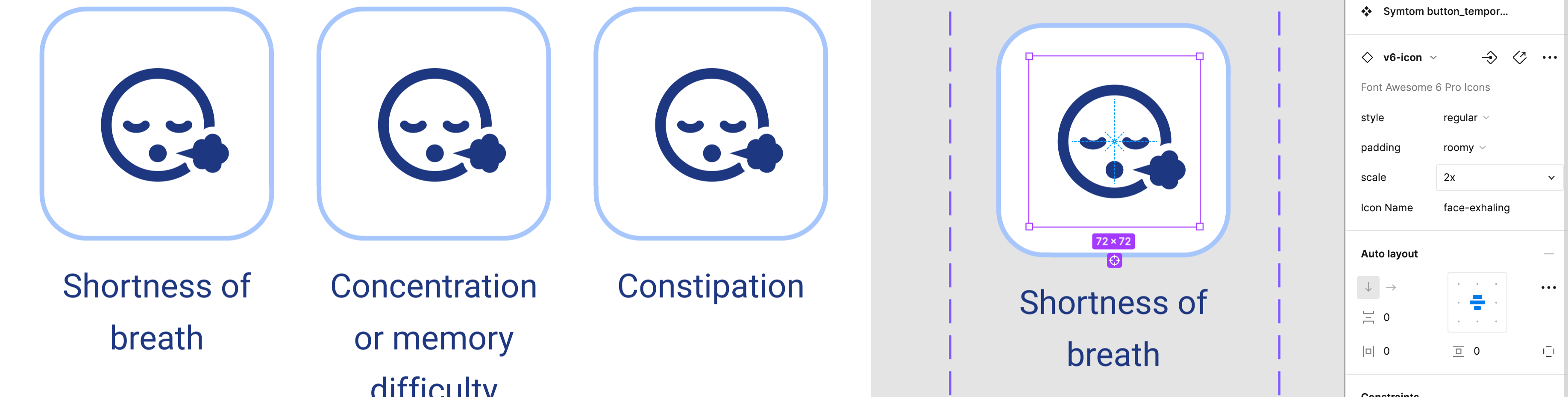
The layer naming is all the same, as it should be so overrides don’t reset. I just noticed it replaces the content of the Fontawesome icon instance once I change a property of the icon instance in the button component.
image

Could this have something to do with the new “apply instance swap property” update?

I hope I explained my issue clearly, if not. I can add a screen recording.

Thank you in advance 🙏

This topic has been closed for comments

13 replies

Jil
  • Author
  • 3 replies
  • May 24, 2022

@jory Any clue?


jory
  • 9 replies
  • May 24, 2022

@Jil Hmmm. This is a tricky one. I think I need to see the structure of the button component you’ve built. Based on the dotted purple line, it looks like it has some variants associated with it? I built a sample on my end and confirm that the issue is happening. I need to do a little more digging, but it looks like the text variant isn’t cascading through each instance.

I can’t quite determine if this is a Figma issue… or an issue with the way I built the initial component.


jory
  • 9 replies
  • May 24, 2022

UPDATE: This issue is now fixed with the latest BETA features available for components!

Okay. Did a little more digging, and this does indeed look like it’s the result of how Figma handles nested components with text property overrides. Essentially, the “text property” variants can only really be one layer deep with components, which kind of breaks the way we’ve built the Font Awesome icon component.

For your particular use case, I might suggest detaching the initial FA component and just using a plan ol’ text layer/property for the icon names. That should allow it to correctly cascade throughout your component.

I’m going to continue researching this, in case there’s a solution I can build in to the component itself.


Alexandre_Istrasoft

Hello @jory , indeed we use buttons, table headers and many other higher level components that incluse the FA icon component inside and have the same issue (even before the new component update), that switching the FA icon variants after having changed the icon itself reverts the icon to its default smile as soon as it’s nested.

Also, we would like to “limit” or at least encourage a more systematic use of the same icons for the same actions within the design system, so for now we did it through a parent component wrapping a FA instance with a modified base icon, but indeed this could be achieved easier with the new Figma update allowing component swap properties. That would require each FA icon to exist as a separate figma component I guess. What do you think ?


image


Alexandre_Istrasoft

Also, since the icon is essentially just a text layer, it’s also very possible (and maybe easier) to use Text Styles rather than component variants to change between Regular/Solid/Light/Brands etc and even the size of the icon. This way, you would ship 1 text style per icon variant in the current component, and only have 1 basic component that applies a text style to the text layer. The switch of icon category or size would be done entirely via styles.

image

and therefore maintained when you use nesting and overrides any number of levels over.
The text content override would be therefore separate as a text property, and with no variant properties on the component, there would be no issues with nesting.

image

Figma – 26 May 22

jory
  • 9 replies
  • May 26, 2022

@Alexandre_Istrasoft Thanks for the details! So, yes… if you want to use the component swap property, then each icon would need to be a separate component. It’s something we’ve considered, and we’re working on a plugin to make it easier… but for now the easiest way is to use our OTF files because it allows for just typing out the icon name, and surpasses issues with licensing. (Including Pro icons directly in a Community file wouldn’t work.)

As for using text styles for the different icon sizes/styles… that’s a great idea! I’ll look into it!


Alexandre_Istrasoft

Thanks @jory, I’m quite junior as designer so thanks for considering my somewhat unusual ideas haha 🙂
Of course I would like to keep using the OTF files, and development wise we’re using a custom SVG sprite that we plan to limit to the icons actually included and validated for the design system, so component swap might make sense in our case.

both my ideas could even be combined (1 component per icon, with just the text content changed, but using Text Styles for sizes and icon types)


RizePoint_Product

I answered another post a few days ago from someone else who was having issues working with SVG-based implementation of Fontawesome within Figma. I wanted to share the solution I came up with that avoids those issues by, as Jory suggested, just typing out the icon name. I’ve been using this solution for a few months now and I love it. I hope it helps!

Figma

Jil
  • Author
  • 3 replies
  • May 27, 2022

@jory Thank you a lot for already looking into it. Maybe we need to take this conversation further to @Figma_Support to ask why they don’t consider cascading the content of a text variant.

@Alexandre_Istrasoft I love your workaround on this using styles. That’s very helpful! The only issue I see is that we can’t cover all the properties of the FA icon component like padding for example. But your solution already covers scale and style so that’s a win.

@RizePoint_Product That is in fact a solution but it defeats the purpose of FontAwesome. I don’t want to build my own icon library again. I want to be able to type the word that I need and have access to a vast library that I don’t have to maintain.

Thank you all so far for figuring this out, greatly appreciated!


Alexandre_Istrasoft

Hello @Jil indeed padding is not doable with text styles, but as usually the icon is included in a higher level component, if that one uses autolayout i personally found padding redundant and I never use it.

however as you mention, the issue with that idea is that color styles are visible and switchable from the component level and higher up the tree, but text styles aren’t brought up higher in the same way, which would be a great addition anyway for other use cases indeed @Figma_Support


Alexandre_Istrasoft

Thanks for sharing. Im not really convinced. If I want to add a color I have to add tens or hundreds of variants in all these components, while it actually is an overridable property at any level, same with size which has any free values allowed by the fact its a font… and can be limited and systematized much easier by text styles alone


RizePoint_Product

@Alexandre_Istrasoft My thinking with this system is ease of use for future designers–while FontAwesome gives you access to thousands of icons and variants, realistically a product is going to use a small subset of those. I want to spare other designers working with the system from having to remember, or go back and reference, the correct icon names/styles/sizes every time they want to insert one in context.

Re: colors, because in our system icons follow the color of the adjacent text, it’s rare that I have one that doesn’t conform to the color set I’ve defined. In cases where I do have an icon that breaks those three, I just override it locally.


  • 0 replies
  • June 30, 2022

This topic was automatically closed 30 days after the last reply. New replies are no longer allowed.


Cookie policy

We use cookies to enhance and personalize your experience. If you accept you agree to our full cookie policy. Learn more about our cookies.

 
Cookie settings