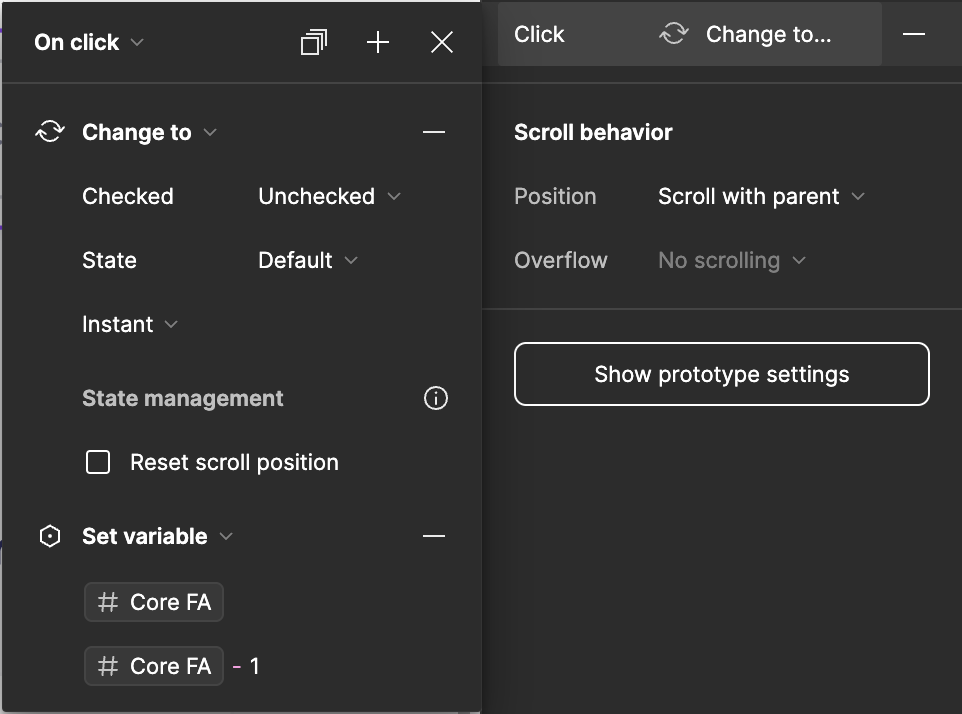
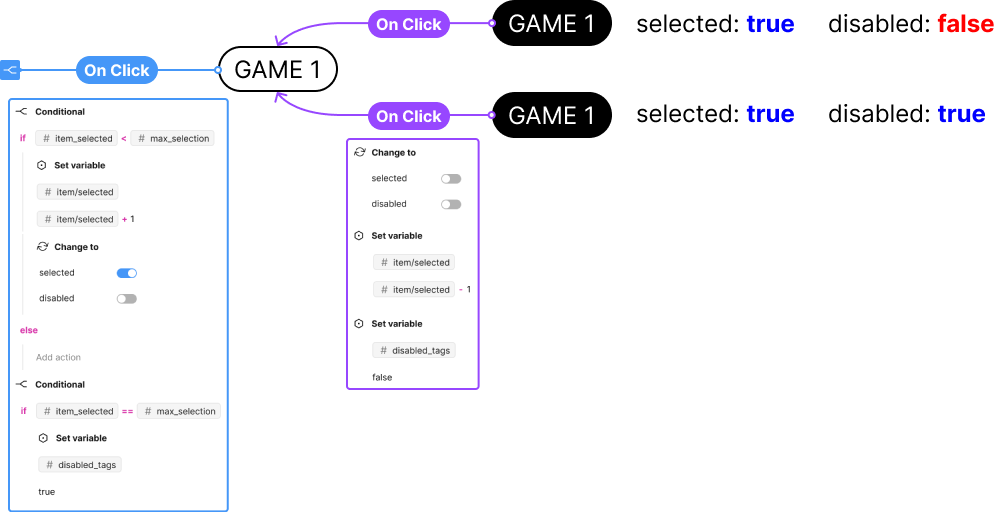
Hi all! I wanted to know if the creation of a particular conditional flow would be possible using the new variables feature and conditional expressions. The flow can be phrased as a bit of a pseudo code ‘else if’ statement. (my js is terrible btw)
if the number of selected pills >= 3 ==>The other unselected pills in the group of pills should turn to a disable state elsethe user can continue to select pills.
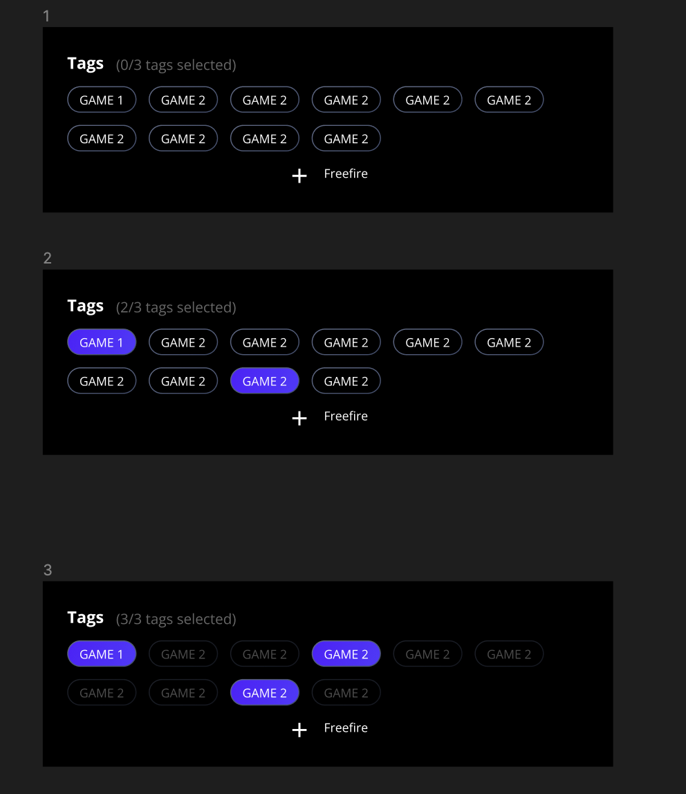
The idea is that the user can tap on any three pills and it changes the state of the unselected pills to indicated that they have selected the max number of pills.
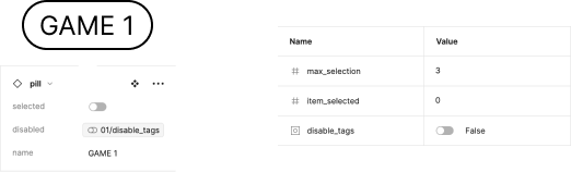
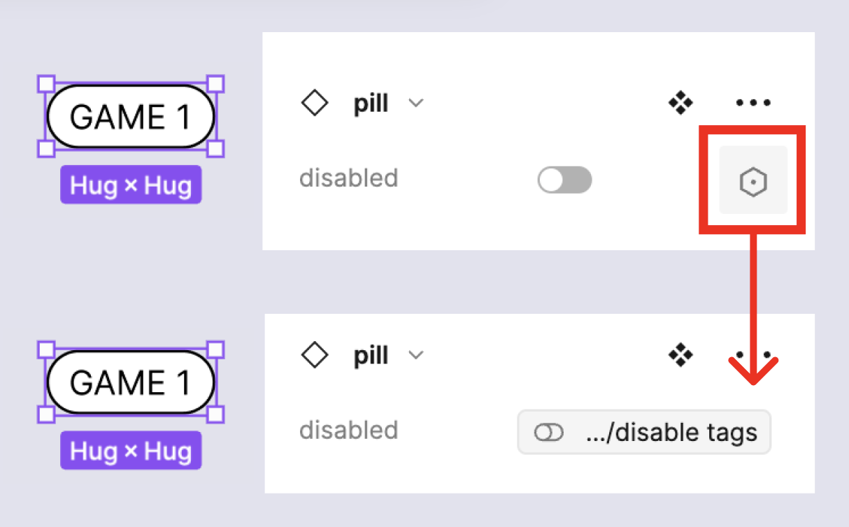
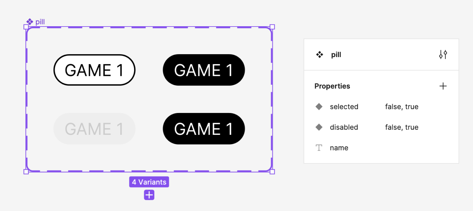
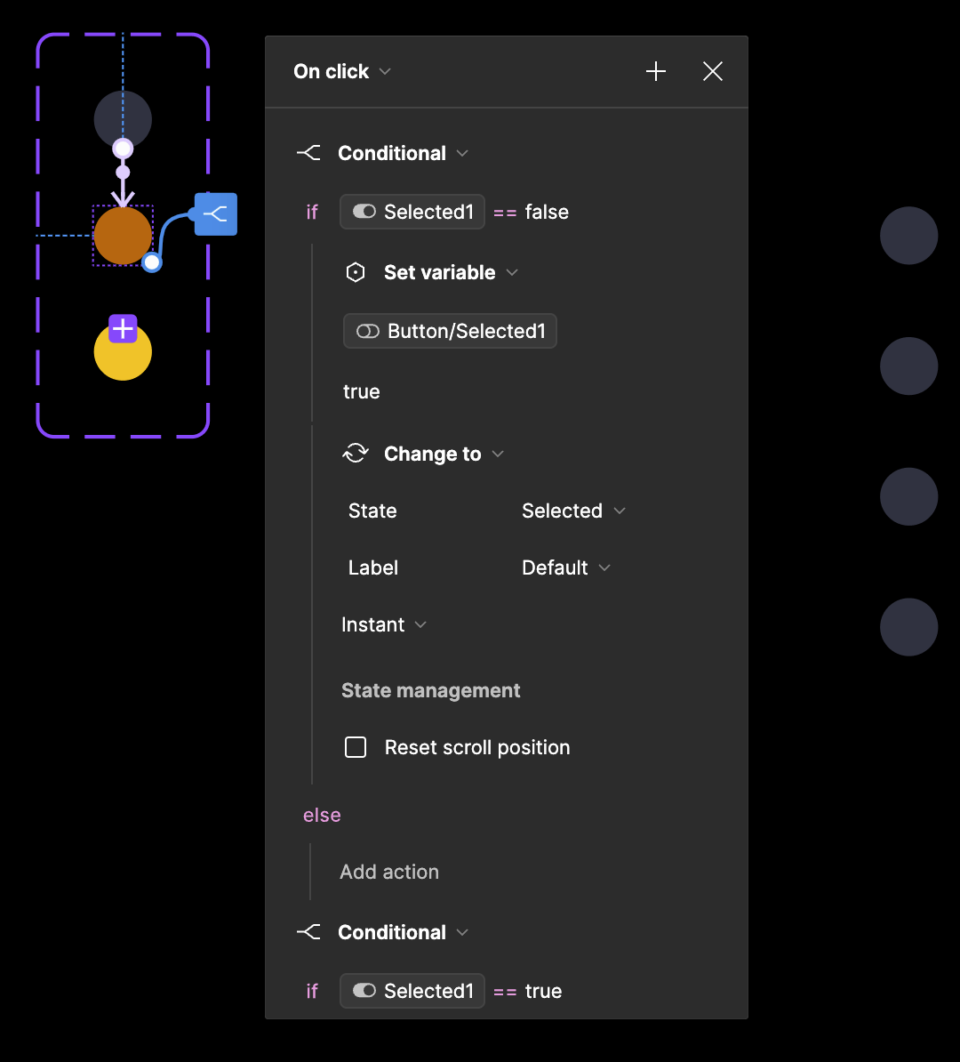
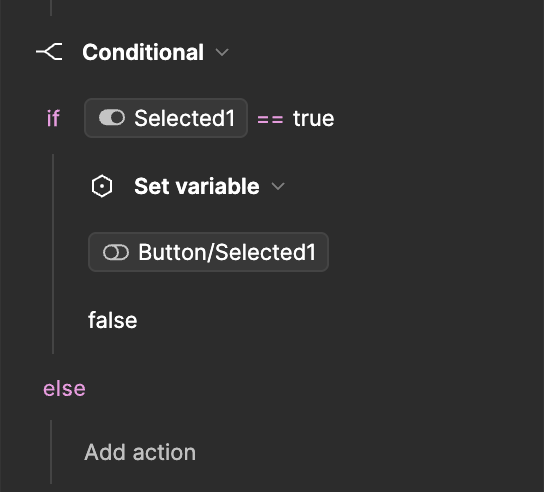
Hoping the images shared below can paint a clearer picture. I do not know if this is possible since component props cannot be linked in variable values? I think?? It feels like it should be doable but I’m just missing something.
You need to bind the variable disable tags to the boolean property of your Tag component instances (as shown above) and then you’ll be able to change all of their status at the same time.
To do so, add to the component interaction On click a condition to check if the total number of selected tag as reach its maximum. Then set your variable disable tags to true if it reach the max and false otherwise.
Could you record video in Presentation mode? It seems to me that your solution does not match the author’s question. Note that the example uses 3 states (disabled, not selected, selected).
Oh, great catch. Thanks for sharing. I originally thought about creating as many variable modes as there are instances. And you made it much easier by using 4 variants.
Hi, I was following this post as I’m trying to build something similar, so thanks for sharing this! I didn’t quite get it though, could you share a screenshot of your interactions and the variables, that would be great!
For context, this is what I’m trying to build:
A card component that has a small variant and a full-screen one.
So if I have a scrollable feed of distinct cards of the small variant and click on of them I want that one to change to full screen and all of the others to disappear (or to also change to full screen but align in a vertical feed in the same order as they were)
Hi @Matti
On this screen you will find all the properties of my component + the variable attached to the instance I used for the prototype and then all the variables
This one will show you the On Click interaction between the different variables of the components Pill
Regarding what you are building, it’s almost the same, when you click on
a small card: you need to trigger a “On click” interaction, and set a boolean variable to true (or false, depending of your card’s property definition).
a full screen card: you also need to trigger a “On click” interaction, and set back the boolean variable to its default value.
then on all your card instance you have to bind the aforementioned boolean variable to the property of the card that defined its disabled state.
Thank you for sharing your workflow! Is it possible to build a radio button menu using a similar approach? I am trying to build it inspired by your workflow, with the difference that the button has the additional hover state along with the default and the selected.
I’m assuming that you want a list of radio button and when on is checked, all the others become unchecked?
In that case, yes it’s quiet the same things : the boolean variable must be applied to the property of your component triggering its state change (in this case the check status)
As for the hover state it shouldn’t be a problem, it just some extra-step to account for the hover state :
add a “while hovering” trigger on the component’s default state
My issue is that once I select a button it remains selected so I get similar functionality as in your example. I don’t know what I am missing to have only one button selected at a time.