Hey! Long time user and Figma-lover. I am always trying to figure out how far I can push Figma when it comes to organization and have a question.
When creating components that generally include other components, it can be sometimes be hard swapping out a lot of the interior pieces with others when they are locked into a set.
An example of this, let’s say I have a dropdown component, and I have the contents of that dropdown in a list that has 10 entries. Sometimes I want all 10, and sometimes I don’t.
I can either:
- Create a master component that has 20 entries and then when I pull the component instance into my document, I can delete (hide) the ones I don’t need.
- Create a component set that has 20 instances of the dropdown- one for each quantity, and then use a dropdown to select how many options I would like.
- Pull in the component that has just 5 entries, break the component link, and then copy/paste as many rows as I need, since they are all in an auto-layout grid.
That last one is what I would like to focus on, because I feel that it is the best way to simply do what I need it to while having full control over it.
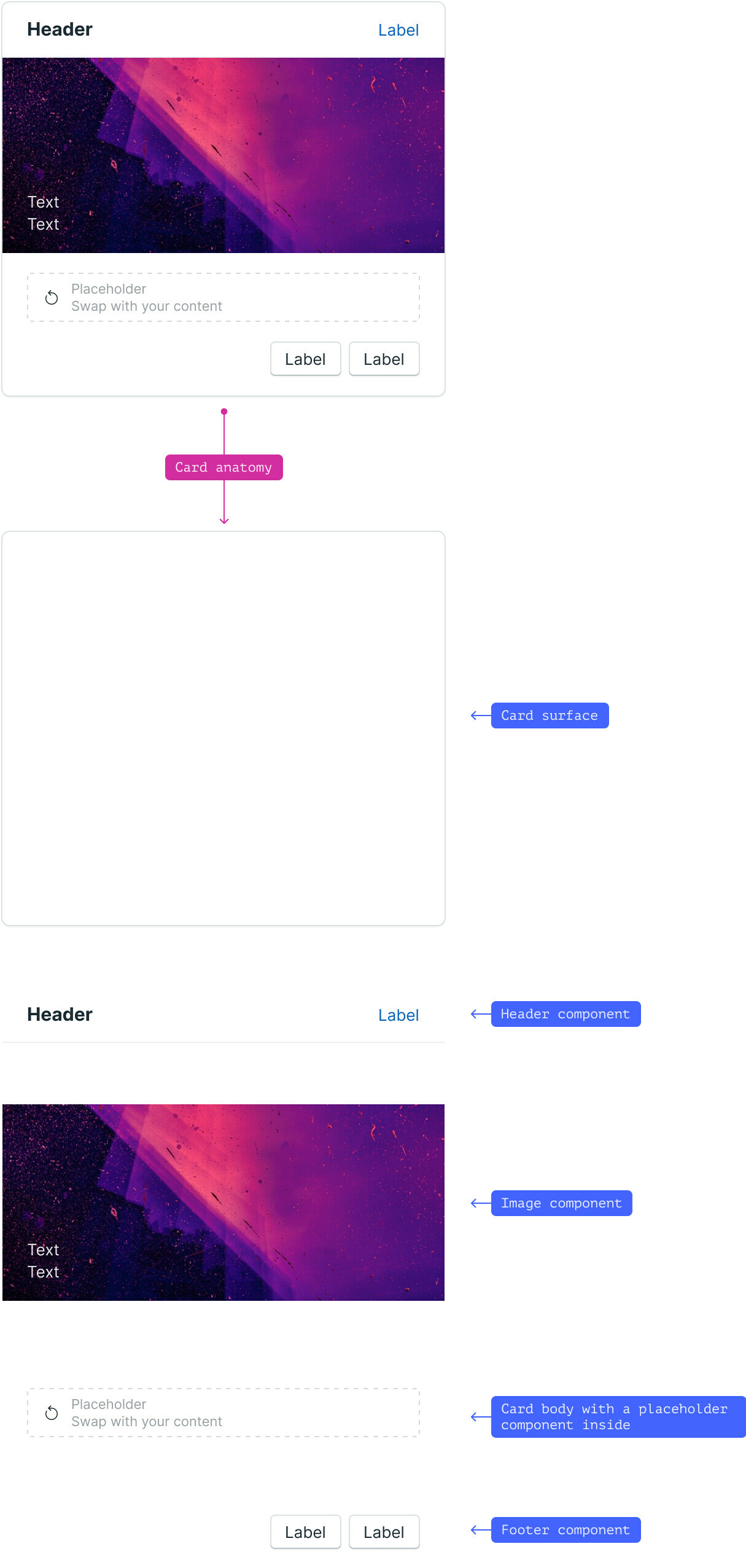
Another example came to mind when I was browsing LinkedIn yesterday and I came across someone sharing an article they had written that showed a large card component, and in the spot where content should be, was a big frame with text that said “Replace this with content” essentially.
That got me thinking, and I was like… that would be amazing if that was an auto-layout frame that I could just drag and drop other components into, such as a text field, image, sliders, etc.
The problem with that is… that you can’t do that when the main component base is a component instance. Basically, I can drag out the card, but then I either have to break the instance and then start pulling in the things I need in there, or try and replace the contents with other components via the drop down menu for component replace/select.
Both of those seem… not ideal.
–
So onto the actual request here.
Right now, in order for something to be included in the component library, it needs to be a component. Which means, that it is either static, or only has the pre-built options that you can slot into it, and all of that requires a lot of setup work, and a lot of work to try and figure it out.
That or breaking the component, which also isnt ideal.
I was thinking that it would be nice to either have components that are semi-locked, with areas that can accept new components when you drag them into it (like an auto layout list) or possibly just having ‘patterns’ that you can just drag out of the component library that come in already unlinked from the master. This isnt ideal because then they arent hooked up to a master obviously, but that already doesnt happen once you break the link anyway.
My end goal is that I would like to have a card component that I drag out, that can still be linked to a master, but that I am able to drag things into to make it work, similar to how a developer can just add content into the space created for it.

