UI3: Please don't hide editing tools and features

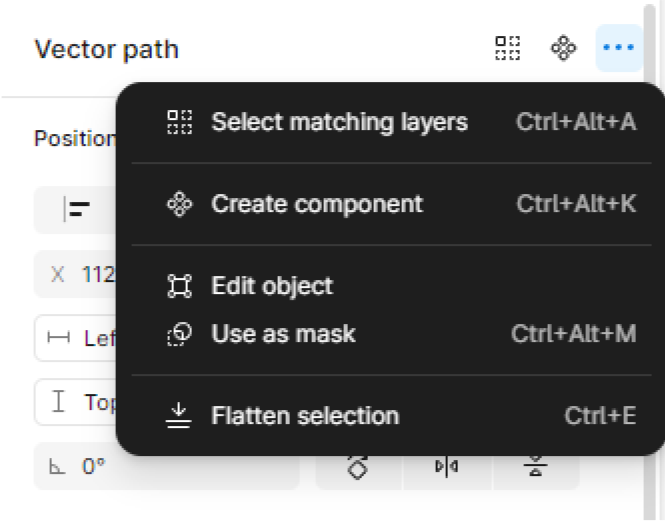
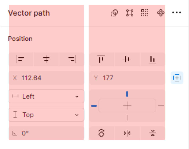
Please don’t hide editing tools and features: Edit Object, Use as Mask, and more

Figma’s mission is to make design accessible to everyone.

And then decided to make some features less accessible. (I know they’re not the same accessible meaning)


At first, i was only a little annoyed but now that I’m editing objects, it becomes annoying. Why would you hide it and only show it primarily when you’re editing outside of a frame? (no shortcut key. The most you can do is double click it and if it’s really tiny i say, goodluck)

When editing vectors or objects, edit object should be a primary action.

In fact, if you’re using grid 1 fraction in this section you can squeeze all of them but instead you opt to hide some and show only 2. (What a tease)

Look. The buttons you’ve designed were small enough so why still save space?


I like how you made it cleaner, but not how you made it less accessible.

2 Likes

I agree with you. They are important features.

1 Like

Hey @Raphael_M, thank you for taking your time to share your feedback with us! I’ve forwarded this internally to the teams for consideration.
Please don’t forget to upvote this, this helps us roadmap future updates.

Thanks!

1 Like

I agree! I just started to learn how to use Figma and it is so frustrating that so many tools and features are hidden! Following tutorials are making me crazy. Features that are visible on some previous versions og Figma is suddenly hidden and I have to search to find out where it is hidden.

1 Like

Hi, Gayani.

I noticed that this (edit object) was fixed already or whatever they did but it already appears on vectors even if it’s inside a frame.

Before: Edit object only appears when the vector is outside the frame
After: Edit object appears even when the vector is inside the frame