I originally posted this in the primary UI3 feedback thread, but it was suggested to me by @Leonel_Vitorino that it be it’s own topic as it had enough importance that it should be able to collect it’s own votes and such.
It appears that inserting components from libraries is entirely driven by a “search” in UI3, in UI2 one could also “browse” for components by looking through a library. This was important to me in my workflow as I don’t always know exactly what a component is named. For example, inheriting a UI kit from a previous designer or using an extensive public icon library. To go a bit deeper, I use Material icons for many of our projects and I may not always know what the icon is named—but I generally know what kind of interaction I am wanting to represent and Material is organized in a way that appropriate icons are “discoverable”. Thus, in UI2 I could generally “discover” a suitable icon by browsing the pages of the icon library file, which is organized like categories.
This is how it used to be in UI2:
Even if you didn’t enter a search term, you could still click through files and pages and frames to discover what you need. I find this super useful even when using libraries that I curate, as I may not always recall exactly what something was named. And if another designer adds something to our UI kit, the problem is exacerbated.
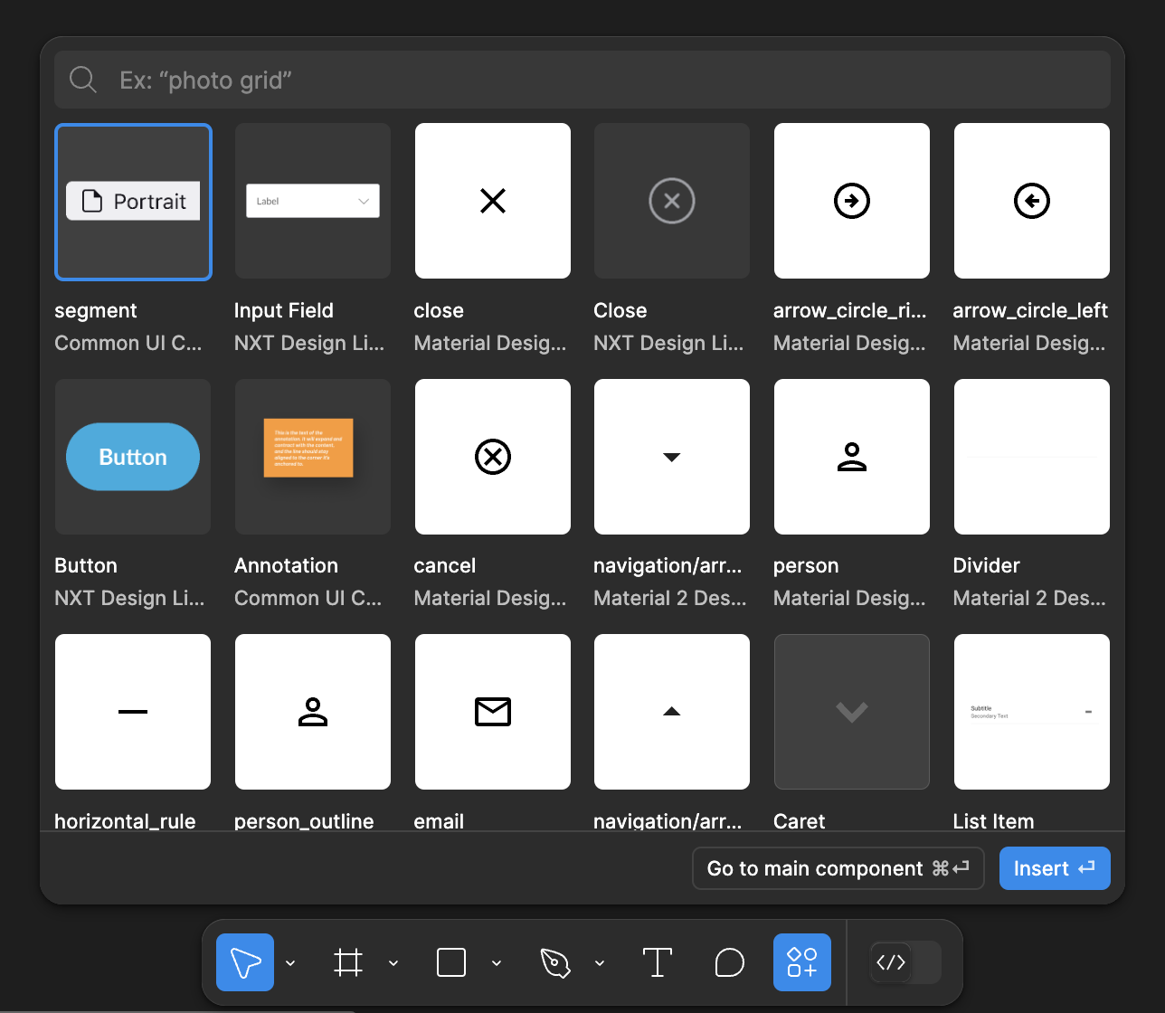
And now this is UI3, I don’t see a way to discover components by looking at a specific page in a specific file:
It seems that in an effort to simplify this feature or make it “easier” to use, it has become more difficult for me to find things unless I know (or have a general idea) of what the component is named.


